Stories & Features
Long-form reflections on fashion as culture—where colour, history, psychology, and personal style intersect. This section explores how clothing communicates feeling, memory, and meaning beyond trend cycles.
A Quiet Shift: Reading the Room Through Color
Saturday, March 14, 2026
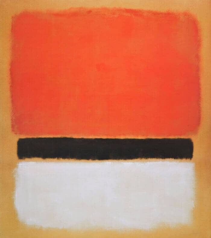
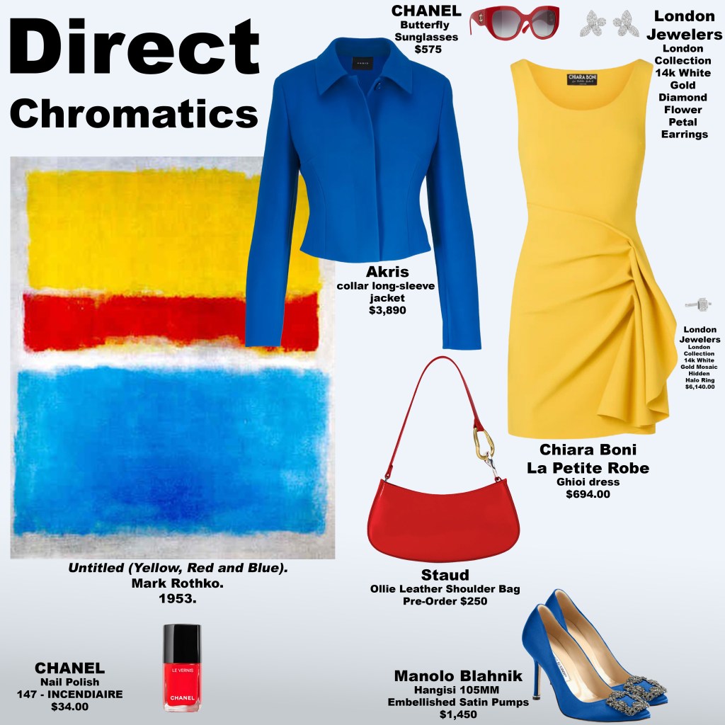
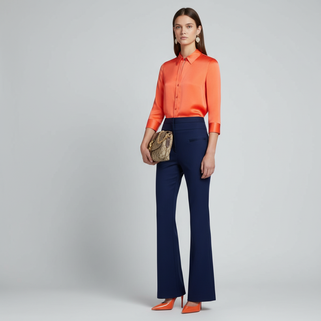
The look draws quiet inspiration from Untitled (1968) by Mark Rothko, yet it resists the instinct to mirror the painting too closely. Rothko’s work is known for its hovering fields of color—layers that seem to breathe against one another, dissolving boundaries rather than asserting them. In this interpretation, however, the palette gently diverges. The tones chosen for the garment are intentionally different from the canvas that inspired it, creating a soft but perceptible tension. Instead of echoing Rothko’s chromatic harmony, the look introduces hues that feel slightly displaced, as though the emotional register has been quietly recalibrated.
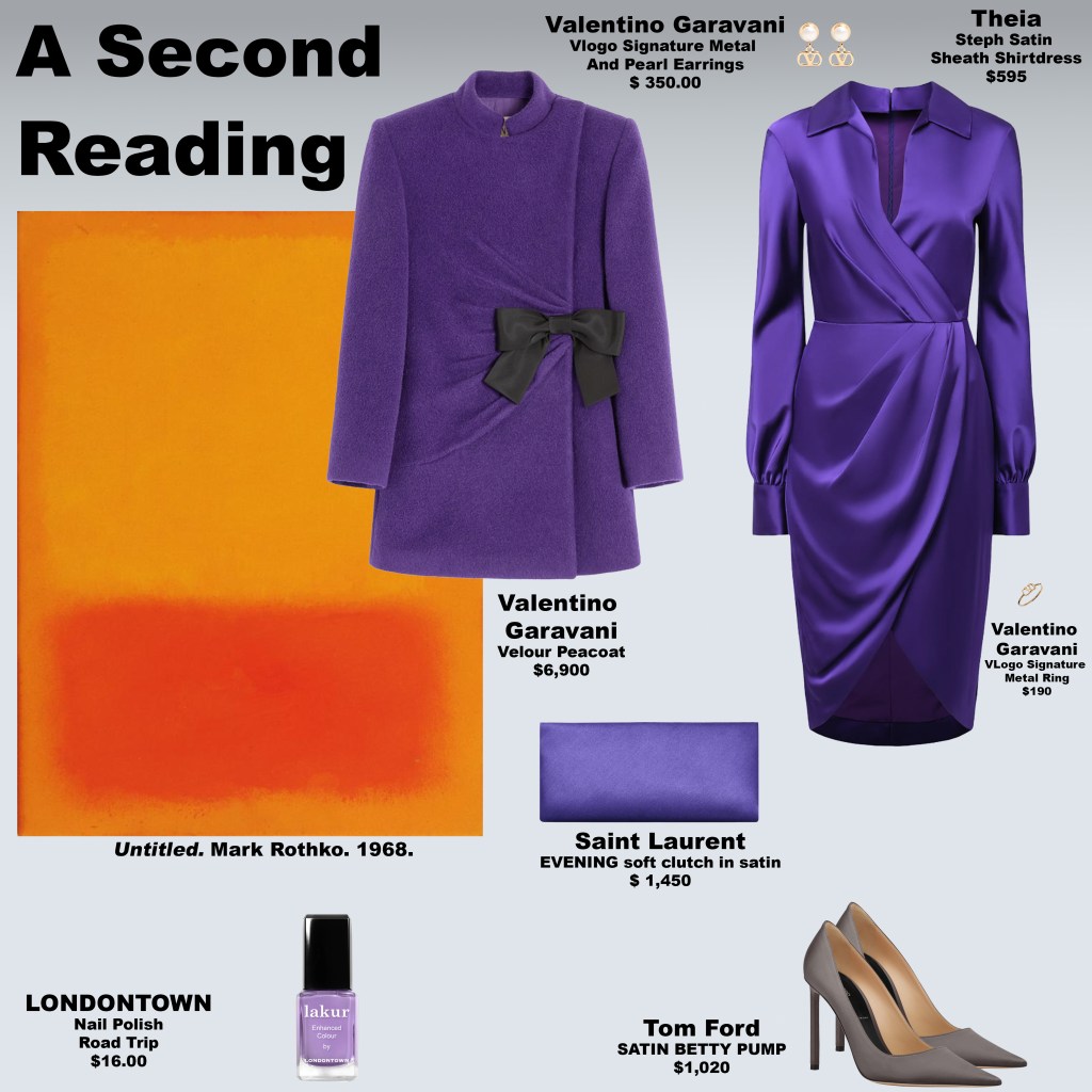
That shift speaks to something subtle in human psychology: the way perception changes when understanding deepens. When a dynamic is seen more clearly, language and meaning can begin to rearrange themselves. Words once used casually may suddenly carry weight, while certain labels appear less like truth and more like attempts to preserve a particular narrative. In moments like these, the atmosphere between people can shift in much the same way color shifts across Rothko’s canvases—almost imperceptibly, yet unmistakably.
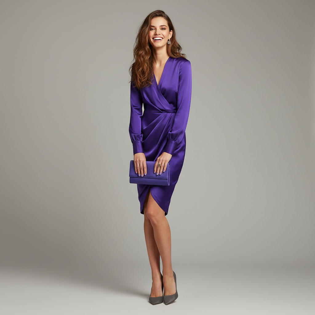
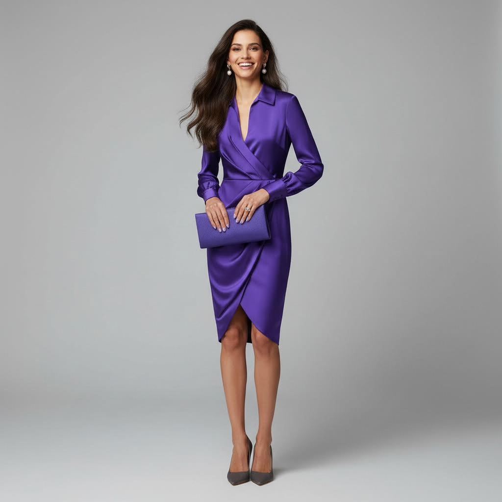
The garment reflects this quiet psychological movement. By stepping away from the painting’s exact palette, it highlights the delicate distance between what is presented and what is felt. The result is not confrontation, but contemplation: a reminder that interpretation is rarely static. Just as Rothko allowed color to hover in a state of emotional ambiguity, the look suggests that meaning often lives in the spaces between certainty and doubt, appearance and understanding. In that space, perception softens, and a new reading becomes possible.

Decoding Attachment: How We Experience Peripheral Devotion
Friday, March 13, 2026
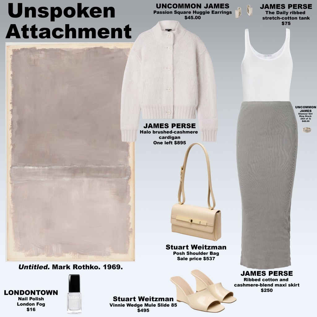
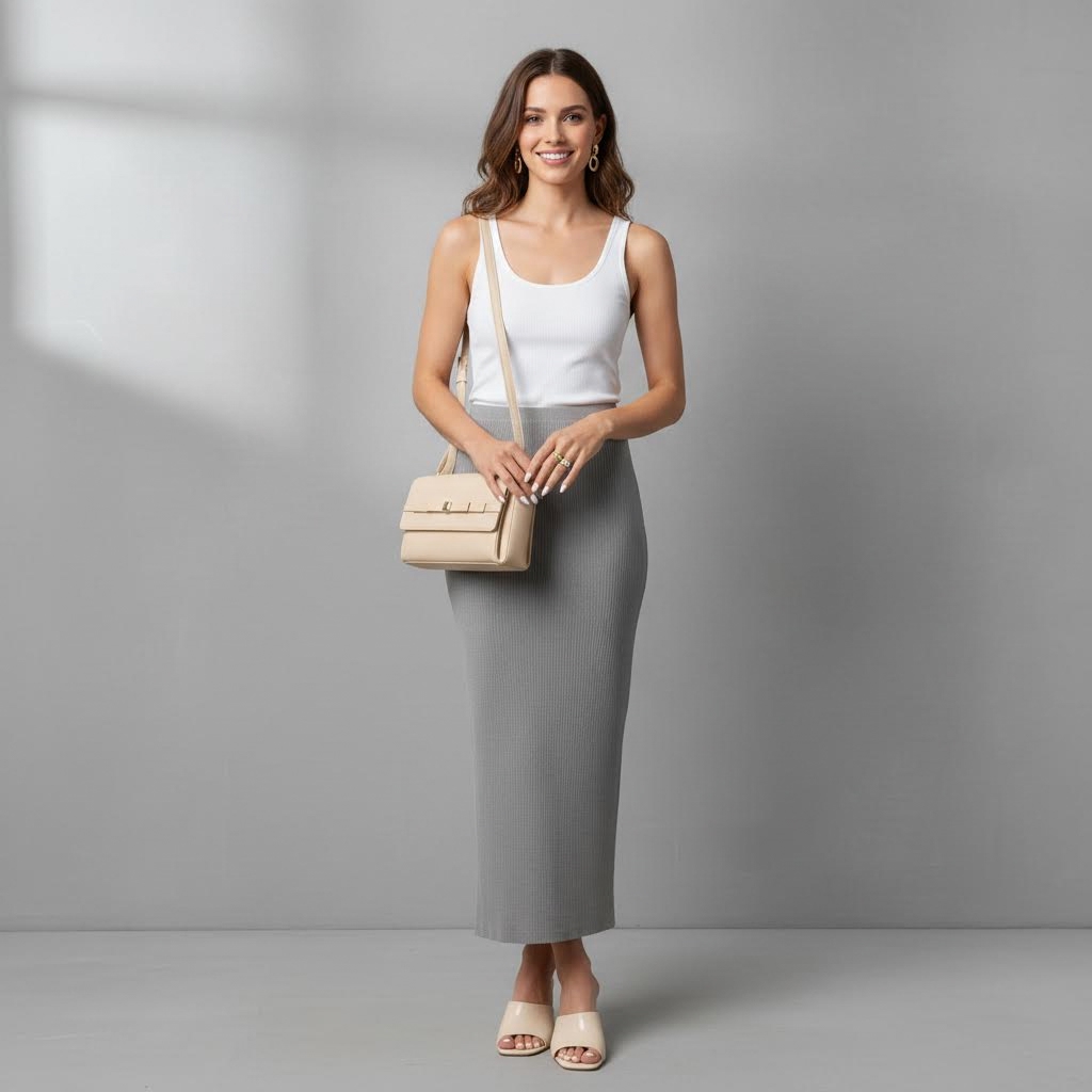
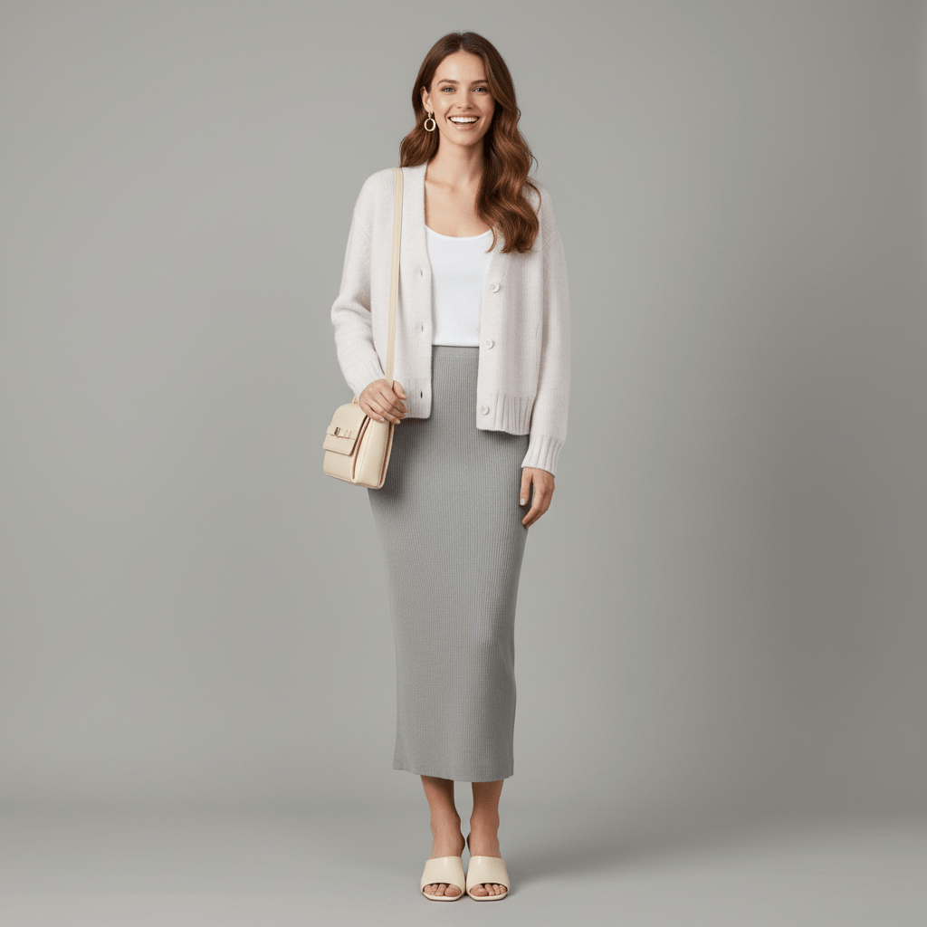
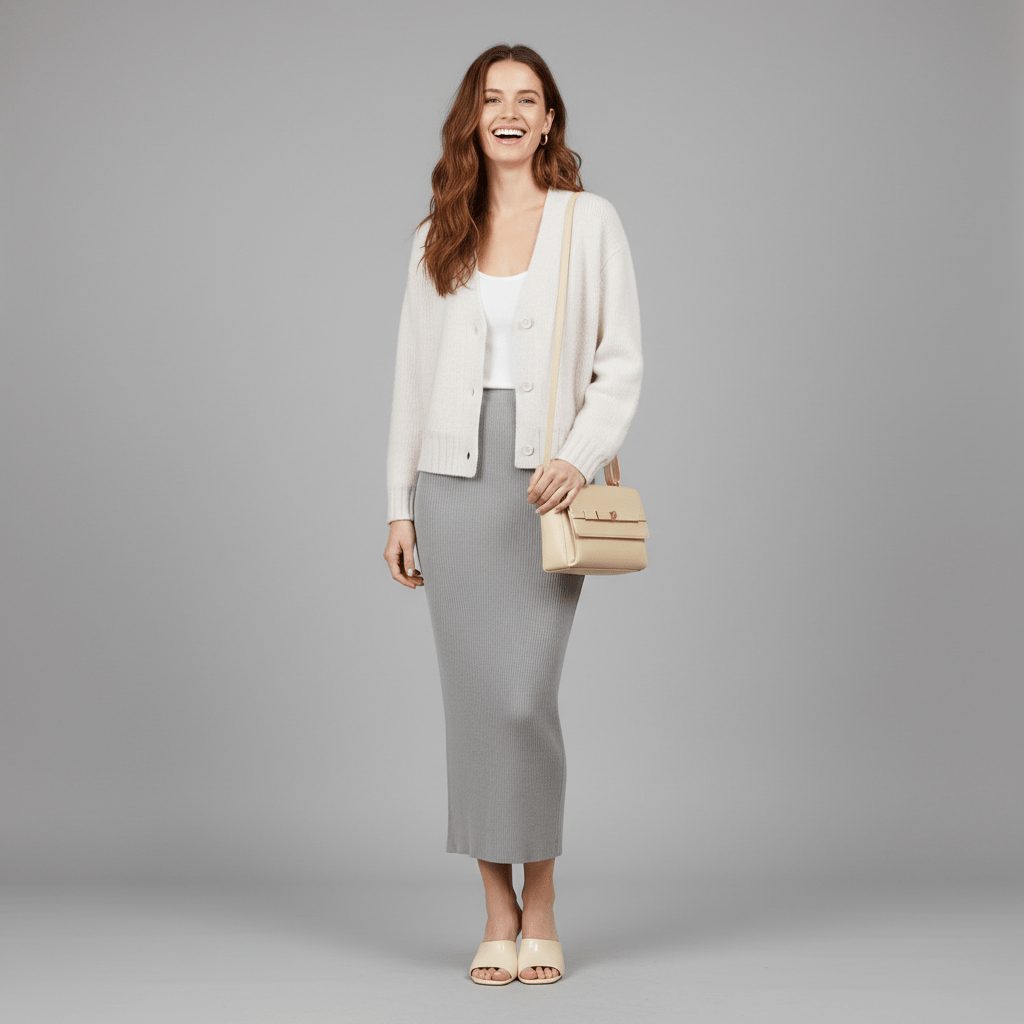
Ambiguity in social dynamics has a curious power: it draws our attention, invites our projection, and keeps us perpetually engaged, unsure of the boundaries between closeness and distance. This tension is at the heart of Unspoken Attachment, a look inspired by Rothko’s 1969 Untitled. The painting is composed of layered blocks of soft gray tones, framed by a warm, muted border in pale beige. The top block, a darker gray, dominates the upper portion of the canvas, while a central strip of mixed darker and lighter gray shades separates it from the lighter gray lower block, which grounds the composition and conveys distance. The colors are understated yet carry weight, creating a space where our perception is active rather than passive. They reflect the psychological experience of navigating ambiguous social cues: we are drawn to the subtle shifts, the nuanced gradations, and the spaces in between.
When ambiguity is present, we are compelled to interpret, to imagine, to assign meaning. Just as we linger on Rothko’s subtle transitions of gray, trying to sense depth or emotional resonance, we find ourselves projecting desire, suspicion, or curiosity onto signals that may be unclear. The pull of perceived attention—without clear reciprocation—creates a feedback loop: we imagine closeness where there is none, attach significance to gestures that may be neutral, and experience emotional highs and lows dictated by interpretation rather than reality. This mirrors parasocial attachment, in which attention and imagined intimacy substitute for actual interaction, producing powerful emotional investment in relationships that exist only in perception.

The layers in Unspoken Attachment mirror this psychological push-and-pull. The top block, a darker tone of gray, conveys the illusion of presence, suggesting engagement that feels close yet ultimately remains unreachable. The central strip, a combination of darker and lighter grays, functions as a buffer—a space for our interpretation, hesitation, and reflection. The lower block, composed of lighter gray shades, conveys distance, creating a subtle separation from the top while grounding the composition. We read the nuances in these tones as we would ambiguous gestures or coded social cues, attempting to discern meaning, significance, or intent where clarity is deliberately withheld.

Why is ambiguity created in the first place? In social systems, ambiguity serves as a form of control, attention management, and cultural signal. Unclear gestures, indirect statements, and coded behaviors force us to interpret, compel our observation, and generate speculation. When signals are confusing, they invite our engagement and prolong our attention: we become invested not in what is said, but in what might be meant. This ambiguity functions as a psychological magnet, drawing our projection, desire, and emotion toward the signal, giving it power far beyond its literal meaning. The “point” of ambiguity, then, is not necessarily to communicate truth, but to shape our perception, influence our engagement, and sustain our fascination.
From our perspective, this can be both compelling and exhausting. Our minds are drawn to the subtle interplay of closeness and distance, trying to reconcile imagined intimacy with reality, generating emotional highs, confusion, and sometimes obsession. In Unspoken Attachment, the soft gray tones of the painting serve as a metaphor for this experience: neutral yet charged, accessible yet unreachable, inviting our contemplation while withholding certainty. The palette captures the liminal space between observation and interpretation, engagement and distance—a visual analogue for the psychological dynamics that emerge whenever ambiguity and attention intersect.
Ultimately, the layered grays of the look embody the cognitive tension created by ambiguous social signals. They remind us that our perception is active: we interpret, imagine, and invest emotionally even when clarity is absent. The ambiguity itself becomes a tool, a medium through which our attention is directed, our desire is projected, and social dynamics are orchestrated. Unspoken Attachment makes tangible the invisible: the subtle emotional currents, the push-and-pull of our perception, and the psychological weight of signals that we can never fully understand, only feel.
The Space Between: When Color Speaks
Thursday, March 12, 2026
For the last few looks—Theatre of Illusion, Legible Depth, and Direct Chromatics—you may have noticed the articles were intentionally left without words. The purpose was to give you, the audience, time to engage directly with the colors, to feel their emotional weight, and to interpret their meaning in your own way. Color has its own language, and sometimes silence allows it to speak more clearly than any script could. Going forward, some looks will be accompanied by written articles, while others will remain blank, offering you the freedom to explore the narrative and the emotions embedded in each palette on your own terms.


We Don’t See With Our Eyes, We See With Our Minds
Thursday, March 12, 2026 🔁 Wednesday, February 11, 2026
“All cats are gray in the dark.” At first, it seems like a simple observation about low light—but it reveals a fundamental truth: seeing is not just about the eyes. The retina collects light, but the mind actively interprets it, filling in gaps, predicting shapes, colors, and depth. Vision is a construction—your brain takes fragments of information and synthesizes them into a coherent experience. What you think you see is as much a product of memory, expectation, and emotion as it is of photons striking the retina.
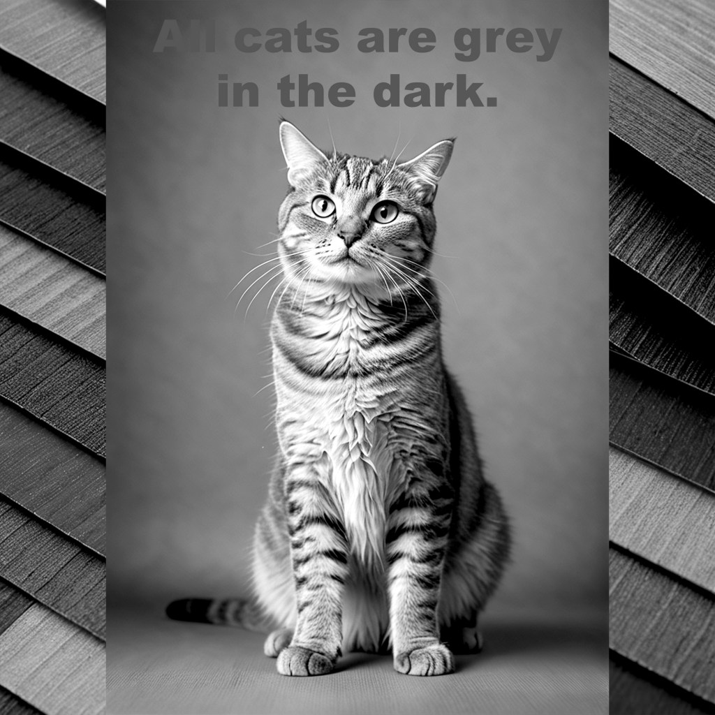
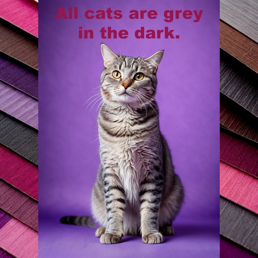
Neuroscience shows that the brain constantly edits and completes visual input. The retina encodes a fraction of what surrounds us, sending it to the visual cortex, where neurons combine incoming data with prior knowledge. In ambiguous or low-light situations, the mind supplies what is missing, blending inference with observation. This is why optical illusions work, why colors shift depending on context, and why a shadow can appear threatening or gentle depending on mood. Seeing is prediction, perception, and interpretation—all orchestrated by the mind.
This dynamic directly shapes fashion and style. The colors, textures, and forms we choose are not simply observed by others; they are interpreted through the minds of both wearer and viewer. A deep burgundy may feel grounding and authoritative, a soft lavender reflective or introspective. The brain reads these cues emotionally, layering memory, expectation, and personal associations on top of the visible surface. Dressing is therefore an act of psychological communication: the mind translates color, pattern, and shape into feeling, presence, and mood.
Understanding vision as a mental construction reframes how we approach style. Clothing, color, and design are not merely seen—they are experienced, interpreted, and co-created. A single hue may resonate differently depending on who wears it and who sees it, reflecting an internal state as much as an aesthetic choice. All cats may be gray in the dark, but the mind colors them, defines them, and imbues them with meaning. Fashion, like perception itself, is not passive; it is a collaboration between eyes, mind, and emotion.
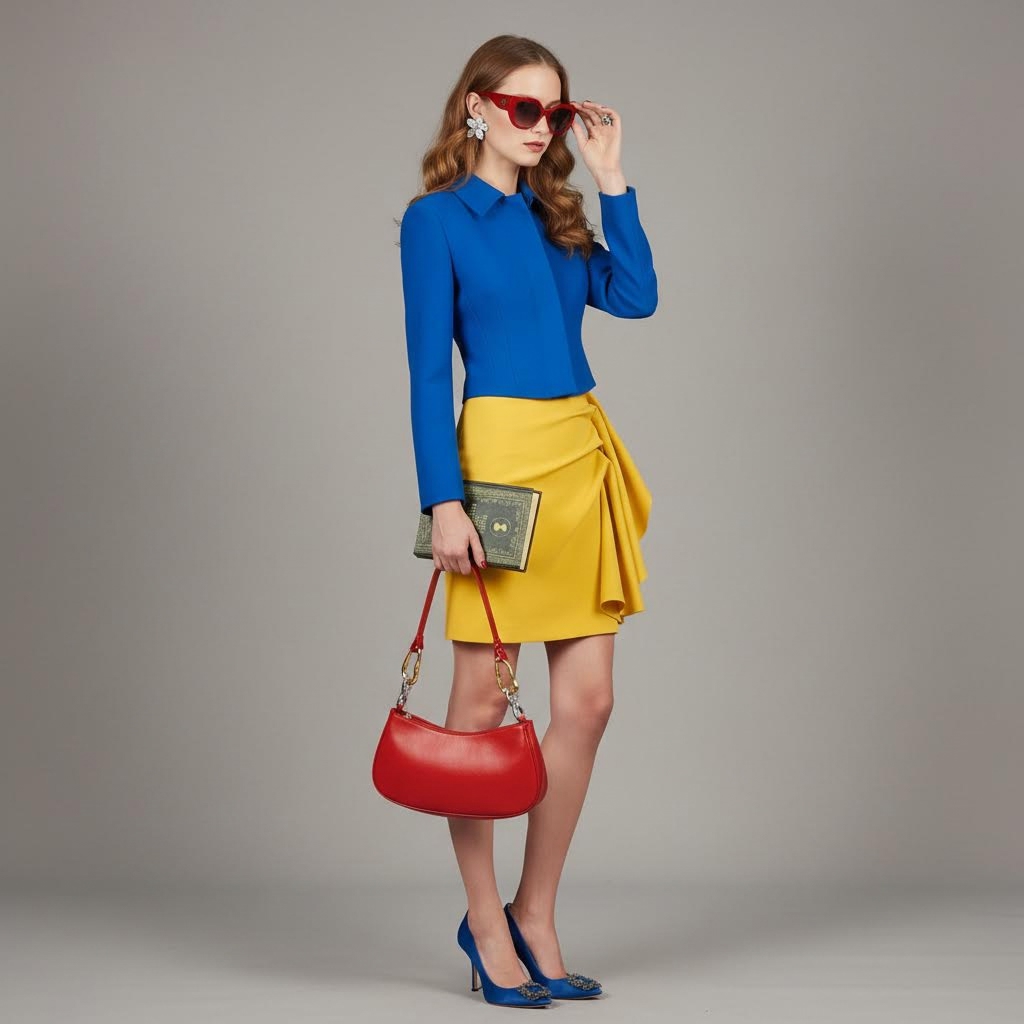
Seeing Clearly in Rothko’s Untitled (Yellow, Red and Blue)
Thursday, March 12, 2026

Understanding Colours and Feelings in Rothko’s Red, Black, White on Yellow
Wednesday, March 11, 2026


Where Colour Becomes Stage: Illusion and Emotional Depth in Rothko
Tuesday, March 10, 2026

Where Light Meets Memory
Monday, March 9, 2026
At the top, a vibrant yellow radiates warmth and immediacy, the smallest of the three blocks yet commanding attention. It evokes the spark of youth, the fleeting thrill of morning light spilling over familiar spaces, and the optimism that lives in memory long after the moment has passed. This band of color carries a psychological brightness, a pulse of energy that suggests curiosity, possibility, and the unguarded openness of early experience.
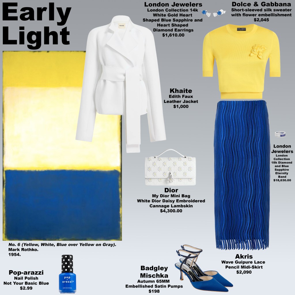
Beneath it, the largest block is a soft white, with the yellow above seeping through its surface. Here, light meets memory in a more contemplative space. The subtle glow of yellow within the white evokes recollection—the filtered warmth of past moments, familiar and tender. It is neither stark nor empty; it is a space where nostalgia and reflection mingle, where memory is both illuminated and elusive, and where the mind gently revisits the past without losing touch with the present.
A narrow strip of yellow separates this luminous expanse from the final block of deep, layered blues. These shades—ranging from navy to cobalt—introduce emotional depth and introspection, grounding the composition. They suggest the weight of lived experience, the richness of reflection, and the contrast between fleeting brightness and enduring gravity. This interplay of light above and shadow below mirrors the emotional architecture of memory itself: vibrant, ephemeral moments supported by deeper, enduring emotional undercurrents.
The look, Early Light, translates these emotional and psychological dynamics into fashion. Vibrant yellow evokes immediacy and youth, soft luminous whites create a reflective calm, and deep blues add grounding depth. Together, they form a visual narrative of the mind’s journey through memory, where moments of light and joy meet the quiet weight of reflection. It is a study in balance, in the tension between presence and remembrance, between ephemeral spark and enduring emotional resonance.
The Psychology of Calm Power
Sunday, March 8, 2026
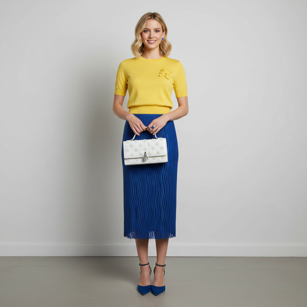
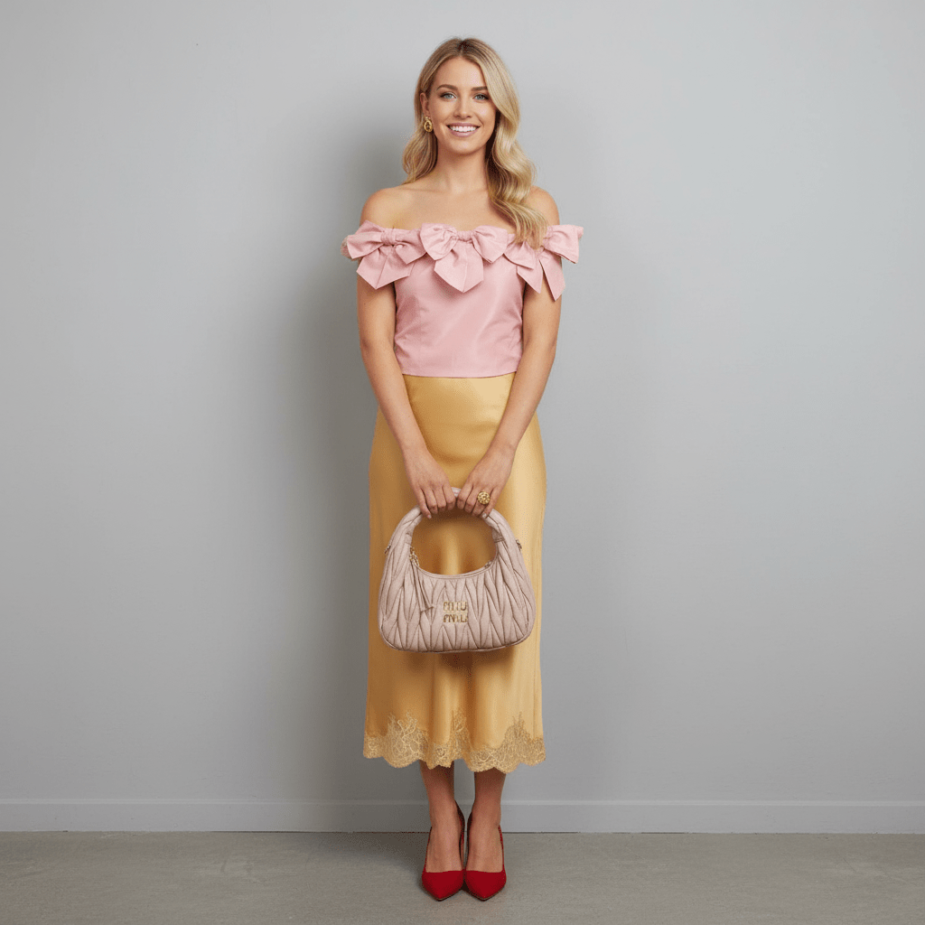
The look Balanced Mind draws its emotional architecture from Untitled, a work that communicates presence not through spectacle but through quiet equilibrium. From a distance the composition appears almost meditative—soft layers of sand, cream, and pale beige settling into one another like light across a calm landscape. The surrounding border introduces gentle warmth through muted clay, coral rose, and softened brick tones, creating a perimeter that feels protective rather than confrontational. Instead of demanding attention, the colours hold it softly, establishing a psychological frame where the interior fields can breathe.
Within this frame, the upper portion opens into expansive tones reminiscent of sunlit linen, warm wheat, and pale caramel. These colours evoke steadiness and mental clarity, the visual equivalent of a deep breath. At the centre lies a narrower band of warm blush and softened terracotta-beige, positioned precisely between the larger fields. This middle layer acts almost like a moment of introspection—a psychological hinge between thought and emotion. Below it, the lower field returns to the language of gentle sand and honeyed beige, grounding the composition in warmth and stability.
The emotional effect is subtle but powerful. In colour psychology, soft neutrals often create a sense of cognitive calm because they avoid visual conflict while still holding warmth. Rather than stimulating urgency or excitement, these tones encourage focus, composure, and internal balance. The composition reflects the idea that power does not always announce itself loudly; sometimes it exists in the ability to remain steady when everything else demands reaction.
Balanced Mind captures this principle visually. The restrained palette, the measured proportions of the colour fields, and the quiet warmth of the border all work together to create a state of equilibrium. It suggests a form of authority that is grounded rather than performative—an emotional landscape where clarity, composure, and quiet confidence coexist. In this sense, the look embodies the essence of calm power: the ability to hold one’s center without needing to overpower the room.
The Colour of Self-Possession
Saturday, March 7, 2026
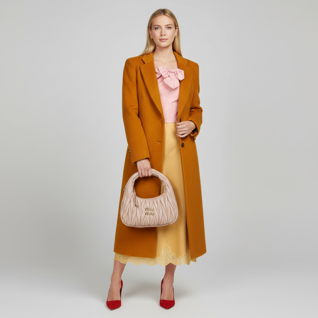
In Mark Rothko’s Untitled (Yellow, Pink, Yellow on Light Pink) from 1955, colour does not shout—it steadies itself. The composition begins at the border with a warm, golden frame that gently dissolves into the surrounding field, setting the stage for the upper portion, which glows with luminous shades reminiscent of late-afternoon sunlight—saffron, marigold, and warm honey. Just below, a horizontal band of softened rose and terracotta, edged with subtle traces of warm sand and muted clay, introduces a gentle pause before the lower section deepens into richer golden ochres and amber hues. The transition feels almost atmospheric, as though the painting breathes from warmth into warmth, holding a quiet pulse of energy at its centre.
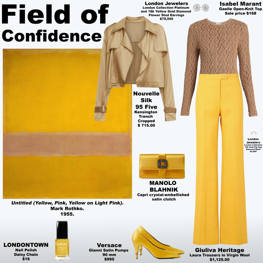
This visual architecture becomes the emotional blueprint for the look Field of Confidence. The palette sits squarely in the psychological territory of the solar plexus—the centre associated with autonomy, assurance, and self-definition. Yellow in these variations does not behave as mere brightness; it becomes a statement of presence. The rose-toned band interrupts the fields of gold just enough to create tension and release, suggesting a moment of reflection within power itself. Rather than explosive or aggressive, the energy here is contained and self-aware, like confidence that has been earned rather than announced.
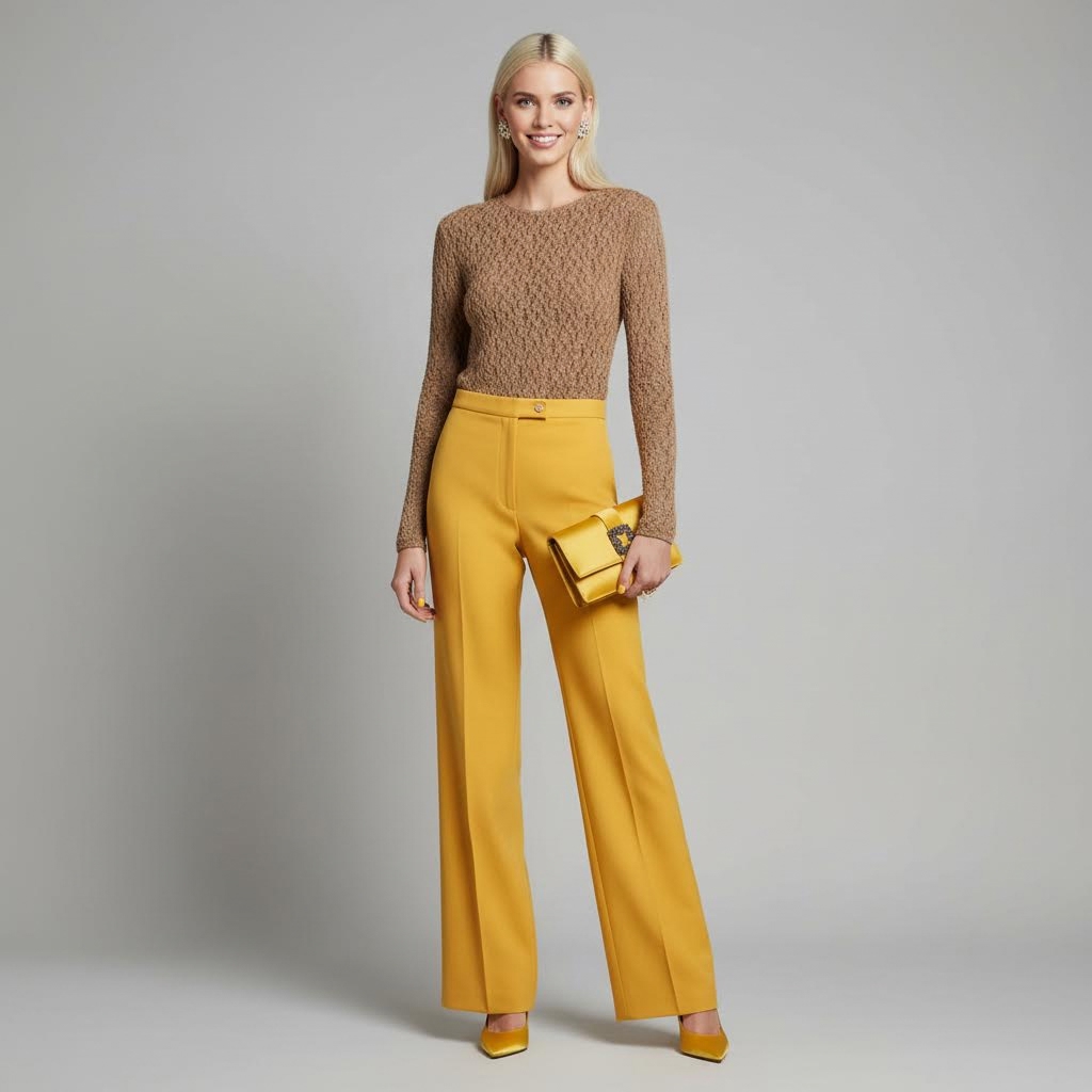
What emerges from Rothko’s layered colour fields is the sensation of standing inside one’s own light. The surrounding warmth feels protective rather than decorative, wrapping the composition in a glow that suggests inner stability. In fashion terms, Field of Confidence translates this sensation into a visual posture—an atmosphere of assurance that does not rely on spectacle. It is the colour of someone who understands their own centre of gravity. In this sense, the look is not simply about yellow; it is about the emotional territory yellow can occupy when it becomes the language of composure, clarity, and quiet authority.

Listening to Colour
Friday, March 6, 2026
Mark Rothko’s No. 10 (1950) reads less like a static image and more like a composition of tones waiting to be heard. The painting opens with a border of saturated ultramarine—clear, luminous, and steady. Rather than creating heaviness, this blue establishes a calm, expansive atmosphere, like a continuous note that holds the composition together. At the very top sits a narrow breath of pale ivory. Because it is so delicate, it registers almost like a pause or intake of breath, suggesting that the work invites attentiveness before anything else unfolds.
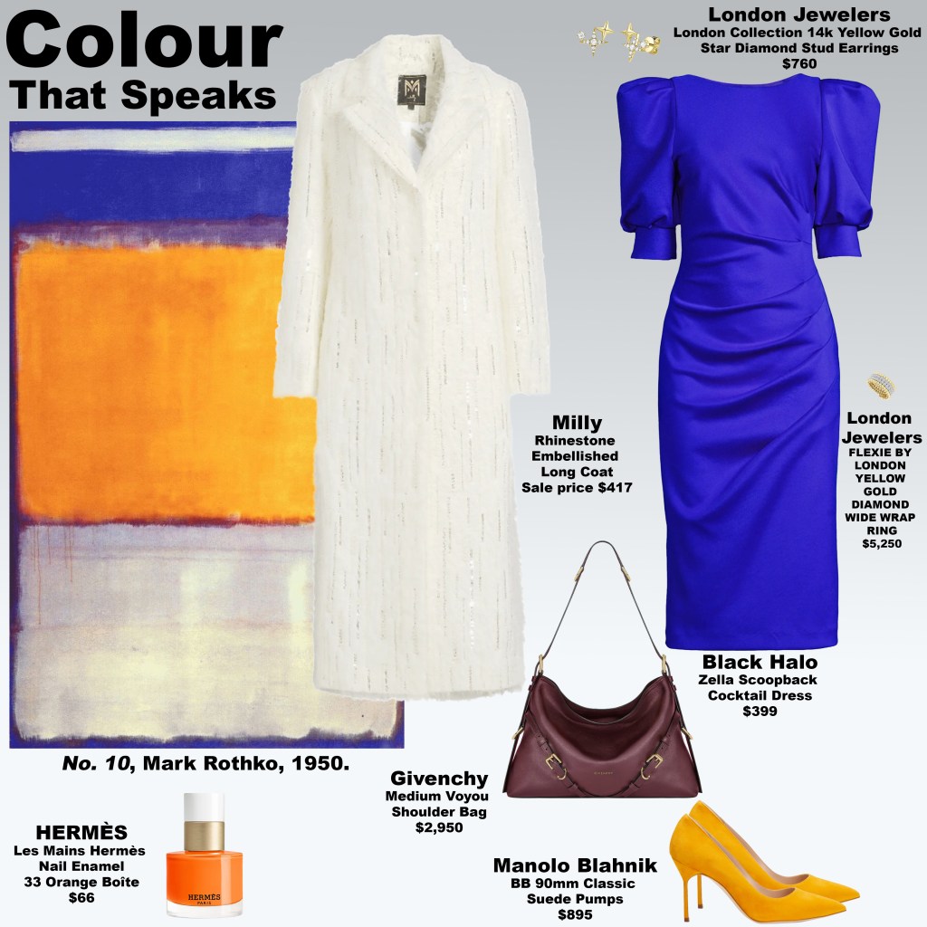
Beneath this slim band, the blue field reappears before the eye reaches the painting’s central voice: a large block of glowing yellow and warm orange. These colours carry warmth and alertness, like a sudden surge of expression within the quiet blue environment. They are softly contained by a border of muted plum and violet tones, which prevent the brightness from spilling outward. Psychologically, this section feels like colour finding its language—energy emerging within a calm field rather than breaking it.
Below this radiant passage, the composition settles into a broad area of pale cream and softened ivory-grey. Compared with the intensity above, this section feels receptive and reflective. It absorbs the warmth of the central block and distributes it quietly across the lower half of the canvas. The proportions create balance: the bright middle speaks, while the lighter base listens.
Through this structure Rothko suggests that colour operates almost like sound. The blue establishes atmosphere, the yellow and orange declare presence, and the pale tones beneath receive and soften the message. In this sense, colour becomes communicative rather than decorative. The look Colour That Speaks draws from this dynamic, translating Rothko’s chromatic dialogue into fashion, while the story reminds us that colour is not only seen—it is felt, interpreted, and quietly understood.
The Neuroaesthetics of Color: How Shades Shape Our Minds
Thursday, March 5, 2026
Color is far more than a visual experience—it is a neurological one. Research in neuroaesthetics shows that different hues activate distinct areas of the brain, influencing mood, cognition, and even behavior. Warm tones like reds, oranges, and yellows can heighten alertness and arousal, while cooler blues and greens promote calm and focus. In fashion, interior design, and visual media, these responses are harnessed consciously or unconsciously to shape perception and emotional experience.
Excessive color stimulation can overwhelm the brain, producing fatigue or tension. In these moments, a naturalized neutral palette—earth browns, off-whites, soft beiges, and muted greys—offers a neurological reset, helping the mind recover and maintain emotional balance. Conversely, when environments or wardrobes lack stimulation, bold, saturated colors can spark mental activity, enhancing creativity, engagement, and attentiveness. Color thus functions as both aesthetic expression and a regulator of neural states.
In fashion, this explains the dual trends we see today: serene, grounding ensembles in naturalized neutrals versus daring statements in vivid colors. A wardrobe built around earth browns and soft, muted neutrals can create calm and cohesion, while pops of bold color invigorate perception and command attention. Designers strategically deploy this understanding, curating collections that resonate not just visually, but psychologically.
By appreciating how color affects the brain, consumers and creators alike can make mindful choices—whether to soothe, energize, or inspire. In this way, the palette is never arbitrary: it is a tool for shaping mood, guiding cognition, and orchestrating emotional experience. Color becomes not merely decorative, but a functional interface between the world we see and the minds that perceive it.
The Signal Beneath the Image
Thursday, March 5, 2026
On social media, images rarely exist as neutral objects—especially within fashion. A single photograph in an Instagram story can act as a signal. Sometimes the signal is intentional, sometimes it is not, but once the image is posted it becomes a small broadcast. Different viewers interpret it in different ways, bringing their own assumptions, rivalries, or curiosities to what they see.
At times the signal is deliberately ambiguous, inviting observation of who reacts and how they interpret it. Other times the intention behind the image is straightforward, yet viewers attach entirely different meanings to it. In fashion culture, where symbols, references, and aesthetics already function as a kind of language, these fragments of imagery become a study in perception. The image itself may be simple, but the reactions it provokes reveal how differently people assign meaning to the same visual cue.
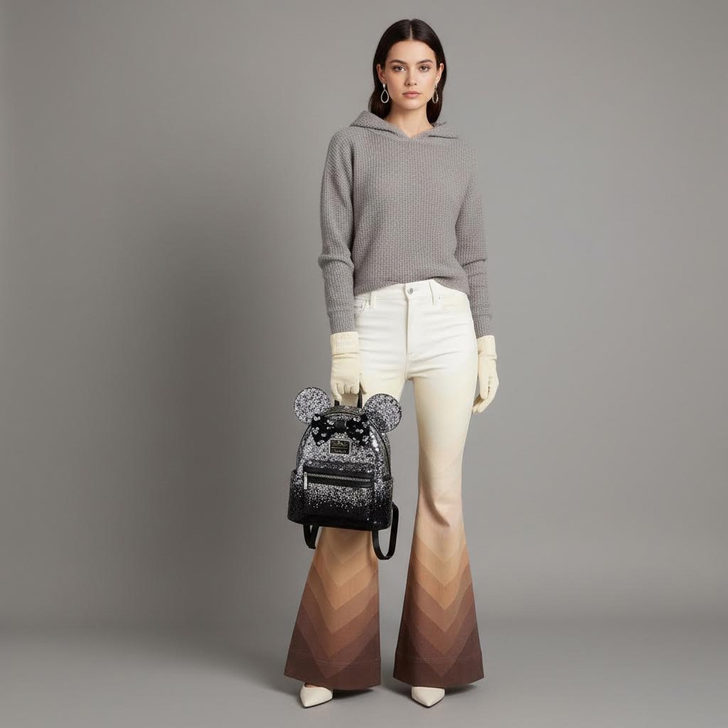
The Emotional Shelter of Brown
Thursday, March 5, 2026
In Brown as Shelter, colour becomes less about decoration and more about psychology. Inspired by Untitled (Brown and Gray), the look builds its emotional architecture through a quiet divide of tone. The upper field carries a muted, almost weathered warmth: a softened beige touched with sand, layered with a pale stone grey and a washed taupe that feels gently worn by time. These hues hover with restraint, neither bright nor dark, suggesting a space of hesitation—an atmosphere where feeling is present but deliberately softened. Like the top register of Rothko’s canvas, the palette feels suspended, calm yet unsettled, as if something unspoken lingers just beneath the surface.
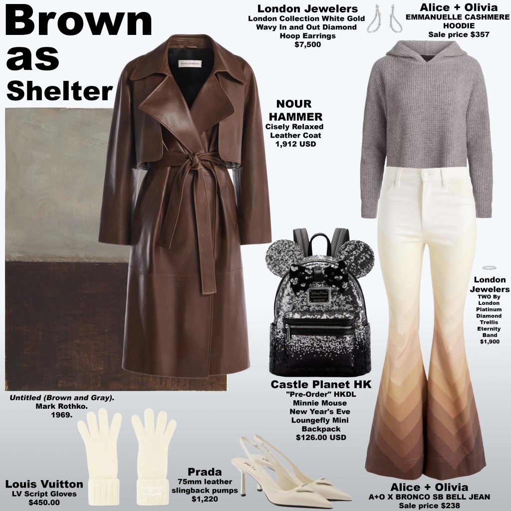
Below, the colours deepen into a far heavier terrain. Dense chocolate, burnt earth, and dark walnut tones collect into a grounded block that absorbs light rather than reflecting it. The mood shifts from openness to retreat. In this lower register, brown operates almost like a protective wall—something built to hold weight, to keep emotion contained and out of sight. The result is a composition where the wearer seems partially hidden within the palette itself. Rather than projecting outward, the look folds inward, using earth tones as a kind of emotional architecture. Here, brown becomes more than a colour—it becomes shelter, a quiet place where feeling can be held without needing to be fully revealed.

Grace in Contrapposto: Oprah Winfrey in Peach at Stella McCartney
Wednesday, March 4, 2026

At the Stella McCartney Fall/Winter 2026–2027 show in Paris, Oprah Winfrey appeared in a look that balanced softness with quiet authority. Dressed in layered shades of peach paired with a crisp white shirt, the palette carried a sense of warmth and clarity that stood out amid the spectacle of Paris Fashion Week. The tones felt deliberate—sunlit, gentle, and refined—allowing the simplicity of the ensemble to communicate confidence without excess. In a week often defined by dramatic silhouettes and bold experimentation, Oprah’s presence reminded the audience that restraint can be just as compelling as theatricality.

Equally striking was the ease of her posture. Standing in a subtle contrapposto stance, her weight shifted naturally through the body, giving the look movement and sculptural balance. The gesture added elegance to the soft peach layers and structured white shirt, turning a relatively minimal ensemble into something quietly powerful. It was a moment that underscored how personal presence completes fashion: the garments may set the tone, but it is the grace and assurance of the wearer that ultimately brings the look to life.

The Layers We Carry
Wednesday, March 4, 2026
At first glance, the composition reads as luminous and open. A glowing field of saffron and marigold frames the work, enclosing it in warmth. A bright yellow plane occupies the upper register — confident, declarative, outward-facing. It feels social. It feels legible. It is the part of us that enters a room first.

But Rothko never allows brightness to exist unchallenged.
Beneath the optimistic surface, a sequence of narrow chromatic interruptions appears — a pale hesitation, an earthy grounding note, then a sudden strike of red-orange. These bands are thin yet disruptive. They function like emotional confusion: moments of doubt, flashes of assertion, the subtle irritations that complicate first impressions. Because they are compressed, they feel contained rather than resolved — tensions folded into the composition rather than released.

The painting deepens abruptly. A strip of plum-toned shadow introduces introspection before yielding to a near-blackened field that occupies roughly one third of the canvas. This lower register shifts the emotional center of gravity. It absorbs the earlier luminosity and replaces it with density. Here, Rothko suggests that what anchors us is not the brightness we project, but the weight we carry privately — memory, restraint, history. The surface may be radiant, but the foundation is interior.
Just above the border, saturated green and ochre re-emerge, not as naïve optimism but as integration. Green here reads as recalibration; ochre suggests endurance. Together they signal maturity — a synthesis rather than a return to innocence. The golden perimeter that once felt like projection now feels protective, enclosing all layers equally.
Surface and Subtext, the look inspired by this work, translates this psychological architecture into form. Brightness is positioned deliberately at the top — visible, structured, self-aware — while deeper tones ground the silhouette. Sharp accents interrupt the flow, echoing those thin chromatic fissures. The overall effect is layered rather than blended, intentional rather than fluid. It acknowledges that presentation and interiority coexist, sometimes harmoniously, sometimes in tension.
Rothko’s Untitled 1949 work is ultimately about proportion. The painting reminds us that the largest emotional spaces are not always the most visible ones. In both art and dress, what supports us often sits beneath what is seen. The surface introduces us; the subtext defines us.
The Show of Status: When Luxury Becomes Performance
Tuesday, March 3, 2026
In today’s social media-saturated world, luxury fashion has taken on a new role: not just a marker of taste or personal style, but a stage for proving oneself. For some, buying expensive items isn’t about aesthetic pleasure or creative self-expression; it’s about sending a message: “I can afford this, I belong here, I am seen.” Each post, each carefully curated outfit, becomes a declaration of status, a quiet but pointed assertion of social hierarchy. The energy behind it is often competitive, even aggressive, as if the item itself carries the weight of personal worth. What was once occasional peacocking has, in many digital spaces, become regular programming — an expected cycle of acquisition, display, validation, repeat.
This form of fashion obsession is rooted in social comparison. The object is less a garment and more a symbol — a tool to signal equivalence, superiority, or belonging. The dopamine rush comes not just from acquiring the piece, but from the visible acknowledgment of others: likes, comments, and shares become validation that the wearer is “as good as” or “better than” their peers. Over time, this feedback loop normalizes competitive display. The aggressive undertone becomes subtle but persistent, woven into everyday scrolling culture. Any perceived challenge — someone else sporting similar items, critical eyes, or indifference — can trigger tension, a need to defend the projected identity. Clothing, in this context, transforms into an instrument of competitive self-assertion.
Culturally, this behavior is amplified by the performative structure of online capitalism. Luxury items become ritualized badges of inclusion in exclusive loops of visibility and consumption. The energy feels strategic because it is strategic: each post broadcasts, consciously or unconsciously, that the wearer possesses power, taste, and access. Unlike reflective engagement with fashion, which prioritizes personal satisfaction, creativity, or ethical alignment, this performative approach prioritizes perception. Proving replaces experiencing. Display replaces discovery.
Ultimately, this dynamic reveals a central tension in contemporary fashion culture. The same garments that can inspire creativity, joy, and identity exploration can also become instruments of hierarchy and subtle aggression. When status performance becomes normalized — when it becomes regular programming — the line between expression and competition blurs. Understanding the psychology behind performative luxury allows us to look beyond the gloss of designer labels and examine the deeper motivations at play, asking not just what is being worn, but what is being communicated — and at what emotional cost.
Composition as Confession
Tuesday, March 3, 2026
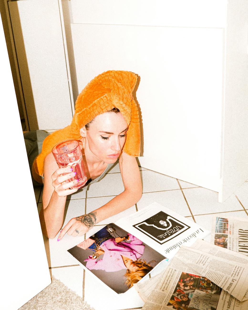
Inspired by Untitled (1952) by Mark Rothko, this look translates a study in emotional depth, proportion, and color into wearable form, echoing the act of confession and the vulnerability of disclosure. The painting is framed in a border of glowing amber, honeyed gold, and muted tangerine tones, a subtle invitation to witness and hold the intensity within. The top block dominates the canvas, layered with dusky violets, smoky plums, and soft lavender that fade into a cool grey-blue. This expansive violet field evokes introspection, emotional honesty, and the courage to confront one’s inner life — a visual confession that occupies space without apology, inviting the viewer into a quiet, contemplative dialogue.
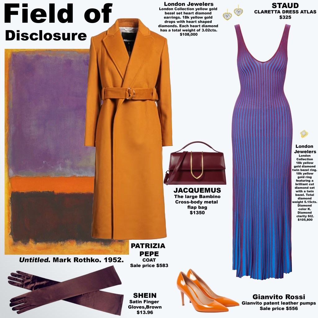

A narrow central band of vivid orange slices across the composition, acting as a moment of revelation — a pulse of awareness and vitality that interrupts the meditative calm. Beneath it, the bottom block combines deep espresso brown with a reddish-brown tone, anchoring the composition with stability while subtly revealing the layered complexity of emotion beneath the surface. The proportions — vast violet, piercing orange, and layered brown foundation — mirror the psychological structure of confession itself: the openness of the heart, the clarity of revelation, and the grounded acknowledgment of truth.
Translated into fashion, Field of Disclosure channels these ideas into color, proportion, and form. Voluminous violet tones suggest emotional vulnerability and introspection, while flashes of amber-orange punctuate the silhouette like moments of revelation. The dual-browns provide grounding, giving the wearer a quiet confidence in the midst of expressive intensity. In every seam and drape, the look embodies the interplay of confession and disclosure: the courage to reveal, the tension between private and visible, and the beauty of holding one’s truth in full view.

A Study in Romantic Warmth
Monday, March 2, 2026
This look, inspired by Red and Pink on Pink by Mark Rothko, immerses the viewer in a landscape of romantic warmth and subtle emotional nuance. The dominant upper block, over three times the size of the lower, features a spectrum of rich reds and deep coral-leaning pinks, each shifting in intensity to create a feeling of passionate vibrancy. These hues evoke a sense of intimacy and tenderness, a visual heartbeat that is both immediate and enveloping, commanding attention without force. The expansiveness of this top field amplifies its psychological presence, drawing the eye and inviting emotional engagement with its romantic, alive energy.

Beneath, the smaller lower block balances this intensity with softer, muted rosewood and terracotta tones, providing grounding warmth and reflective calm. These gentler shades counterbalance the fiery upper section, creating a sense of harmony and proportion that mirrors emotional dynamics — the interplay of ardor and quiet affection. The overall mood is one of romantic equilibrium: a tender, inviting intensity softened by calm, earth-tinged accents. In translating this palette to fashion, the look channels passion with subtlety, offering garments that feel both intimately expressive and emotionally resonant.

In Full View: Personal Meaning Through Colour
Sunday, March 1, 2026
With the looks now in full view, a cohesive narrative of colour, perception, and emotional clarity begins to emerge — each piece functioning not only as a garment but as an invitation to notice more deeply. From the soft, truth-seeking blues that explored what it means to see clearly, to the enveloping reds that translated warmth into lived sensation, the collection forms a quiet dialogue between hue and feeling, presence and perception. Rather than prescribing a single interpretation, the looks encourage personal reflection: which three remain with you the longest? Which colours resonate most, and what is it about those tones — their warmth, their restraint, their luminosity — that speaks to your own emotional landscape?


Where Colour Becomes Atmosphere
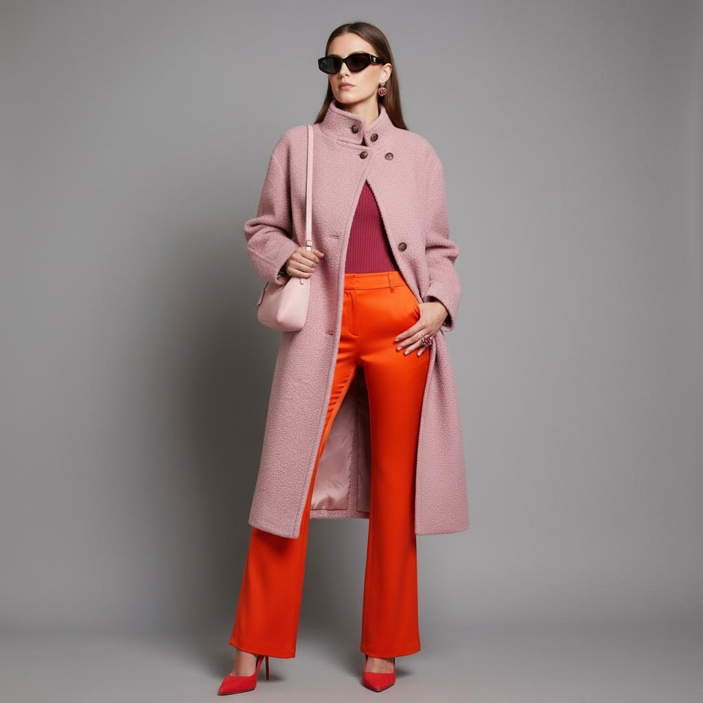
Sunday, March 1, 2026
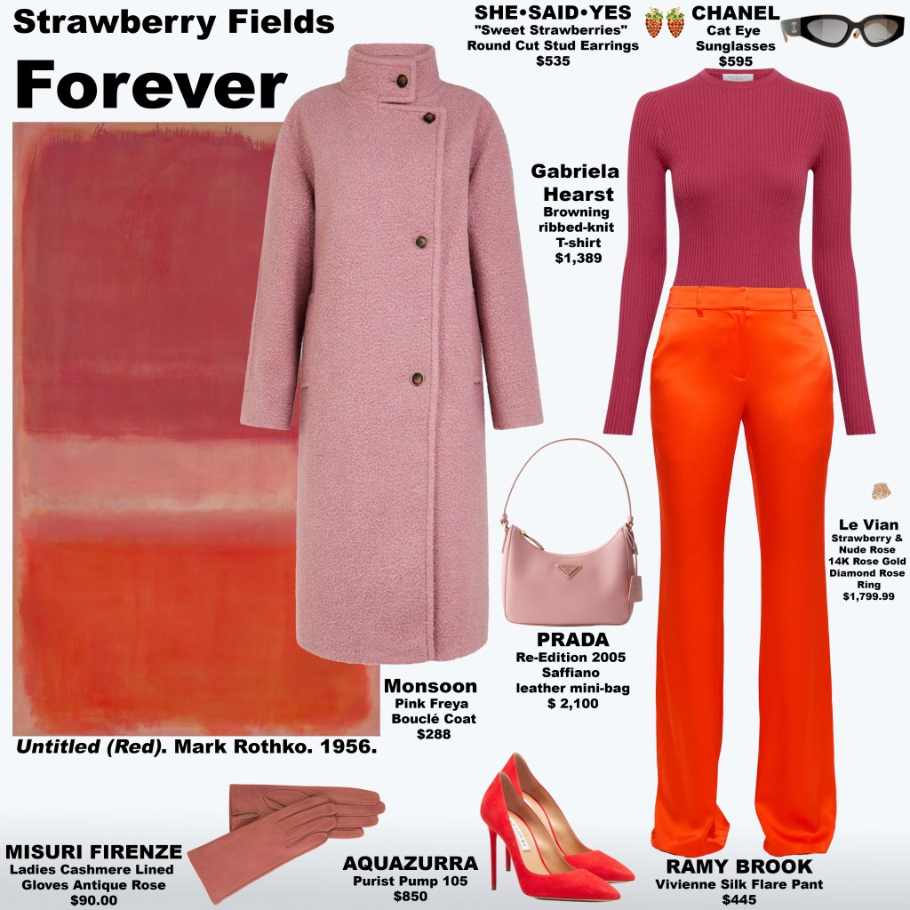
Strawberry Fields Forever invites you into a saturated reverie where colour becomes atmosphere and emotion lingers just beneath the surface. Inspired by Untitled (Red) (1956) by Mark Rothko, the look translates fields of crimson, blush, and softened berry tones into wearable sensation — a study in warmth that feels both enveloping and alive. Rather than declaring itself, the palette hums: sun-ripened reds, tender pink undertones, and a diffused glow that settles like late afternoon light across the skin. As you take in the painting and the look side by side, can you trace where the hues echo one another — where a seam mirrors a horizon of colour, where fabric holds the same quiet intensity as pigment? The dialogue between art and garment becomes a gentle act of noticing, asking the viewer not just to see red, but to feel the emotional temperature it carries.

Truth, Perception, and the Language of Soft Blue
Saturday, February 28, 2026
The composition that inspires Seeing Clearly unfolds as a vast, meditative expanse bordered by a softened, mist-like off-white that feels like a breath at the edge of perception. This pale perimeter carries the quiet warmth of diffused daylight through linen — a threshold tone that invites entry without imposing limits. Within it, an immense upper field drifts through a sequence of airy blues: beginning with a grounded sky tone, it softens into a powdered atmosphere, lifts into a near-weightless wash reminiscent of coastal haze, and reaches a translucent lightness akin to glacial meltwater before gently returning toward a subdued steel-blue that restores visual gravity. Rather than progressing in a straight ascent, the gradient breathes — expanding, thinning, and settling — mirroring how perception itself widens and refines over time.
Beneath this expansive field rests a narrow band of muted slate-blue, dense with grey undertones, like a distant horizon where sea and sky negotiate their boundary. Though it occupies only a fraction of the composition, its psychological presence is essential. It offers orientation. In perceptual terms, the eye requires a point of reference to comprehend openness; without it, vastness becomes disorienting. This lower register provides that anchor, allowing the viewer to experience breadth without losing clarity. The result is not tension but equilibrium — a visual demonstration that expansiveness and structure are not opposites, but partners in comprehension.
The emotional atmosphere created by this palette is one of calm lucidity. Soft blues are associated with mental clarity and physiological ease, encouraging a state of relaxed alertness in which the mind can observe without strain. Here, the gentle tonal shifts resemble the natural rhythm of breath — expansion, pause, return — fostering a sense of openness and composure. Rather than dramatizing feeling, the colours refine it, suggesting the way perspective sharpens when the nervous system is at ease. The eye moves effortlessly through the field, experiencing colour as continuity rather than contrast, and in doing so, encounters a quiet form of truth: clarity does not arrive through force, but through spaciousness.
This restrained spectrum speaks to a contemporary desire for visual and psychological coherence. In a culture saturated with noise, speed, and overstimulation, softness becomes a form of precision. The misted border invites pause, the atmospheric blues permit mental drift without confusion, and the weighted horizon restores orientation. Together they create a perceptual environment in which the self can expand without blurring — a reminder that to see clearly is not to narrow one’s view, but to hold breadth and definition at once.
Seeing Clearly is not about spectacle. It is about recognition — the moment when the world comes into focus, not because it has changed, but because we have.
Venus Signs & the Language of Love: How Astrology Shapes Personal Style
Friday, February 27, 2026
In astrology, Venus is the planet of love, beauty, pleasure, attraction, and aesthetic sensibility. While your Sun sign describes identity and your Moon sign reflects emotional needs, your Venus sign reveals how you give and receive love — and just as importantly, what you find beautiful.

In fashion, Venus operates like an internal stylist. It influences the textures you crave, the silhouettes you feel most “yourself” in, and the visual codes you use to attract connection. Understanding your Venus sign can illuminate why you’re drawn to certain fabrics, colours, and moods — and why what feels luxurious to you may feel excessive or minimal to someone else.
Below, a guide to each Venus placement, its romantic language, and its fashion expression.
♈ Venus in Aries

Love language: excitement, pursuit, spontaneity
Fashion mood: bold, athletic, attention-grabbing
Venus in Aries loves the thrill of the chase. This placement expresses affection through action — initiating plans, making the first move, and keeping passion alive through novelty.
Style expression:
Sharp tailoring, statement reds, moto jackets, cut-outs, and sporty silhouettes. Clothing functions as armour and allure simultaneously.
How they love:
Fiercely and immediately — they show love by choosing you, boldly and without hesitation.
♉ Venus in Taurus
Love language: touch, consistency, sensual comfort
Fashion mood: tactile luxury, timeless femininity
Ruled by Venus itself, Taurus placements revel in sensory pleasure. They love through presence, reliability, and physical closeness.
Style expression:
Silk, cashmere, organic cotton, body-skimming silhouettes, earthy tones, and investment pieces that age beautifully.
How they love:
Slowly and steadfastly — they build love through comfort, loyalty, and physical warmth.
♊ Venus in Gemini
Love language: conversation, wit, curiosity
Fashion mood: playful, eclectic, trend-fluid
Gemini Venus falls in love with the mind. They express affection through words, humour, and shared ideas.
Style expression:
Mix-and-match prints, unexpected pairings, vintage with modern, statement accessories, and adaptable outfits.
How they love:
Through dialogue — they connect by sharing thoughts, laughter, and endless curiosity.
♋ Venus in Cancer
Love language: nurturing, emotional safety, memory
Fashion mood: soft, nostalgic, romantic
Cancer Venus loves through care. They create emotional sanctuaries and attach sentiment to objects, clothing, and shared spaces.
Style expression:
Lace, heirloom details, soft knits, pearl accents, vintage slips, and pieces that feel like home.
How they love:
Protectively and tenderly — they love by making you feel safe and cherished.
♌ Venus in Leo
Love language: admiration, grand gestures, loyalty
Fashion mood: glamorous, radiant, regal
Leo Venus loves to adore and be adored. Romance is theatre — expressive, generous, and warm.
Style expression:
Gold accents, dramatic silhouettes, bold colour, statement jewellery, and anything that commands a room.
How they love:
Lavishly — they love by celebrating you and making you feel extraordinary.
♍ Venus in Virgo

Love language: acts of service, attentiveness, refinement
Fashion mood: tailored, clean, intentional
Virgo Venus expresses love through care in the details. They notice what others overlook and show devotion through practical support.
Style expression:
Crisp lines, neutral palettes, high-quality basics, precise tailoring, and garments chosen for function and longevity.
How they love:
Quietly and thoughtfully — they love by improving your life in tangible ways.
♎ Venus in Libra
Love language: harmony, partnership, shared beauty
Fashion mood: balanced, elegant, symmetrical
Libra Venus seeks equilibrium in love and aesthetics. They are drawn to beauty that feels refined and relational.
Style expression:
Soft draping, coordinated ensembles, pastel tones, classic silhouettes, and polished presentation.
How they love:
Gracefully — they love by creating balance, fairness, and shared beauty.
♏ Venus in Scorpio
Love language: depth, loyalty, emotional intensity
Fashion mood: magnetic, mysterious, sensual
Scorpio Venus loves beyond the surface. They seek transformative bonds and express devotion through depth and exclusivity.
Style expression:
Black lace, sheer layers, body-conscious silhouettes, leather, deep jewel tones, and subtle power dressing.
How they love:
All-or-nothing — they love with intensity, loyalty, and emotional depth.
♐ Venus in Sagittarius
Love language: freedom, adventure, shared experiences
Fashion mood: global, relaxed, expressive
Sagittarius Venus thrives on expansion. Love is a journey, and connection grows through shared exploration.
Style expression:
Travel-inspired textiles, relaxed fits, bold prints, artisanal pieces, and functional yet expressive garments.
How they love:
Openly — they love by inviting you into a life of discovery and possibility.
♑ Venus in Capricorn
Love language: commitment, reliability, long-term investment
Fashion mood: structured, classic, quietly luxurious
Capricorn Venus approaches love with intention. They value stability and demonstrate affection through consistency and long-term planning.
Style expression:
Structured tailoring, heritage fabrics, neutral palettes, investment handbags, and understated luxury.
How they love:
Steadily — they love by building a future and standing by their promises.
♒ Venus in Aquarius
Love language: friendship, individuality, shared ideals
Fashion mood: unconventional, futuristic, experimental
Aquarius Venus values authenticity and intellectual connection. Love thrives when individuality is honoured.
Style expression:
Avant-garde silhouettes, unexpected materials, techwear, asymmetry, and pieces that challenge norms.
How they love:
Uniquely — they love by accepting you exactly as you are.
♓ Venus in Pisces
Love language: empathy, romance, spiritual connection
Fashion mood: ethereal, fluid, dreamlike
Pisces Venus loves in poetry. They dissolve boundaries and seek soulful, transcendent bonds.
Style expression:
Sheer fabrics, flowing silhouettes, iridescent tones, soft pastels, and oceanic textures.
How they love:
Selflessly — they love with compassion, imagination, and emotional depth.
Why Venus Matters in Fashion & Branding
For designers, stylists, and brands, Venus archetypes offer a powerful framework for understanding consumer desire. People don’t just buy clothing — they buy emotional resonance. A Taurus Venus seeks sensory comfort; a Leo Venus seeks visibility; a Scorpio Venus seeks magnetism.
Fashion, like love, is an act of attraction.
When we dress in alignment with our Venus sign, style becomes more than appearance — it becomes a language through which we signal how we wish to be loved.
The Balance of Mass and Mood in Untitled
Friday, February 27, 2026
Mark Rothko’s Untitled from 1967 presents a study in emotional weight and spatial tension, inviting viewers into a space where colour and proportion govern perception. The painting’s background is a deep, grounded red, providing a sense of warmth and containment. Against this field, a vast block of deep, muted magenta rises, roughly four times the size of the smaller brown block at the base. The scale of the muted magenta suggests an enveloping presence, a psychological pause that asks the viewer to linger, reflect, and connect feeling with thought. The smaller, dense brown block acts as a stabilising anchor, a reminder of gravity, grounding the emotional expanse above it.
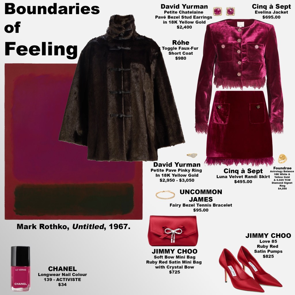
The proportions themselves carry profound psychological significance. The large muted magenta field dominates attention, yet its subdued tone encourages introspection rather than aggression, creating a space where the mind is invited to reconcile intensity with calm. The tiny but deliberate brown block offers contrast, a stabilising force that gives the eyes a place to rest and the mind a measure of equilibrium. Together, these masses create a tension between immersion and balance, between the pull of emotion and the containment of restraint.
Emotionally, the painting resonates with the subtle oscillation between vulnerability and control. The viewer is drawn first into the expansiveness of the muted magenta, feeling the breadth of its presence, before settling into the quiet gravity of the brown. The overall effect is contemplative and meditative, a reminder that feeling is boundaried and yet expansive, both enveloping and stabilised. Rothko’s mastery lies in this orchestration — the ability to convey psychological depth purely through scale, proportion, and the resonance of colour.
Front Row Signals: Mark Zuckerberg and Priscilla Chan at Prada
Thursday, February 26, 2026

At Prada’s latest runway presentation, Mark Zuckerberg and Priscilla Chan occupied front-row seats with a composure that mirrored the brand’s disciplined aesthetic. Zuckerberg’s understated tailoring and Chan’s refined, minimalist silhouette aligned with Prada’s intellectual approach to luxury — one that privileges precision, material integrity, and quiet authority over overt display. Their presence signalled more than celebrity attendance; it reflected the growing convergence of technology, philanthropy, and high fashion as parallel systems of influence. In a space where image functions as cultural currency, the couple’s restraint read as intentional, reinforcing the notion that power in contemporary style often resides not in spectacle, but in studied clarity.

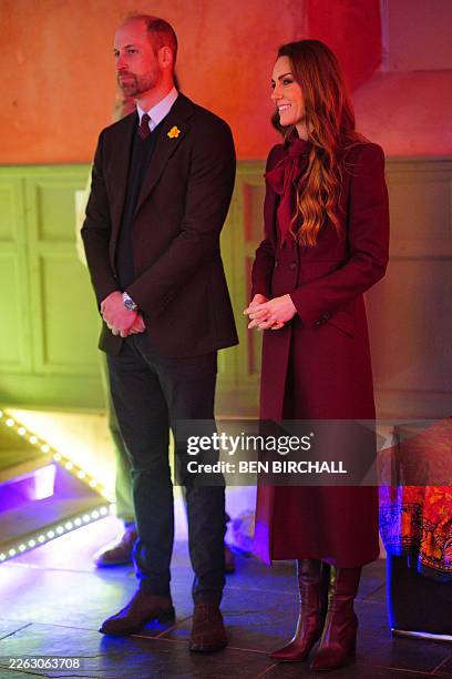
In Full Knowledge: Gem-Toned Composure in Wales
Thursday, February 26, 2026
Prince William and Princess Catherine’s visit to Powys, Wales unfolded with a quiet precision, their engagements spanning education, the arts, and community wellbeing. Princess Catherine’s deep berry coat and magenta scarf — tones reminiscent of ruby and garnet — introduced warmth, while her plum boots anchored the palette in restraint. Prince William’s navy sweater and trousers evoked sapphire, steadied further by a brown garnet jacket that lent depth and gravity. Together, the jewel-toned harmony suggested not display, but deliberation — a visual coherence that set the cadence for the day’s exchanges.
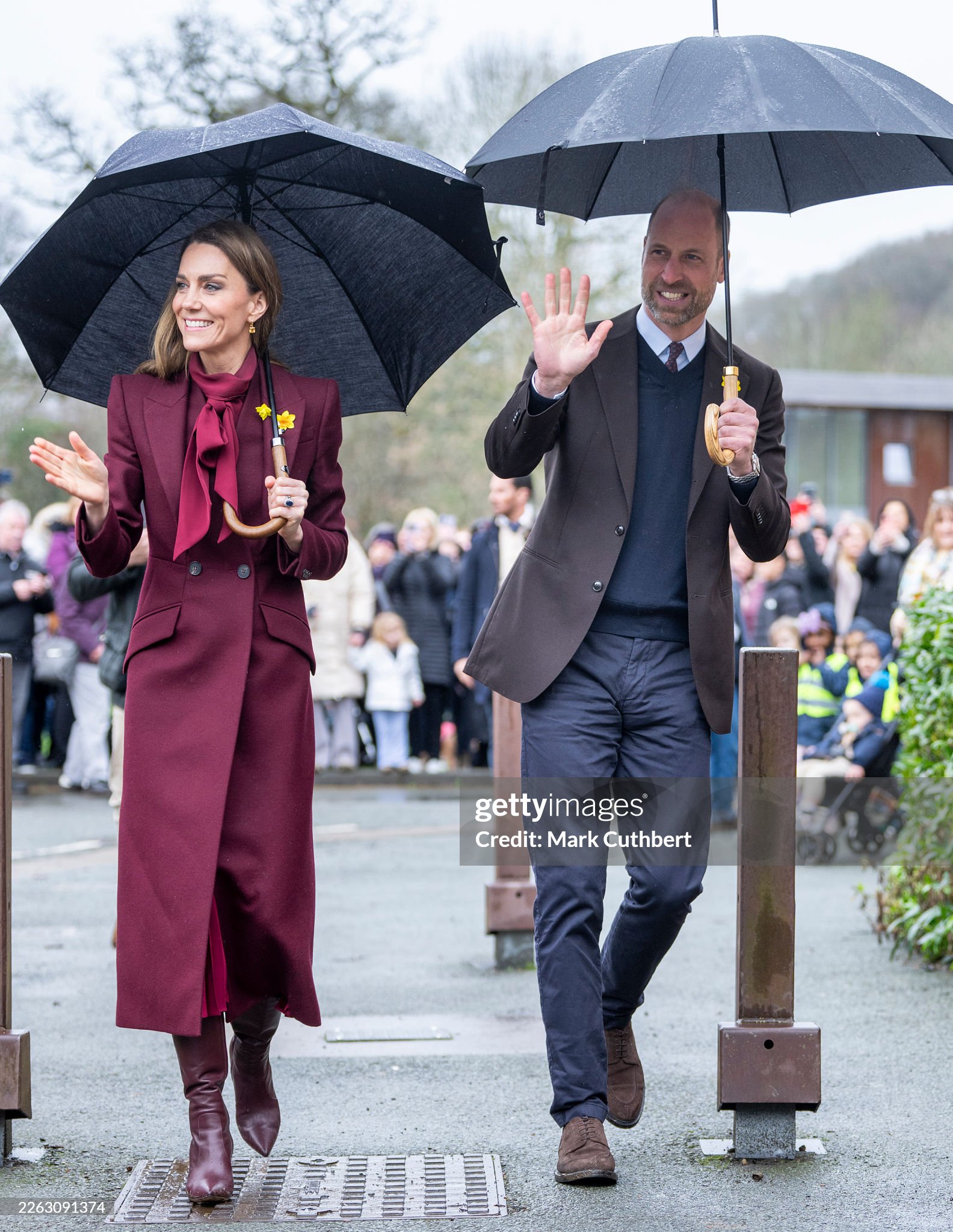
As they moved through classrooms and cultural spaces, their attentiveness carried a measured quality, each pause and reply calibrated to the moment. Princess Catherine’s rich hues projected reassurance, while Prince William’s sapphire and brown garnet tones conveyed steadiness and resolve, forming a palette that felt considered rather than incidental. The effect was subtle yet unmistakable: a presence shaped by careful understanding, expressed through composure, listening, and the disciplined language of dress. In a programme defined by public duty, the couple’s visual and verbal restraint left the impression of a visit conducted with full awareness — every detail received, every gesture returned with intent.
Muted Cerulean and the Psychology of Measured Expression
Thursday, February 26, 2026
In Muted Cerulean, inspired by Untitled (1955) by Mark Rothko, the emotional force of the composition lies not only in colour, but in proportion. A warm terracotta-peach ground encloses the scene, creating a holding environment — a psychological container that suggests safety, embodiment, and the human need for boundaries. Within this frame, a vast field of softened cerulean dominates, its cool, greyed blue extending across twice the space of the golden-apricot block beneath it. This expansive blue does not function as a declaration; it operates as a pause. In psychoanalytic terms, it resembles the moment of suspension in dialogue — the breath between stimulus and response — inviting reflection before articulation. The smaller apricot field below introduces warmth and affect, signalling that feeling remains present, but contained. The eye descends from cognition to emotion, mirroring the psyche’s movement from thought to embodied awareness.
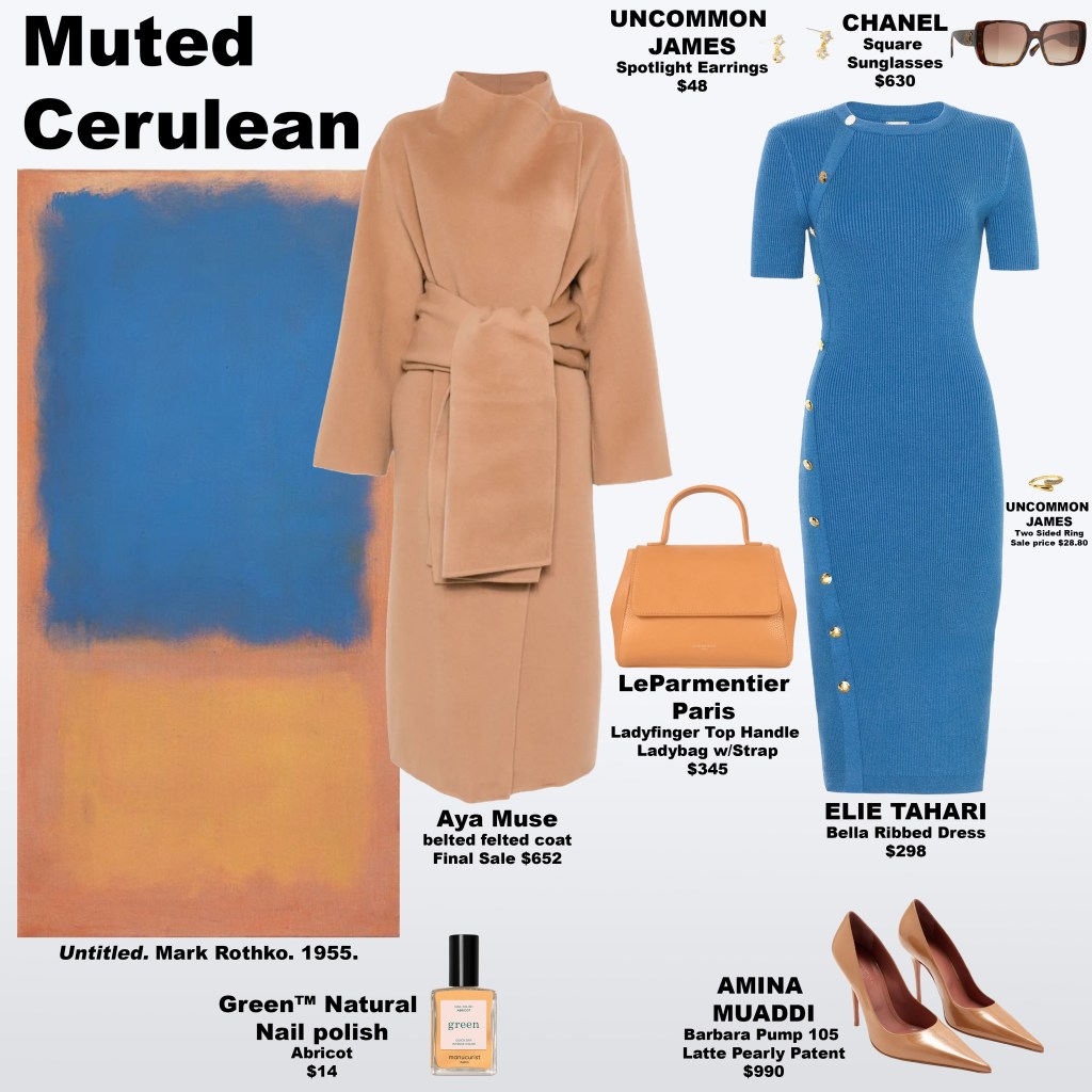
As a look, these proportions translate into a meditation on communication and emotional integration. The muted cerulean dress, uninterrupted and expansive, aligns with the throat chakra not as a symbol of constant speech, but as an invitation to mindful expression — the discipline of pausing to ensure that what is spoken is congruent with what is felt. The nude toned coat and pumps echo the painting’s border, grounding the wearer in somatic awareness and reinforcing a sense of personal boundaries. Meanwhile, the golden-apricot handbag and nail lacquer introduce the sacral chakra’s domain — creativity, sensuality, and emotional truth — in a measured register. Rather than competing with the blue, these warm accents affirm that feeling informs voice. The result is a visual psychoanalysis of presence: communication not as immediacy, but as integration — a reminder that clarity emerges when we allow ourselves the space to pause, to feel, and then to speak.
Emotional Fields in Warm Tones
Wednesday, February 25, 2026
Drawn from No. 5/No. 22, Warm Light translates a landscape of radiant colour into a wearable meditation on feeling and perception. A glowing golden ground establishes an atmosphere of optimism and alertness, immediately enveloping the viewer in warmth. Bands of sunlit yellow sustain that luminosity, encouraging the eye to linger before descending into a commanding red field whose surface appears gently disturbed, revealing the warmth beneath. This interruption reads not as damage, but as disclosure — a moment in which intensity softens into vulnerability. The composition settles into a vivid orange base, grounding the experience in energy that feels both stabilising and expansive.
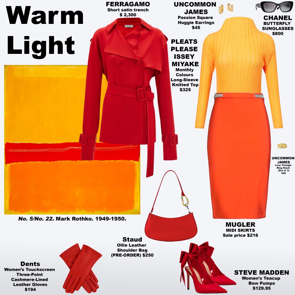
Echoing the chromatic cues seen in Huishan Zhang’s Fall 2026 Ready-to-Wear presentation, the look incorporates red gloves — a detail currently resonating across fashion — to guide the gaze with intention. Red is carried cohesively through the trench, handbag, pumps, and gloves, forming a rhythmic continuity that mirrors the painting’s central field. A yellow top introduces clarity and intellectual brightness, while an orange skirt sustains warmth and momentum, bridging the chromatic narrative. Psychologically, the eye is drawn first to red for its physiological urgency, then to yellow for its cognitive lift, and finally to orange for its emotional warmth and sociability. In this dialogue between art and attire, colour becomes more than visual — it becomes experiential, inviting the viewer to inhabit an emotional field shaped by warmth, revelation, and quiet radiance.
Colour Psychology and the Directed Gaze: Huishan Zhang Fall 2026 Ready-to-Wear
Tuesday, February 24, 2026
In Huishan Zhang’s Fall 2026 Ready-to-Wear presentation, colour functions not as mere ornament but as a visual hierarchy, choreographing the viewer’s gaze. Against a restrained, subdued palette — and even in moments captured in black-and-white photography — the eye is drawn first, almost involuntarily, to the red gloves. From a colour psychology perspective, red carries the longest wavelength in the visible spectrum, making it optically advancing and neurologically stimulating. It conveys urgency, vitality, and presence, prompting the brain to prioritise it as a signal of importance. Within this muted visual environment, the red accents act as focal anchors, establishing an immediate point of orientation.
Once the eye acclimatises, attention shifts to the light blue, which function as a secondary focal point. Unlike red’s physiological arousal, pale blue evokes cognitive calm and trust, offering a visual exhale after the initial intensity. The gaze then settles on the red gowns dispersed among neutral looks — a repetition that reinforces recognition and pattern-seeking behaviour in the brain. Even when certain ensembles are rendered in black-and-white photography, the memory of colour persists, prompting the viewer to mentally restore the chromatic hierarchy. Zhang’s presentation demonstrates how strategic colour placement guides perception: the eye does not wander randomly, but follows a deliberate path shaped by contrast, emotional resonance, and the brain’s innate drive to locate meaning within a visual field.


Sex and the City: How a Show Changed the Way We Dress
Tuesday, February 24, 2026
When Sex and the City first aired in 1998, it wasn’t just a television show — it was a cultural phenomenon that reshaped fashion itself. From Carrie Bradshaw’s eclectic mix of high-end designers and vintage finds to Samantha Jones’ bold, unapologetic glamour, the series made style inseparable from character. Each outfit wasn’t just clothing; it was a statement, a mood, and a narrative device, teaching viewers that fashion could be playful, daring, and deeply personal.

The show popularised trends that felt both aspirational and attainable. Tulle skirts, Manolo Blahnik heels, statement handbags, and brightly coloured ensembles became symbols of individuality and empowerment, and fans around the world began curating wardrobes inspired by the show’s fearless style. Costume designer Patricia Field’s eye for colour, texture, and mix-and-match drama helped make these trends feel like extensions of personality rather than rules to follow.
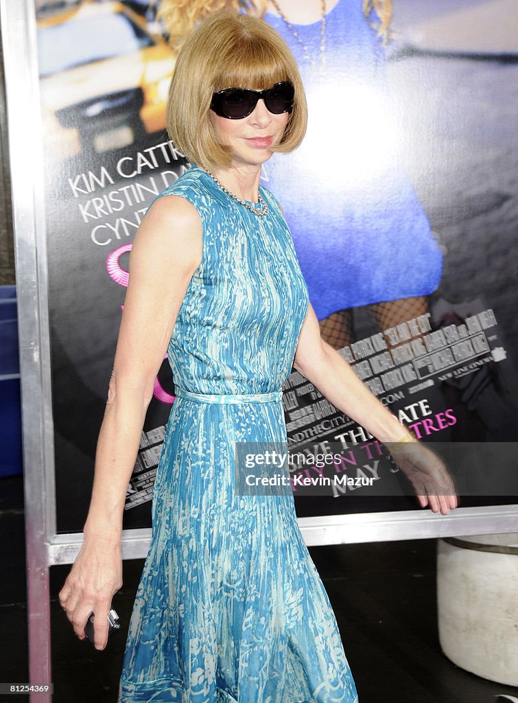
More than two decades later, Sex and the City’s influence remains pervasive. Fashion weeks still echo its bold pairings, street style celebrates Carrie-inspired layering, and designers continue to cite the show as a touchstone for merging glamour with storytelling. Even at the premiere, the cultural weight of the series was reflected in the guest list: Anna Wintour attended in a dashing light-blue dress, a nod to clear communication and the throat chakra, carrying no handbag, with only her phone as her accessory — a quiet statement of modern authority and editorial confidence. The show proved that television could be a runway, and that fashion, at its best, is not just about clothes — it’s about confidence, narrative, and the courage to dress like the world is watching.
Miranda Priestly Educates Andy About Her Cerulean Sweater
😄💙💙💙💙😃
Tuesday, February 24, 2026
Miranda Priestly: This… “stuff”? Oh, okay. I see. You think this has nothing to do with you.
You… go to your closet, and you select… I don’t know, that lumpy blue sweater, for instance, because you’re trying to tell the world that you take yourself too seriously to care about what you put on your back, but what you don’t know is that that sweater is not just blue, it’s not turquoise, it’s not lapis, it’s actually cerulean.
You’re also blithely unaware of the fact that, in 2002, Oscar de la Renta did a collection of cerulean gowns, and then I think it was Yves Saint Laurent, wasn’t it?… who showed cerulean military jackets. I think we need a jacket here.
And then cerulean quickly showed up in the collections of eight different designers. Then it filtered down through the department stores and then trickled on down into some tragic casual corner where you, no doubt, fished it out of some clearance bin.
However, that blue represents millions of dollars of countless jobs, and it’s sort of comical how you think that you’ve made a choice that exempts you from the fashion industry when, in fact, you’re wearing a sweater that was selected for you by the people in this room… from a pile of “stuff.”
Into Focus: When Colour Clarifies Emotion
Tuesday, February 24, 2026
Inspired by Mark Rothko’s Untitled (Red-Brown, Black, Green, Red) (1962), Coming Into Focus translates a language of layered colour into a wearable meditation on perception. The border tones — blue-violet grey and softened slate — create a contemplative frame, drawing the eye inward. From there, the dense earthen browns at the top ground the composition, followed by a near-black interval that quiets visual noise. A submerged green emerges next, cool and steady, before a final field of red surfaces as recognition. Worn together, these hues do not compete; they resolve, guiding the gaze toward clarity.
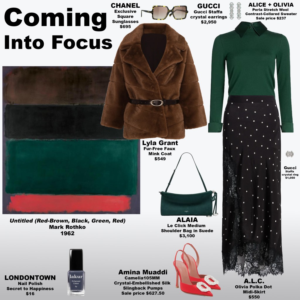
Rothko believed colour could evoke emotion beyond words, and this look asks the wearer — and the observer — to consider when feeling becomes legible. Does the deep brown steady us before we understand? Does the black create the pause necessary for perception? Does the green suggest renewal just before awareness arrives? And when the red appears, is it a signal to pay attention, or the moment something finally comes into view? In translating these chromatic thresholds into dress, the look proposes that elegance can be a form of attention — that colour, carefully composed, does not merely adorn the body but helps us see, and feel, more clearly.
What fashionistas… are excited?
Monday, February 23, 2026
Princess Catherine in White: A Spring Study in Regal Restraint
Monday, February 23, 2026
In June 2022, Princess Catherine and Prince William commemorated Windrush Day, with Princess Catherine choosing an all-white suit that embodied clarity, respect, and modern elegance. The tailored ensemble, attributed to Alexander McQueen, featured structured shoulders, sharp lapels, and fluid straight-leg trousers — a silhouette that balanced authority with grace. Styled with neutral pumps, delicate jewellery, and soft, natural beauty, the look conveyed quiet confidence through restraint rather than ornament.
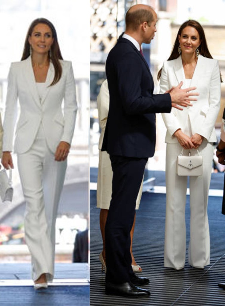
As spring approaches, the ensemble feels especially relevant. Its luminous palette and precise tailoring offer a timeless blueprint for transitional dressing: polished yet effortless, minimal yet impactful. Princess Catherine’s Windrush Day appearance endures as a study in disciplined elegance, demonstrating how a monochrome suit, articulated with intention, can communicate unity, composure, and enduring sophistication.
Blushing Hues: How Colours Stir Emotion
Monday, February 23, 2026
Mark Rothko’s Untitled (1958) presents a delicate interplay of emotion through colour. The top field radiates a vibrant raspberry-pink, luminous and energetic, while the bottom block offers a rich, earthy burnt sienna that grounds the composition. These blocks are separated by a softer blush of warm apricot, creating a subtle pause that allows the eye—and the mind—to process the transition between intensity and calm. The painting’s structure invites contemplation, encouraging viewers to engage with how colour shapes perception, emotion, and internal dialogue.

The look, Tender Flush, translates this chromatic psychology into wearable form. Psychologically, the combination evokes the sensation of a romantic flush: excitement tempered by comfort, vitality balanced with grounding. Emotionally, the palette encourages openness, intimacy, and reflection, inviting the wearer—and the viewer—to participate in the dialogue of colour. Which hue speaks to your own inner warmth?
Ever So Dashing: The Royal Couple’s Coordinated Elegance
Sunday, February 22, 2026
At the 2026 EE BAFTA Film Awards, Prince William and Princess Catherine arrived with a composed sophistication that reaffirmed their status as the evening’s most quietly commanding presence. Prince William looked impeccably refined in a classic Giorgio Armani tuxedo accented with an imperial plum velvet jacket, a rich, jewel-toned hue that complemented the regal atmosphere of the evening. The depth and warmth of the jacket perfectly echoed the matching velvet waistband of Princess Catherine’s gown, tying their looks together with understated elegance.

Princess Catherine dazzled in a custom Gucci chiffon gown in soft lilac and violet tones, with the imperial plum velvet waistband providing a striking anchor that harmonized beautifully with Prince William’s jacket. The flowing chiffon, delicate color palette, and precise tailoring projected poise and grace, while the velvet accent created a subtle yet deliberate visual connection between the royal couple. Together, they looked ever so dashing, their ensembles perfectly balanced and complementary, a refined testament to coordinated elegance and royal style.

The Hidden Labor of Looking Effortless
Sunday, February 22, 2026

What appears as effortless style on Instagram is, in reality, a form of continuous identity curation shaped by the pressures of platform economics. Maintaining aesthetic relevance demands cognitive load, emotional regulation, trend surveillance, and algorithmic responsiveness — a cycle more akin to unpaid brand management than personal expression. Each post requires strategic timing, visual cohesion, audience awareness, and the anticipation of shifting micro-trends, turning self-presentation into labor rather than leisure. The psychological toll is cumulative: decision fatigue from constant styling, performance anxiety tied to engagement metrics, and the erosion of intrinsic creativity under algorithmic expectations. In this landscape, fashion ceases to be a source of joy and becomes a metric-driven obligation, revealing the hidden cost of looking effortlessly relevant in a system that monetizes attention while extracting invisible work.
What Do You See?
Sunday, February 22, 2026
Before assigning meaning, pause and notice your own perception. Do you read the gold as sunlight, memory, or something more tactile — a warmth you can almost feel on your skin? Does the white below open into space, offering breath and clarity, or does it feel like a quiet stage awaiting movement? As the tones meet, consider what emerges for you: stillness or rhythm, restraint or celebration. What you see here is not fixed; it is a dialogue between color and consciousness, shaped as much by your inner landscape as by the surface before you.
Royal Blue, Perfectly Poised
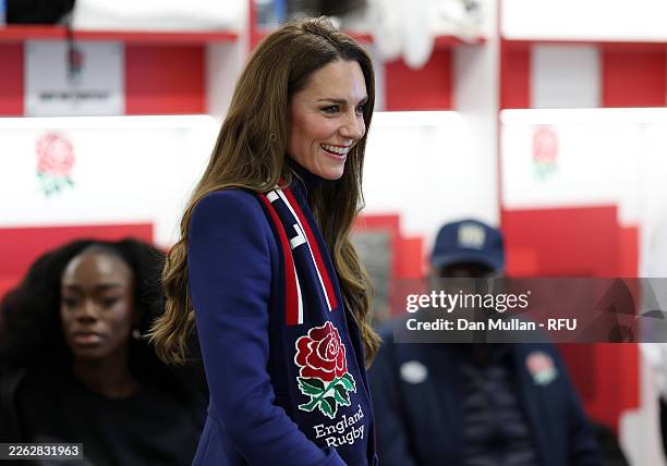
Saturday, February 21, 2026

At the England v Ireland Guinness Six Nations 2026 match in London, Princess Catherine appeared impeccably composed in a striking royal blue coat that balanced precision tailoring with effortless elegance. The saturated hue conveyed confidence and quiet authority, while the clean lines and refined silhouette reinforced her reputation for polished, purposeful dressing. Set against the electric atmosphere of the stadium, the look projected steadiness and grace — a vivid reminder of how thoughtful colour and structure can communicate poise, optimism, and enduring style.
Dear Light, Steady and True
Saturday, February 21, 2026
In No. 7 (Dark Brown, Gray, Orange), Mark Rothko composes a quiet architecture of warmth and steadiness. A deep, earthen border grounds the canvas, holding a luminous upper field of softened golden beige tones that seem to glow from within rather than shine outward. Beneath it, a smaller field of burnished orange rests with concentrated warmth, like an ember protected from wind. The composition feels anchored yet radiant — a meditation on light that does not flicker, but endures.
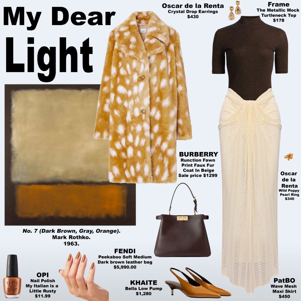
My Dear Light translates this atmosphere into tactile form. A fawn-print faux fur coat gathers the painting’s golden and rust hues into a surface that feels protective and alive, while the skirt’s pale, creamy tone echoes the upper field’s gentle luminosity. The top and handbag, rendered in deep, earthy browns, mirror the grounding border, stabilizing the palette and framing the lighter elements. Pumps and jewelry in burnished orange tones carry the warmth of the lower field, and rust-toned nail polish completes the dialogue, allowing the look to move seamlessly between softness and strength.
Psychologically, both painting and ensemble cultivate a sense of steadiness in illumination — a reminder that light can be constant rather than fleeting. The warm neutrals foster emotional security and belonging, the golden hues encourage openness and trust, and the deeper browns provide a stabilizing counterweight that supports resilience. Together, these elements create an atmosphere of grounded radiance: a state in which the wearer feels held, present, and quietly luminous.
A quiet, enduring brightness emerges — one that does not demand attention but gently sustains it. In uncertain moments, this kind of light becomes a compass: guiding without glare, warming without overwhelm. Through this dialogue between art and dress, illumination becomes not a spectacle, but a steady companion — faithful, reassuring, and always within reach.
Twin Thresholds: Reflection in Maroon and Shadow
Friday, February 20, 2026
In Black on Maroon, Mark Rothko composes a field of contained intensity: a warm, earthy maroon frames a deep near-black expanse that draws the eye inward. Within this space, two vertical forms rise side by side like a quiet “11,” subtle yet unmistakable — a visual symbol of duality, reflection, and internal dialogue. The painting balances depth and warmth, inviting contemplation while radiating a low, ember-like vitality that suggests energy held with intention.

Mirror Eleven brings Rothko’s architecture into wearable form. A black top, jacket, pumps, and jewelry echo the central field, creating a cohesive plane, while a muted maroon-plum skirt reflects the borders and vertical forms. Silver crystal accents in the handbag and nail polish catch and refract light, adding dimension and vibrancy. Anchored yet luminous, the ensemble translates the painting’s layered intensity into tactile symbolism: maroon grounds and warms, black conveys poise and authority, and silver introduces clarity and resonance, fostering mirrored resilience and harmonious presence.
Psychologically, the twin vertical forms evoke dual selves, twin flames, and internal reflection. The “11” serves as a portal for introspection and self-recognition, a metaphor for balancing strength and sensitivity, energy and calm, outward projection and inward depth. The look invites conscious integration of these dualities, transforming fashion into a tool for both self-awareness and expression.
Through color, structure, and symbolism, the painting and the look demonstrate that fashion can hold energy and mirror the self. Intensity is contained without suppression, reflection becomes visible, and the wearer navigates the world with grounded confidence, radiant presence, and harmonized duality.
Flame Within: Intensity Framed
Thursday, February 19, 2026
In Number 18 (1951), Mark Rothko shapes a composition of warmth held in deliberate restraint, creating an atmosphere that feels both energized and serene. A softened coral-clay ground frames a luminous persimmon-orange field that radiates vitality, while a narrow band of pale stone neutrals and dusky mauves offers a moment of tonal pause. The return of saturated orange restores rhythmic momentum before the composition resolves into a near-white mineral base, releasing the eye into lightness and calm — a cycle of intensity, modulation, renewal, and poised clarity.

This chromatic rhythm finds precise expression in the look, where a vivid orange dress embodies the painting’s radiant force, projecting creative energy and forward motion. A short faux fur jacket, interweaving white, deep gray, and subtle coral undertones, mirrors the atmospheric border and softens intensity with tactile restraint. White gloves and pumps introduce crisp definition that reflects the pale mineral base, allowing the ensemble to breathe, while a silver crystal clutch captures and refracts light like Rothko’s layered pigments. Cool lavender nail polish offers a counterpoint, resonating with the muted mauves and sharpening the surrounding warmth with controlled contrast.
Psychologically, both painting and garment evoke energized poise — a state where vitality is fully present yet contained. The orange spectrum stimulates creativity, confidence, and engagement, while the pale base acts as a stabilizing field, diffusing intensity and restoring clarity. Coral and persimmon tones cultivate embodied presence, and the lavender accent introduces intuitive nuance. Energetically, the composition centers on the sacral realm, expressing sensuality and creative life force, while the luminous base regulates the intensity through crown-like spaciousness and root-level grounding. Desire and perception coexist harmoniously, allowing expression without overwhelm.
Together, Rothko and the look propose a paradigm of intensity framed by structure. Rather than suppressing passion, the design demonstrates how warmth, creative charge, and sensual energy can be held within a field of composure, enabling wearer and viewer alike to experience activation with balance. In this synthesis, fashion transcends adornment to become a vessel for perception, shaping emotional tone, supporting regulation, and creating a space where the self can expand with poise and clarity.
Thermal Memory: Dressing the Glow of Rothko
Wednesday, February 18, 2026
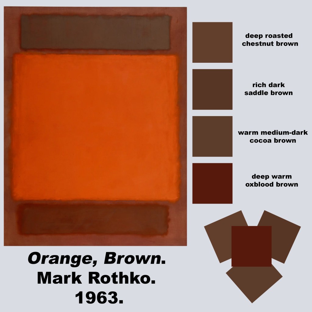
In Orange, Brown (1963), Rothko presents a luminous vertical landscape of warmth and energy, where color behaves as atmosphere rather than mere pigment. The surrounding field forms an earthen envelope of umber and clay — sun-warmed soil, rich terracotta, and aged wood tones — providing a grounding canvas for the fields within. Rather than enclosing the inner forms, it creates a serene environment in which each block can radiate its own energy.
The top field hovers like a soft veil of smoked cocoa and worn saddle leather. Its tones evoke steeped tea leaves, walnut husk, and antique wood, matte and contemplative, with a subtle glowing edge that adds depth without heaviness. Below it, the central expanse radiates a vivid blaze of solar orange and molten vermilion, luminous as sunlit persimmon or glowing amber. Its faint rust-dark perimeter provides gentle definition, highlighting the energy within. The bottom field anchors the composition in burnished mahogany and resinous cedar, layered with warm caramel and honey tones. Its deep auburn edge offers a calming presence, evoking richness and stability rather than weight.
Together, these fields progress from reflective warmth to radiant vitality to grounded balance — a visual rhythm that mirrors natural energy flows rather than thermal cycles.
Any impression of green within the painting is optical and relational, not literal. Rothko’s palette is a closed system of heated earth tones and oxidized reds. The brilliance of the central orange can make surrounding browns appear cooler by contrast, producing a fleeting olive effect in perception. This is a perceptual phenomenon, a product of simultaneous contrast and soft-edged transitions, rather than an actual pigment.
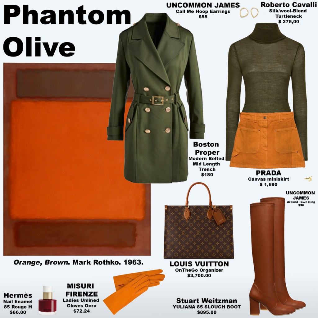
My initial response to the work was shaped by this perceptual nuance. The upper and lower fields seemed faintly olive, and I translated this intuition into the first look, Phantom Olive: a green turtleneck layered beneath a green trench coat. The ensemble honored the eye’s first impression — a study in intuition, perception, and emotional resonance.
Upon closer examination, the olive impression gave way to the painting’s true red-browns and umbers, inspiring the second look, Ember Truth, which replaced green with walnut, saddle, and burnished mahogany tones. In both looks, I added orange gloves — a nod to current trends — to serve as a focal point and draw the eye, connecting the styling directly to the radiant energy of Rothko’s central field. The faint oxidized red perimeters of each block inspired nail polish accents, echoing the subtle energy lines that hover around each field.

Psychologically, the painting resonates on a somatic and emotional level. The top field invites calm reflection, the central glow radiates vitality and creative energy, and the lower field provides stability and balance. The emotional arc flows gently from introspection to energy to calm focus, engaging the viewer without tension.
What began as a perceptual misreading became the conceptual core of the styling. In translating Rothko’s fields into dress, the body becomes a site for engaging with color, perception, and energy. Phantom Olive reflects the emotional resonance of first impressions, while Ember Truth embodies clarity, chromatic alignment, and a celebration of radiant warmth. Both looks honor the glow and vitality of Rothko’s composition, transforming abstract color into wearable energy.
Visible Reverie: Fashion for the Romantic Soul
Tuesday, February 17, 2026
Some garments carry the weight of feeling without a single word spoken. For the romantic heroine, fashion becomes a language of presence — a way to be seen feeling, to translate longing, introspection, and quiet passion into visible form. Films like Wuthering Heights capture the intensity of inner life, and modern collections allow the wearer to inhabit that same emotional resonance. Silks that catch the light, flowing chiffons, layered textures, and delicate embellishments invite attention not for spectacle, but for the subtle acknowledgment of emotion made tangible.
Morphine Fashion

Designers like Ecaterina Sergheevici of Morphine Fashion and Rebecca Hessel Cohen of Love Shack Fancy bring the romantic heroine to life through garments that speak directly to emotion. Morphine Fashion celebrates fairytale-like princess dresses with voluminous skirts, corset tops, and layered textures that make the wearer feel light, enchanted, and fully present in her own story. Love Shack Fancy complements this sensibility with ethereal ruffles, delicate embroideries, and nostalgic prints, conjuring the emotional resonance of literary heroines. Together, these designers show how fashion can act as a vessel for feeling — a way for the wearer to inhabit her inner world while signaling it to the outside, inviting recognition and connection without words.
Love Shack Fancy FALL 2026 READY-TO-WEAR


This approach is not about display but resonance. Every choice — color, texture, silhouette — is calibrated to make emotion legible, offering the romantic heroine a way to inhabit her story fully and to be observed in her vulnerability. Fashion here functions like a living language, where the wearer’s mood, memory, and longing are expressed as clearly as a scene from a beloved film. In these ensembles, emotion becomes visible, present, and celebrated, allowing the wearer to step into her own narrative with both grace and quiet intensity.
Emotional Topographies
Tuesday, February 17, 2026
There are compositions that do not speak in declarations but in suspensions — moments where color seems to pause mid-thought, holding emotion in a state of quiet tension. Mark Rothko’s Blue, Green, and Brown (1952) inhabits this suspended atmosphere. Rather than presenting color as surface, the painting unfolds as an emotional climate: cool expanses hovering above a dense, earthen gravity, separated by thresholds of muted green that feel less like borders and more like places of transition.
The upper field breathes in layered blues that range from luminous, open-sky clarity to deeper, contemplative marine tones. These blues do not read as singular; they oscillate between distance and intimacy, evoking the psychological sensation of looking both outward toward the horizon and inward toward private thought. The eye drifts through them as it would through memory — fluid, ungraspable, and gently immersive.
Beneath this expanse, a narrow register of subdued green emerges like a quiet threshold. Its mossed and olive undertones introduce a pause in the composition, a place where the energy softens and recalibrates. Psychologically, this band functions as a mediator: it absorbs the cool vastness above while preparing the viewer for the density below. It is the emotional equivalent of exhaling.
The central earthen field carries the painting’s gravitational pull. Rich browns infused with traces of umber and clay suggest warmth held in reserve rather than displayed. Flanked by shadowed, mineral hues, this section feels architectural — a grounded interior space within the otherwise atmospheric composition. It anchors the painting not through weight alone, but through a sense of lived-in stillness, as though time itself has settled into the pigment.
The lower register returns to green, but darker now, tempered by forest and lichen tones that feel rooted rather than transitional. Along its edges, cooler blue-grays seep inward, blurring boundaries and dissolving structure. The effect is one of quiet integration: sky, earth, and growth no longer separated, but diffused into one another.
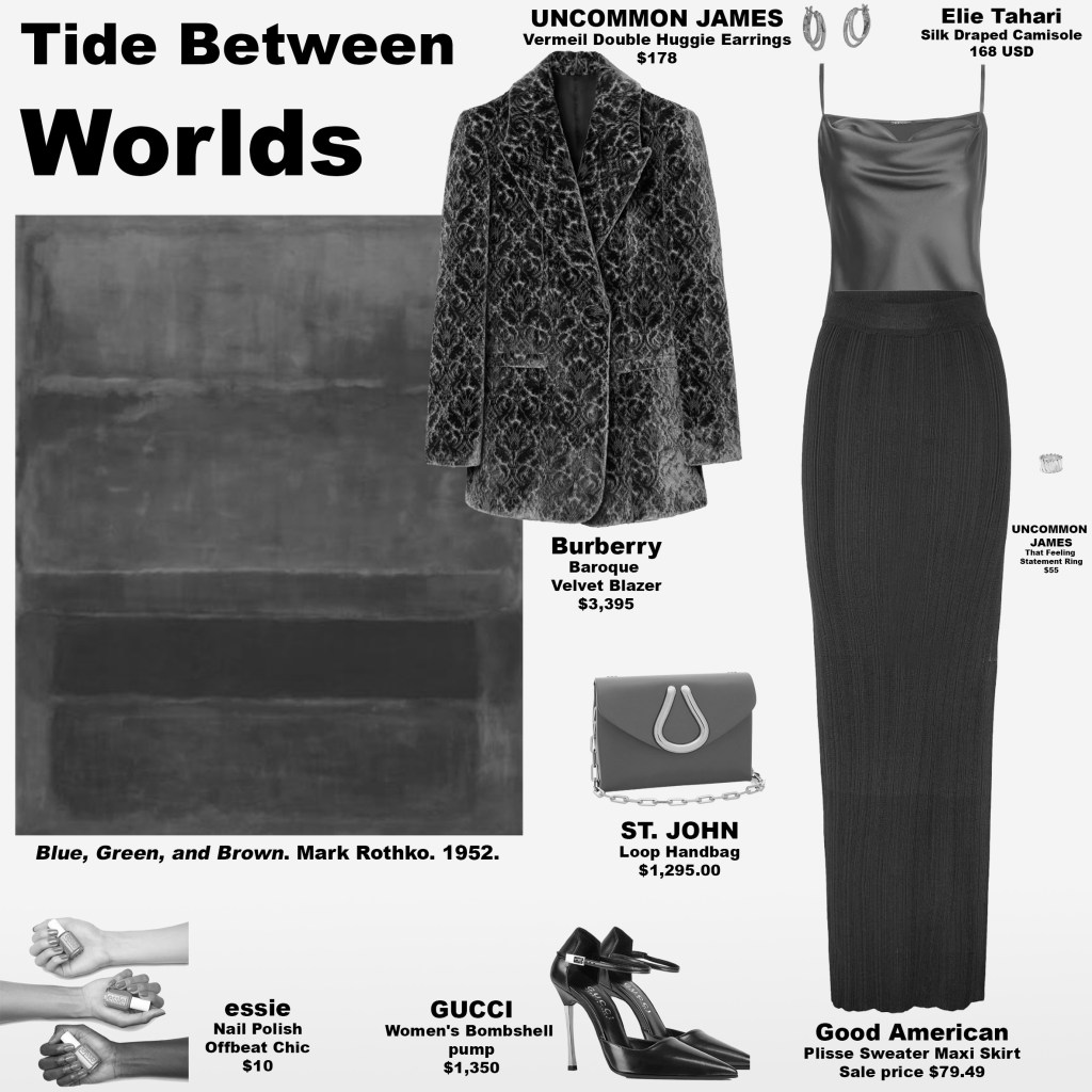
Tide Between Worlds translates this emotional architecture into dress. A silk camisole in shifting oceanic blues mirrors the painting’s upper field, its surface catching light in a way that evokes water rather than fabric. The color appears to deepen or brighten with movement, creating the same oscillation between openness and introspection found in Rothko’s layered blues. A matching handbag and lacquered nails extend this reflective quality, allowing the cool luminosity to travel beyond the garment and into gesture.
Layered over this, a green baroque velvet blazer adds tactile richness. Its plush surface captures and softens light, creating a subtle chiaroscuro that mirrors the painting’s transitional greens — not simply dividing, but mediating between tones. The green does not compete with the blues above; instead, it grounds them, providing the eye with a place to pause, settle, and recalibrate.
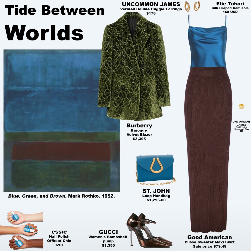
The brown skirt and pumps carry the composition’s emotional weight. Their tone suggests polished earth after rain — warm, steady, and quietly protective. Rather than reading as heaviness, the brown operates as reassurance, a reminder of physical presence beneath the more atmospheric upper layers. Together, these elements create a vertical narrative: atmosphere, threshold, gravity, and integration.
Psychologically, the look evokes a state of poised equilibrium. The cool blues invite reflection and mental spaciousness; the greens regulate and soften; the browns stabilize and contain. The wearer becomes a living gradient between sky and soil, embodying the subtle tension between expansion and grounding. There is no theatricality here — only a measured, interior confidence that radiates through restraint.
The hidden insight of this palette lies in its refusal of urgency. In a visual culture that often demands saturation and speed, these tones insist on duration. They ask the viewer to linger, to notice transitions rather than endpoints, and to recognize that emotional depth often resides in the spaces between extremes.
This expression transcends color alone. It captures the moment before movement, the inhale before speech, the tide paused between retreat and return. Through both painting and dress, it offers a meditation on balance — not as symmetry, but as the living negotiation between opposing forces held in quiet accord.
From Court to Catwalk: The Enduring Language of Gloves
Monday, February 16, 2026
At the recent 7 For All Mankind runway, nostalgia arrived not only through slouchy silhouettes and early-2000s ease, but through a subtler, more deliberate accessory: gloves. Of the 51 looks presented, only a handful omitted them. In at least 46 ensembles, hands were sheathed — not for warmth, but for emphasis. The effect was unmistakable: a styling choice that transformed effortless dressing into something more composed, more intentional. What initially read as a curious detail revealed itself as part of a broader shift. Across Fall 2026 ready-to-wear collections, designers treated gloves not as protection from the cold, but as punctuation — a visual cue that reframes the body and signals control over presentation.
7 For All Mankind FALL 2026 READY-TO-WEAR


A Brief History of Gloves as Fashion
Gloves have long existed at the intersection of utility, status, and symbolism. Their evolution mirrors changing attitudes toward the body, etiquette, and self-presentation.
Medieval and Renaissance Europe
Gloves signified rank and authority. Nobility wore finely worked leather and embroidered gauntlets, while clergy used gloves in liturgical dress to denote purity and ritual separation. To be gloved was to be elevated — literally set apart from the common touch of the world.
17th–18th Centuries: Etiquette and Refinement
As court culture codified manners, gloves became essential to polite society. They concealed the laboring hand, signaling leisure and refinement. Materials softened — kidskin, silk, lace — transforming gloves into markers of delicacy rather than armor.
19th Century: The Height of Formality
Victorian dress codes made gloves nearly compulsory in public. To appear bare-handed in formal settings was considered improper. Gloves functioned as social armor, mediating contact in an era obsessed with propriety and restraint.
Early 20th Century: Glamour and Modernity
Opera gloves and wrist-length styles became synonymous with elegance. Hollywood icons reinforced their allure, turning gloves into cinematic shorthand for sophistication and mystery.
Mid–Late 20th Century: Decline and Subversion
As social codes relaxed in the 1960s and 1970s, gloves fell out of daily use. When they appeared, it was often with subversive intent — punk leather, avant-garde styling — transforming a symbol of propriety into one of rebellion.
Early 2000s: Bare Hands, Effortless Ease
The early-2000s aesthetic — embodied by figures like Mary-Kate Olsen and Sienna Miller — favored undone layering and visible skin. Hands were bare, reinforcing the illusion of spontaneity. Accessories felt incidental rather than declarative.
Why Gloves Now?
The resurgence of gloves in contemporary collections signals a recalibration of fashion’s relationship to effortlessness. Today’s styling suggests that what appears casual is increasingly composed.
1. Framing the Body
Gloves create a visual boundary at the hands, sharpening silhouettes and directing attention to gesture. In a time when images circulate instantly, framing the body becomes a form of visual authorship.
KIM SHUI FALL 2026 READY-TO-WEAR


2. Control in an Age of Exposure
In hyper-visible digital culture, gloves function as a subtle barrier — not concealment, but curation. They suggest control over touch, presence, and self-presentation.
ALICE + OLIVIA FALL 2026 READY-TO-WEAR


3. Nostalgia with Structure
Where early-2000s style prized nonchalance, today’s revival tempers that ease with precision. Gloves add intention to otherwise relaxed ensembles, transforming “thrown-on” into “considered.”
Lii FALL 2026 READY-TO-WEAR


4. Symbolic Resonance
Historically, gloves mediated contact between the individual and the world. Their return hints at a contemporary desire for boundaries — psychological as much as physical.
Bibhu Mohapatra FALL 2026 READY-TO-WEAR


What This Says About Fashion Now
The near-ubiquity of gloves on the 7 For All Mankind runway suggests that effortless chic has evolved. The early-2000s ideal of looking as though one simply stepped out the door has been reinterpreted for an era that understands the performance embedded in every image.
7 For All Mankind FALL 2026 READY-TO-WEAR


Today’s fashion does not abandon ease — it stages it. Gloves, once symbols of status, propriety, or rebellion, now function as instruments of clarity. They frame the hand, refine the gesture, and signal that even the most relaxed silhouette is a deliberate composition.
In this light, the return of gloves is not about warmth. It is about authorship — the quiet assertion that style, no matter how effortless it appears, is always a matter of choice.
The Return of Early-2000s Effortlessness
Monday, February 16, 2026
Drawing on the undone glamour of early-2000s icons, 7 For All Mankind’s latest collection under Nicola Brognano revisits that era with a modern lens — where slouchy layers, textured denim, and quiet statement pieces create a look that feels spontaneous yet refined.
The Quiet Gravity of Color
Monday, February 16, 2026
Some colors linger in the mind long after they are seen, not through intensity, but through presence. Inspired by Mark Rothko’s No. 10, Brown, Black, Sienna on Dark Wine, this look channels the painting’s contemplative energy into a modern expression of style, where tone, layering, and atmosphere carry the emotion.
Rothko’s painting is structured with expansive fields of color floating within a deep wine backdrop, each block separated by thin bands of the surrounding tone. The upper hues hover in gentle garnet-browns, the central field absorbs light with quiet depth, and the lower register radiates earthy warmth—like heat resting just beneath the surface. The composition draws the eye inward, fostering a sense of calm awareness, as if the colors themselves are breathing softly.
Muted Force translates this balance into wearable form. A shirt in softened wine-browns mirrors the upper field, its warmth inviting without demanding attention. Layered over it, a jacket in earthen plum creates subtle transitions, echoing Rothko’s feathered edges and creating a feeling of floating depth. The pants, nearly black, serve as an anchor, offering grounding presence while letting the surrounding tones breathe. Accessories carry the lower field’s gentle glow: a handbag in terracotta introduces warmth and energy, and pumps in a dusty mauve-plum provide soft, reflective detail that connects the palette from head to toe.

The psychological effect is one of quiet expansion. Rather than dramatic tension, the look cultivates a sense of settling and centering—a gentle, crown-chakra–like clarity. Each layer and shade invites contemplation, grounding the wearer in a calm yet confident energy. The eye moves naturally across the ensemble, just as it would over Rothko’s blocks, settling on warmth, pausing in depth, and flowing upward with soft luminosity.
This is a translation of color into presence. Muted Force captures the essence of Rothko’s quiet gravity, inviting the wearer into a space where energy is refined, layered, and light—a meditative expression of color that feels both grounded and uplifted.
Anna Wintour, Faith, and Fashion: From a 1988 Vogue Cover to the 2018 Met Gala
Sunday, February 15, 2026
Anna Wintour’s first Vogue cover in November 1988 introduced a subtle but profound dialogue between fashion and faith. Featuring model Michaela Bercu in a jeweled Christian Lacroix cross top paired with denim, the image reframed Christian symbolism within a contemporary, everyday context. The cross—an emblem of sacrifice, redemption, and devotion—was not presented as costume or spectacle, but as a lived symbol integrated into modern identity. By placing this sacred motif on the cover of a leading fashion publication, Wintour signaled that belief and style need not exist in separate spheres; religion could be worn, visible, and culturally relevant.

Three decades later, that early gesture toward faith found a monumental echo in the 2018 Met Gala, Heavenly Bodies: Fashion and the Catholic Imagination. As co-chair, Wintour helped shape one of the most thematically cohesive exhibitions in the Costume Institute’s history, exploring the visual language of Catholicism—from liturgical vestments and papal regalia to contemporary couture inspired by religious symbolic representation. The exhibition did not treat faith as mere ornamentation; instead, it examined how centuries of sacred art and tradition have informed fashion’s aesthetics, craftsmanship, and symbolism.
The continuity between Wintour’s 1988 cover and the 2018 Met Gala lies in their shared recognition of faith as an extension of personal identity—an outward expression of belief that shapes how individuals see themselves and present their values to the world. The jeweled cross top functioned as an intimate expression of belief woven into daily dress, while Heavenly Bodies expanded that idea to a global stage, demonstrating how religious imagery has shaped collective notions of beauty, reverence, and transcendence. Both moments affirmed that sacred symbols point to a singular truth while resonating through personal devotion, historical tradition, and artistic expression—and that religion can serve as a bridge between these dimensions.
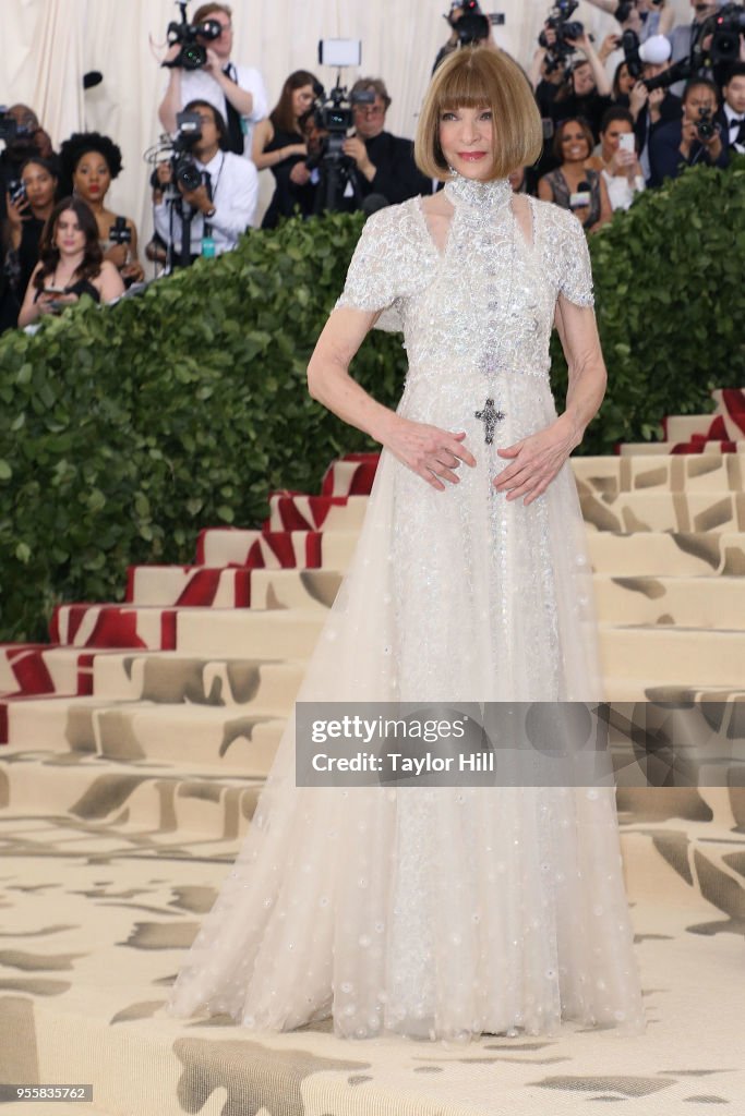
Importantly, Wintour’s stewardship of Heavenly Bodies suggested a sustained respect for the power of religious imagery. Rather than reducing religious motifs to trends, the exhibition emphasized craftsmanship, narrative, and the emotional resonance of faith traditions. In doing so, it reinforced a perspective first glimpsed on her debut cover: that fashion is not solely about novelty, but about the enduring symbols that help people articulate identity, values, and belonging.
Seen together, these milestones reveal a throughline in Wintour’s career—an understanding that clothing can carry the weight of belief while remaining relevant to contemporary life. From a jeweled cross on a magazine cover to a landmark exhibition exploring the global Catholic influence, her work demonstrates that faith, when approached with nuance and respect, can enrich fashion’s capacity to communicate meaning beyond the surface.
Color, Calm, and the Energy of Renewal
Sunday, February 15, 2026
In No. 8 (Lilac and Orange over Ivory), Mark Rothko constructs an atmosphere rather than an image—an arrangement of softened neutrals, hushed violets, and earthen warmth that invites emotional stillness. The ground of the composition rests in layered sand and antique light, a spectrum that moves from pale almond to sun-faded straw. These shades do not assert themselves; they hold space. Above, the upper field diffuses into a misted ivory and softened lilac-gray, a palette reminiscent of overcast light filtering through sheer fabric. A narrow band of soft sand separates this quiet haze from the lower register, where mineral reds and raw sienna tones gather—terracotta muted by dust, ocher kissed by late-afternoon light, and the gentle glow of sunlit clay.
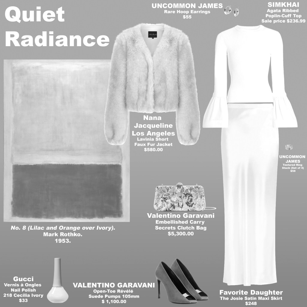
Translating this palette into dress, the look adopts the same philosophy of restraint and resonance. A blouse and skirt in airy, cloudlike white echo the calm luminosity associated with Pantone’s Cloud Dancer, establishing a visual exhale at the center of the ensemble. This pale foundation mirrors the painting’s softened upper field, suggesting openness, clarity, and the possibility of renewal. Over this, a jacket in warm sand tones—akin to sunlit limestone and brushed straw—grounds the look, while a handbag with hues of lilac channels the painting’s atmospheric upper register. Terracotta pumps anchor the composition with earthen depth, their clay-red warmth providing the same stabilizing counterpoint found in the lower block of Rothko’s work. Nails lacquered in a sandy hue create continuity, allowing the palette to move seamlessly across surfaces.

Psychologically, the look operates as a dialogue between calm and vitality. The cloudlike whites and softened neutrals quiet the nervous system, aligning with a cultural longing for clarity and decompression in an overstimulated era. Lilac introduces introspection and emotional nuance, a color long associated with contemplation and spiritual sensitivity. Terracotta, by contrast, activates grounding energy—its connection to soil and warmth evokes stability, embodiment, and creative presence. Together, these hues create a regulated emotional cadence: soothe, reflect, anchor. The wearer becomes both centered and present, projecting composure without detachment.
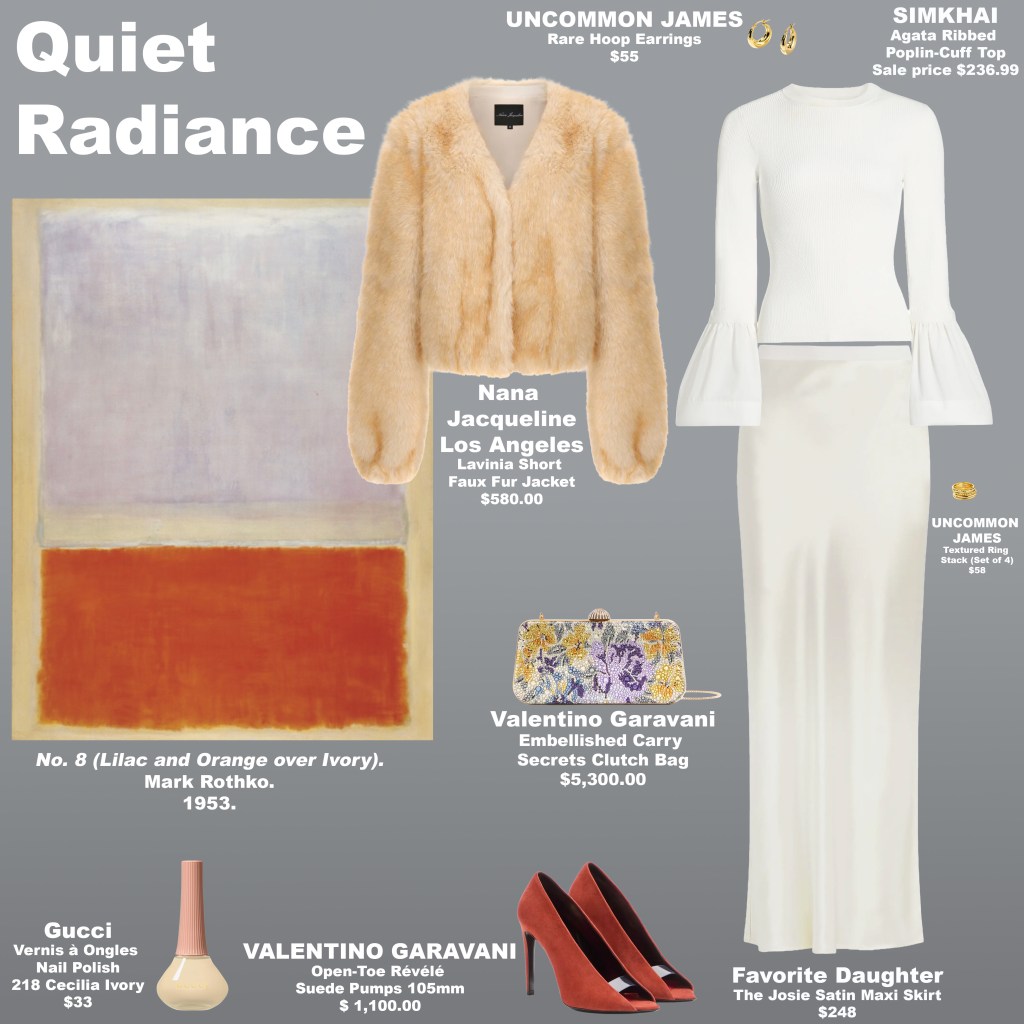
This interplay resonates strongly with the ethos behind Pantone’s recent emphasis on restorative, breathable tones. The incorporation of Cloud Dancer–like whites signals a collective shift toward spaciousness and intentional living, while the surrounding palette demonstrates that serenity need not be sterile. Warm neutrals and earthen reds prevent the look from drifting into abstraction; they tether calm to lived experience. In this way, the ensemble reflects a broader cultural recalibration—one that values softness not as fragility, but as a form of strength.
Energetically, the palette activates a gentle but dynamic flow. The pale core invites openness and emotional reset, the lilac accent stimulates intuition and subtle perception, and the terracotta base energizes the body’s sense of security and creative drive. The result is neither purely tranquil nor overtly bold; it is balanced, attuned, and quietly radiant. Like Rothko’s painting, the look does not demand attention—it rewards presence.
The Biggest Fashion Trends You’ll See Everywhere in 2026 | This Morning
Saturday, February 14, 2026
The Architecture of Tenderness
Saturday, February 14, 2026
Mark Rothko’s Untitled (No. 17) (1961) presents a luminous field framed in a warm marigold-ochre tone that feels both sunlit and earthen, establishing a radiant perimeter that holds the composition in quiet equilibrium. Within this glow, a restrained upper passage of muted rose hovers like a softened memory, while the expansive lower field—steeped in a deep claret hue—grounds the painting with emotional depth. A narrow band of the surrounding golden tone separates the two, acting as a threshold rather than a divider: a moment of suspension where warmth, vulnerability, and resolve meet.
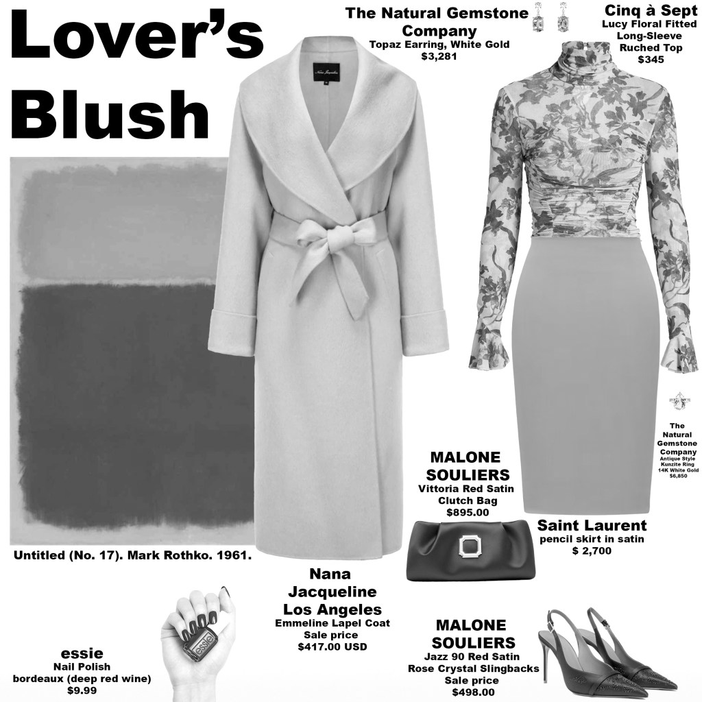
The Valentine’s Day look drawn from this palette translates Rothko’s emotional architecture into wearable form. A blouse in softened rose, patterned with florals in the same deep wine tone as the painting’s lower field, introduces intimacy without sentimentality. The skirt, rendered in a burnished saffron-amber shade akin to the painting’s radiant border, becomes the unexpected focal point—neither overtly romantic nor neutral, but alive with warmth. Accessories in the same rich wine tone—handbag, pumps, and lacquered nails—anchor the look with cohesion, while a coat in the gentle rose hue envelops the ensemble in softness.

What makes this interpretation compelling for Valentine’s Day is its refusal of cliché. Rather than relying on predictable pinks and reds, the palette introduces a golden-amber inflection that adds surprise and subtle edge. The result is unmistakably feminine yet self-possessed: softness framed by structure, warmth tempered by depth. The skirt’s sun-inflected tone acts as a spark within the composition, preventing the look from drifting into nostalgia and instead situating it firmly in the present.
Energetically, the palette operates in the liminal space between the solar plexus and sacral centers—where confidence meets desire, and self-trust meets emotional openness. The marigold-amber note evokes anticipation and vitality, the rose tone invites tenderness, and the deep wine hue conveys devotion and emotional gravity. Together, they recreate the sensation of butterflies: the charged stillness before a first kiss, or the rediscovery of closeness within an enduring partnership. Like Rothko’s painting, the look does not perform romance; it creates a field in which feeling can arise—warm, grounded, and quietly electric.
Self-Love as Presence: Dressing the Whole Self
Friday, February 13, 2026
Self-love is often reduced to slogans or surface rituals, but in its truest form, it is a practice of presence—an ongoing decision to inhabit your life fully, without apology. It is not contingent on perfection, approval, or external validation. It is the quiet recognition that who you are, in this moment, is worthy of care, attention, and respect.
Fashion becomes meaningful within this framework not as performance, but as expression. The way we dress can either conceal or reveal our relationship with ourselves. When rooted in self-acceptance, style shifts from seeking approval to communicating alignment. Colors feel intentional rather than strategic. Silhouettes feel chosen rather than corrective. Clothing becomes a language through which the inner life meets the visible world.
To love yourself fully is to acknowledge complexity. It is to hold ambition alongside rest, strength alongside tenderness, confidence alongside uncertainty. This wholeness resists the pressure to curate a single, polished identity. Instead, it allows for evolution. One day you may dress for clarity and structure; another day for softness and ease. Neither contradicts the other. Both are evidence of a life being lived honestly.
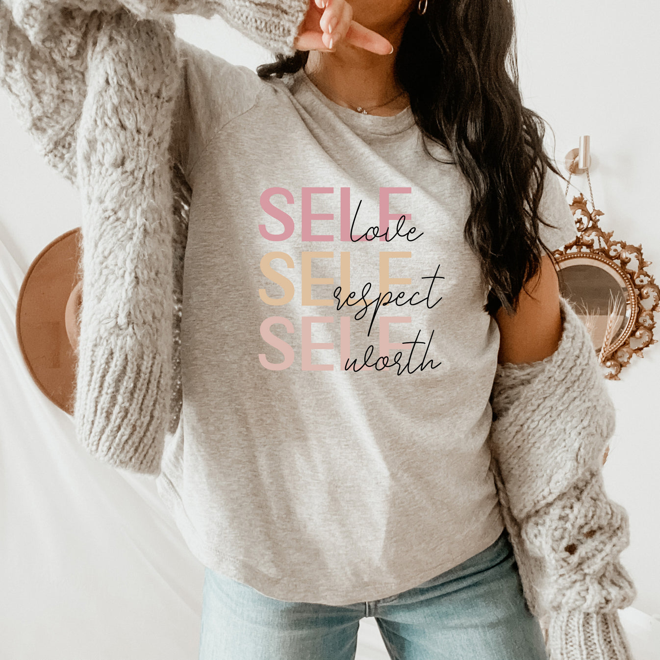
There is also a psychological dimension to self-love that shapes perception itself. When you regard yourself with care, your environment becomes less adversarial and more participatory. You are not dressing to shield against judgment but to engage with the world as a collaborator in your own experience. This shift transforms style from armor into atmosphere—something that supports your mood, your focus, and your sense of belonging.
Ultimately, self-love is not a destination but a posture. It is the decision to stand in your own life without shrinking, to extend compassion inward, and to let that compassion inform how you move through the world. When you dress from this place, fashion is no longer about becoming someone else. It becomes a daily affirmation of who you already are—inside and out.
Veja: The Quiet Power of Conscious Design
Friday, February 13, 2026
In an industry long driven by spectacle and seasonal excess, Veja has built its identity on restraint, transparency, and ecological integrity. Founded in 2005, the French footwear label redefined what a modern sneaker brand could represent: not just style, but accountability. Rather than investing in traditional advertising, Veja directed its resources toward ethical sourcing, fair labor, and material innovation—choices that quietly reshaped consumer expectations. The result is a brand whose influence extends beyond footwear into the cultural conversation around responsibility and design.


At the core of Veja’s philosophy is material honesty. The brand works with organic cotton grown by Brazilian and Peruvian farming cooperatives, wild rubber tapped from Amazonian trees to support forest preservation, and recycled plastic bottles transformed into durable mesh. Vegetable-tanned, chrome-free leather reduces chemical impact while maintaining longevity. These choices are not aesthetic gestures; they are infrastructural decisions that embed sustainability into the product itself. The sneaker becomes not just an object of style, but a record of its own making.


Production takes place in Brazil and Portugal in factories that prioritize fair wages, safe working conditions, and long-term partnerships. Veja’s status as a certified B Corporation underscores its commitment to transparency: the brand openly shares supply chain details and cost structures, challenging the opacity that has historically defined fashion manufacturing. This transparency functions as a form of modern luxury—trust replacing exclusivity as the marker of value.


Design-wise, Veja’s appeal lies in disciplined minimalism: signature models such as the Campo, V-10, and Esplar rely on clean lines, balanced proportions, and the unmistakable “V” logo—a graphic element that signals identity without excess, while performance styles like the Condor maintain this clarity, proving that technical innovation need not sacrifice visual restraint. In this way, Veja demonstrates that sustainability and style are not opposing forces but complementary principles, coexisting in a design language that feels both contemporary and enduring—evidence that the future of fashion may be shaped not by louder statements, but by quieter, more deliberate ones.
Defined and Unapologetic
Friday, February 13, 2026
Mark Rothko’s No. 16 (Red, White, and Brown) (1957) reads as a meditation on boundary and self-possession. The background is built from dense, earthen reds—grounded, clay-like, and steady—establishing a firm foundation, while a compressed band of dark umber and chestnut brown above creates a threshold, a visual line that separates and defines. Below this, a broader, saturated field of bright, commanding red occupies the center of the composition, its intensity reinforced by slightly deeper, richer red tones layered within. The lower register mirrors the upper reds in similar tonal range, creating a visual echo, but here a stark white block is embedded, not as relief, but as a structural pause that defines and clarifies the surrounding crimson. The psychological effect is one of self-possession. The painting conveys a whole personality: grounded, composed, and confident in its own edges. It does not ask to be understood; it simply declares itself.

The fashion look translates Rothko’s chromatic architecture into wearable confidence. A bright red cropped coat mirrors the painting’s central red field, assertive and visible. Pumps in a darker red reflect the deeper shades within the middle block, grounding the look and creating dimensionality. Red nail polish complements this layered red strategy, while ruby and yellow gold earrings and ring echo the richness and subtlety of tonal variation in the painting.

Balance comes from the contrast in neutrals. A chocolate brown top with white polka dots, along with a matching handbag, draws from the darker brown tones above, providing structure and containment. Crisp white pants echo the white block in the lower register, serving as a visual pause that makes the reds more articulate, stabilizing the ensemble while allowing the color to dominate without overwhelming.
The outfit conveys the same mood and psychological effect as Rothko’s work: deliberate confidence, composure, and self-possession. Each element—red, brown, and white—is intentional, working in harmony to project authority and balance. Like the painting, the look does not ask to be understood; it simply declares itself, embodying a personality that is assertive, structured, and vividly present.
Catherine, Princess of Wales at Castle Hill Academy: Presence, Poise, and Purpose
February 12, 2026
Princess Catherine visited Castle Hill Academy in Croydon on February 12, 2026, marking Children’s Mental Health Week in her role as Patron of Place2Be. The engagement centered on emotional wellbeing and early support, but the atmosphere she created extended beyond the program itself. Her presence brought a sense of warmth and attentiveness that resonated immediately with students and staff alike.

Princess Catherine’s attire reflected the quiet intentionality that has become synonymous with her public appearances. She wore a light blue collared shirt beneath a deep mauve-brown jacket, paired with dark mulberry taupe trousers. The palette was refined and grounded—soft blues suggesting calm and approachability, while the muted plum-brown and shadowed taupe conveyed stability and reassurance. The look was elegant without ostentation, allowing her natural charm to remain the focal point.


Rather than commanding attention, the ensemble functioned as a backdrop to her joyful spirit. As she greeted children, listened to their experiences, and participated in activities, the understated tones reinforced a sense of safety and composure. The clothing did not compete with the moment; it supported it, creating a visual language of care that aligned with the day’s focus on mental health.

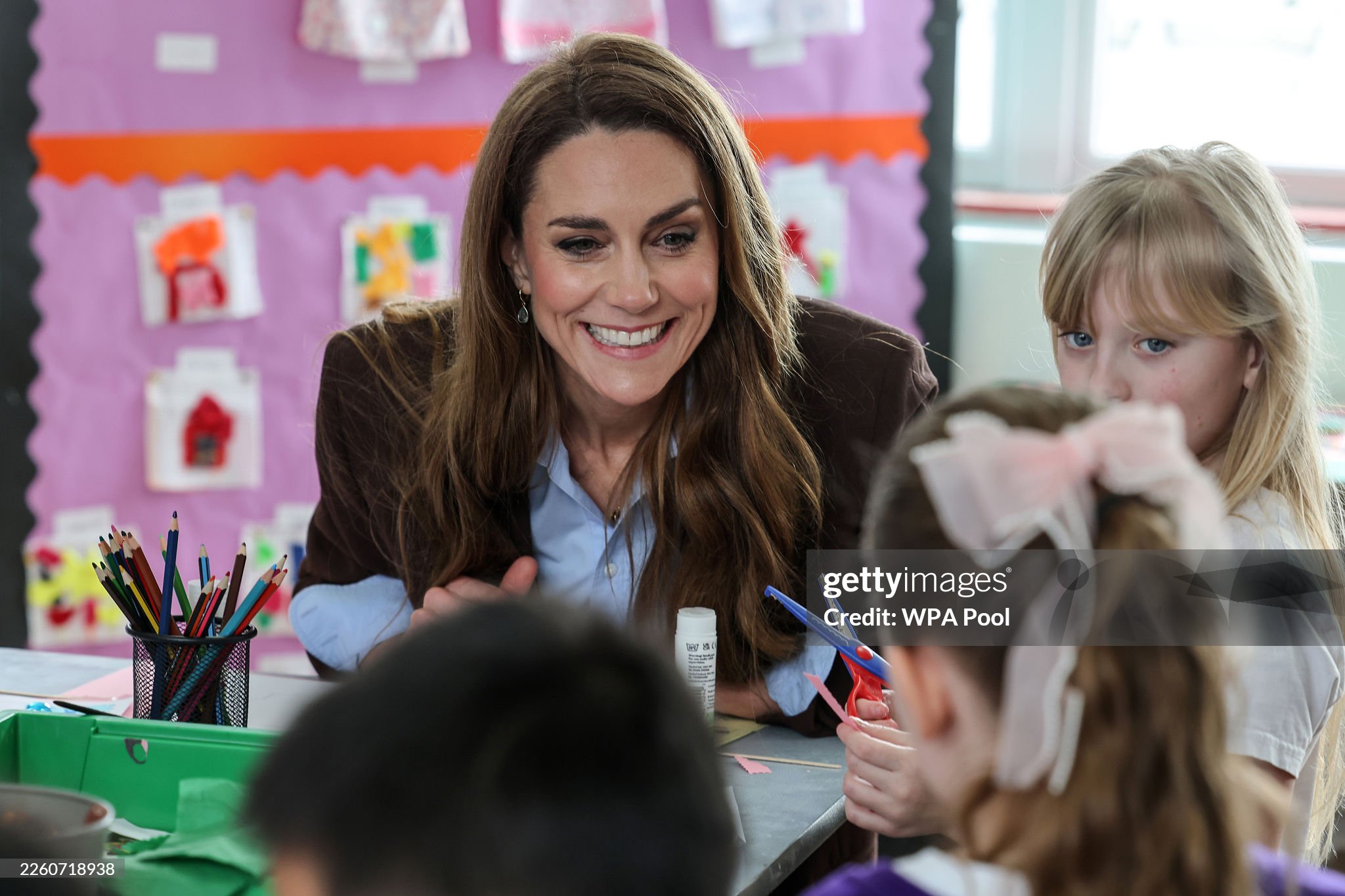
In environments where young people may feel vulnerable or uncertain, such visual cues matter. Calm colors and composed tailoring can subtly communicate reliability and trust, helping to set the emotional tone of a space. Princess Catherine’s visit demonstrated how thoughtful presentation—paired with genuine engagement—can brighten a room, making children feel seen, valued, and at ease. Her elegance was not merely aesthetic; it was relational, amplifying the purpose of the day through presence, warmth, and quiet strength.
What the Mind Chooses to See
Thursday, February 12, 2026
If vision is a construction—if the brain gathers fragments of light, contrast, and motion and synthesizes them into a coherent scene—what does that imply about attention? Neuroscience is clear: we do not perceive the entire visual field with equal fidelity. Although the retina captures vast amounts of data, the brain prioritizes only a fraction. Through selective attention and predictive processing, it amplifies what aligns with our goals and expectations while suppressing the rest. What we call “reality” is filtered emphasis.
Cognitive science refers to this as top-down processing. The brain anticipates the world, prioritizing what it predicts will matter—edges, faces, movement—while filling in gaps to maintain continuity. Change blindness illustrates this mechanism: when attention is directed elsewhere, even obvious changes in our environment can go unnoticed. We do not process every detail before us; instead, the brain constructs a streamlined version of reality, assuming stability rather than recording it in full. The implication is sobering: much of what surrounds us is simply edited out.
That raises a sharper question: what does our focus reveal about us? Attention is not neutral. The fragments we consistently notice reflect our internal priorities—our fears, desires, habits, and rehearsed narratives. Over time, perception begins to mirror preoccupation. The world we experience becomes an echo of what we repeatedly select.

What happens, then, if we deliberately redirect attention toward what we usually ignore—the peripheral, the quiet, the background? Doing so disrupts predictive loops. Novel details generate prediction error, forcing the brain to update its internal model. Widening attention literally reshapes interpretation, requiring the mind to accommodate nuance it previously excluded.
In this sense, perception is an active discipline. If the brain builds experience from fragments, then shifting focus alters the structure of that experience. We are not merely seeing; we are selecting. And what we select determines the version of the world we inhabit. The essential question becomes not “What do you see?” but “What are you choosing to assemble?”
Power, Presence, and Psychological Light
Thursday, February 12, 2026
Mark Rothko’s Yellow, Charcoal, Brown (1953) is less a composition than a field of emotional voltage. The upper expanse—dominated by two luminous yellows, one a saturated golden saffron and the other a softened, buttery light—radiates outward before the eye can fully adjust. Beneath it, a narrow band of burnt orange interrupts the glow, followed by a dense, near-black charcoal field that absorbs light rather than reflects it. At the base, a grounded block of earthen clay holds a muted amber core within it. The architecture is simple; the psychology is not. Rothko stacks illumination over weight, buoyancy over gravity. The result is tension between ascent and grounding—light pressing against depth.
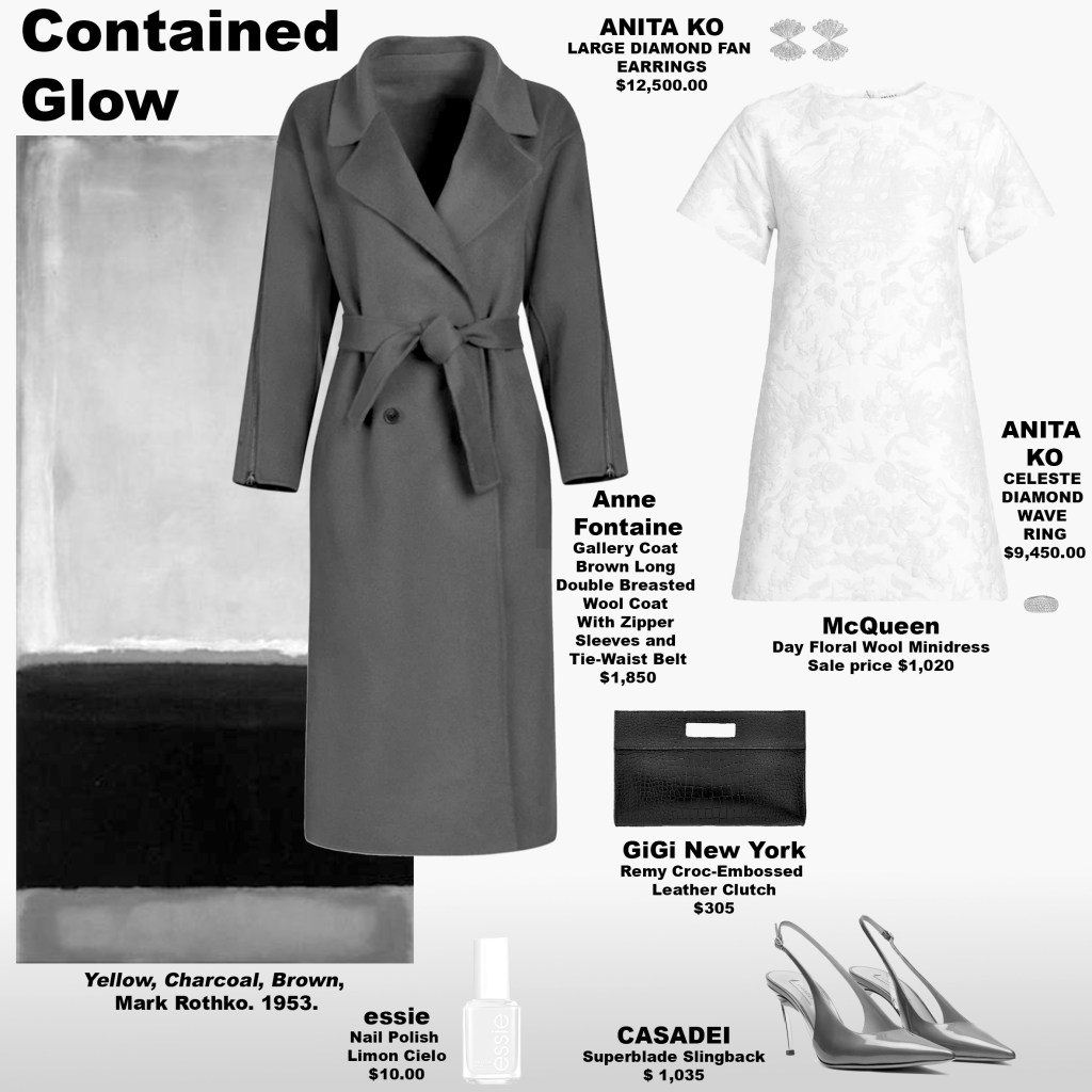
From a perceptual standpoint, yellow is neurologically potent. It reflects more light than most hues on the visible spectrum, stimulating retinal response quickly and demanding cortical attention. It is difficult to ignore. Psychologically, it is associated with alertness, clarity, agency, and cognitive activation. When placed above darker tonal bands, as Rothko does here, the brightness feels amplified—almost charged—because the surrounding darkness heightens contrast. The eye moves upward; the mind follows. The composition suggests expansion rising from density, consciousness emerging from shadow.
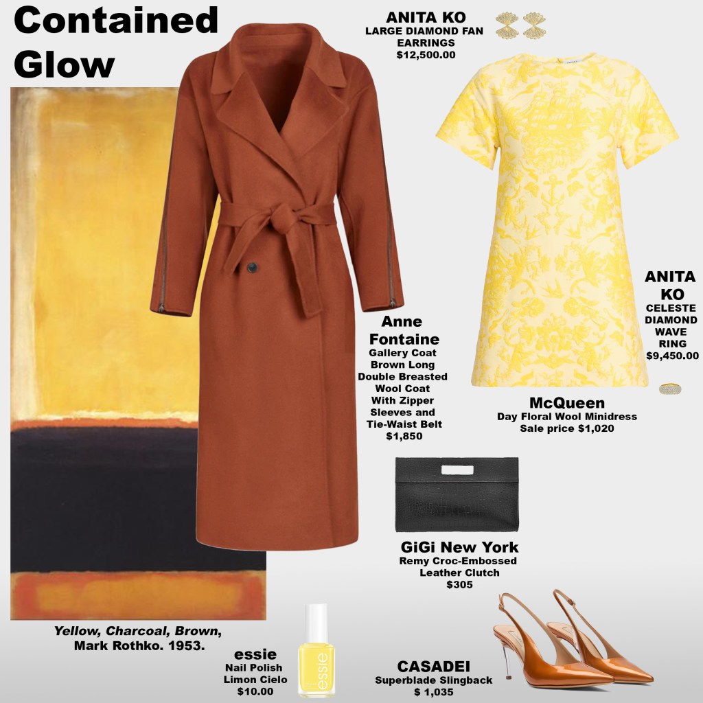
The dress mirrors this architecture. Constructed in two distinct yellows—one vibrant and sunlit, the other softer and diffused—it captures the painting’s upper field and translates it into movement. In the middle of February, when daylight is abbreviated and color palettes tend to retreat into neutrals, this saturation interrupts seasonal monotony. It brightens mood not metaphorically but physiologically: higher luminance colors increase visual stimulation and can elevate perceived energy. The matching yellow nail polish reinforces this continuity, extending the chromatic field through gesture. The effect is immediate—confidence felt before it is articulated.
The outerwear and accessories anchor the light, much like the painting’s darker base tones. A coat that reflects the painting’s deeper brown tones at the base introduces stability and containment. Pumps in a warmer, lighter brown echo the softer hues below, ensuring the yellow remains grounded rather than untethered. The black handbag acts as visual punctuation—decisive and final. Without these darker counterweights, the yellow might drift. With them, it holds its structure. The result is controlled radiance rather than unchecked brightness.
Psychologically, this is a study in personal power. Yellow is frequently linked to the body’s center of agency and will—the region associated with assertion, identity, and momentum. When worn with intention, it signals clarity and self-direction. Rothko understood that light gains meaning through contrast; the same is true in dress. Brightness against shadow feels deliberate. In the muted landscape of winter, stepping into gold is not decorative—it is declarative. The question becomes: when the world is subdued, do you dim with it, or do you introduce your own light?
We Don’t See With Our Eyes, We See With Our Minds
Wednesday, February 11, 2026
“All cats are gray in the dark.” At first, it seems like a simple observation about low light—but it reveals a fundamental truth: seeing is not just about the eyes. The retina collects light, but the mind actively interprets it, filling in gaps, predicting shapes, colors, and depth. Vision is a construction—your brain takes fragments of information and synthesizes them into a coherent experience. What you think you see is as much a product of memory, expectation, and emotion as it is of photons striking the retina.
Neuroscience shows that the brain constantly edits and completes visual input. The retina encodes a fraction of what surrounds us, sending it to the visual cortex, where neurons combine incoming data with prior knowledge. In ambiguous or low-light situations, the mind supplies what is missing, blending inference with observation. This is why optical illusions work, why colors shift depending on context, and why a shadow can appear threatening or gentle depending on mood. Seeing is prediction, perception, and interpretation—all orchestrated by the mind.

This dynamic directly shapes fashion and style. The colors, textures, and forms we choose are not simply observed by others; they are interpreted through the minds of both wearer and viewer. A deep burgundy may feel grounding and authoritative, a soft lavender reflective or introspective. The brain reads these cues emotionally, layering memory, expectation, and personal associations on top of the visible surface. Dressing is therefore an act of psychological communication: the mind translates color, pattern, and shape into feeling, presence, and mood.

Understanding vision as a mental construction reframes how we approach style. Clothing, color, and design are not merely seen—they are experienced, interpreted, and co-created. A single hue may resonate differently depending on who wears it and who sees it, reflecting an internal state as much as an aesthetic choice. All cats may be gray in the dark, but the mind colors them, defines them, and imbues them with meaning. Fashion, like perception itself, is not passive; it is a collaboration between eyes, mind, and emotion.
Red on Maroon: A Study in Continuity, From Daylight to Dusk
Wednesday, February 11, 2026
Mark Rothko’s Red on Maroon (1958) is a study in layered resonance. Its central open rectangle—constructed from deep wine reds and muted oxblood tones—floats within a surrounding field of maroons, shadowed browns, and subtle plum undertones. The colours feel absorbed rather than applied, internalized rather than declared. There is tension here, but it is quiet and psychological—a gentle grounding that draws the mind inward. This palette encourages reflection and presence, anchoring thought while softening distraction, as if the energy of the painting reaches beyond vision into the psyche.
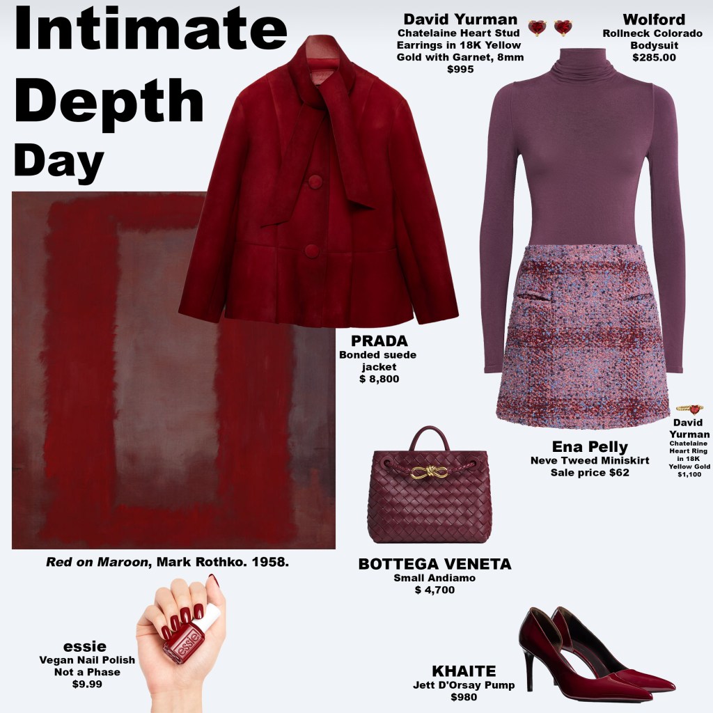
The short-skirt daytime look mirrors this layered subtlety. From a distance, the tweed skirt reads predominantly with the lighter tones of Rothko’s background, creating a cohesive, grounded impression. Up close, the surface reveals a delicate mosaic of dusty rose, muted plum, soft beige, a serene periwinkle-blue, and deep oxblood—micro-colours that interplay to form a perceptual whole. This effect mirrors how certain colours exist only in perception: no single wavelength produces the hue we see. Instead, the brain synthesizes multiple light signals into a unified experience. From afar, the skirt presents two dominant tones; up close, it becomes a subtle choreography of shades, each contributing to the emotional resonance and energetic balance of the look.
The rest of the outfit amplifies this psychological depth. A lacquered deep red jacket anchors the upper body, harmonized with matching pumps and nail polish, cultivating authority and focus. A muted plum-toned top tempers the warmth of the reds, introducing reflective, calming energy. A handbag in a grounded, earthy maroon serves as a stabilizing touch, tying together the upper and lower palette while contributing its own subtle, psychological resonance. Together, these elements invite attentiveness, introspection, and emotional poise. The ensemble functions much like Rothko’s painting itself: encouraging the viewer—and perhaps the wearer—to slow down, perceive nuance, and feel held within colour and form.
Switching to the evening look, the skirt extends into a deeper, near-blackened red drawn from the painting’s darkest shadows. This single change transforms the energy of the outfit: depth intensifies, focus sharpens, and presence becomes more intimate and concentrated. Where the short skirt disperses visual and emotional attention across multiple tones, the longer silhouette consolidates it, mirroring the shift from broad daytime awareness to private evening resonance. Subtle shifts like this demonstrate how colour, proportion, and tonal layering orchestrate both perception and mood.
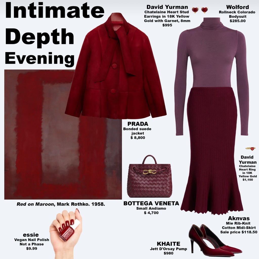
From a psychological perspective, this duality embodies the principle that colour is not simply external. Much like magenta, pink, brown, and certain shades of grey, the tones in Rothko’s background—and reflected in these looks—are constructed as much by the mind as by the eye. Each layer, each interplay of light and shade, is interpreted through memory, emotion, and prior experience. Dressing in these colours becomes an act of compositional participation: the wearer’s energy, attention, and emotional state interact with the palette, creating a visual and psychological resonance that is felt as much as it is seen. How do these layered reds, plums, and dusty shades land for you? Do they feel grounding, reflective, magnetic, or quietly powerful? Like Rothko’s art itself, the answer is personal—but the effect is undeniable: perception, colour, and emotion entwined in one continuous, living experience.
The Colours Your Brain Creates: Dressing With Invisible Vibrations
Tuesday, February 10, 2026
Some colours aren’t just “seen” right away by your eyes—they have to be figured out by your brain. While some colours come from a single kind of light wave, others are made when many different light waves hit your eyes at the same time. No single wave equals that colour on its own. Your eyes send all those signals to your brain, and your brain puts the pieces together—like solving a puzzle. The colour doesn’t fully exist in the light by itself; it becomes complete only when your brain interprets it.

Because of this, colour isn’t just something outside of you. Colours like magenta, purple, pink, brown, and certain shades of grey exist only through this interpretive process. They are not simply wavelengths; they are constructions of perception, requiring active synthesis to emerge. When you wear or encounter these colours, you are participating in their creation—they are as much about experience as they are about light.

Each of these constructed colours carries its own psychological and energetic resonance. Magenta feels magnetic and stimulating, inviting attention and boldness. Purple evokes creative openness, expanding thought and feeling. Pink oscillates between comfort and vulnerability, softening or highlighting emotional presence. Brown conveys steadiness and groundedness, while grey acts as a reflective pause, inviting thoughtfulness and subtlety. Choosing these colours becomes an act of shaping not only visual impact, but emotional and energetic tone.

Ultimately, dressing in colours that exist only in perception transforms fashion into a compositional act. Each choice of magenta, purple, pink, brown, or grey reflects not only aesthetic taste, but also inner state. Because your brain draws on memory, emotion, and past experience to interpret these colours, the palette you select becomes a subtle mirror of your current mindset, mood, and emotional energy. What you wear in these shades is not just seen—it is felt, experienced, and created anew by your own perception.
Poised Contrast: Dancer Energy in Colour and Form
Tuesday, February 10, 2026
Mark Rothko’s Untitled from 1967 captures the quiet power of balance, much like the focused energy of a dancer in motion. A wide, warm peach border frames two contrasting blocks: a smaller white field above and a deep black below, separated by a strip of the same peach. The composition moves the eye with careful rhythm, encouraging introspection and subtle emotional resonance. Just as a dancer commands presence through measured attention to weight, space, and interval, the painting invites the viewer to experience the tension and harmony of form.
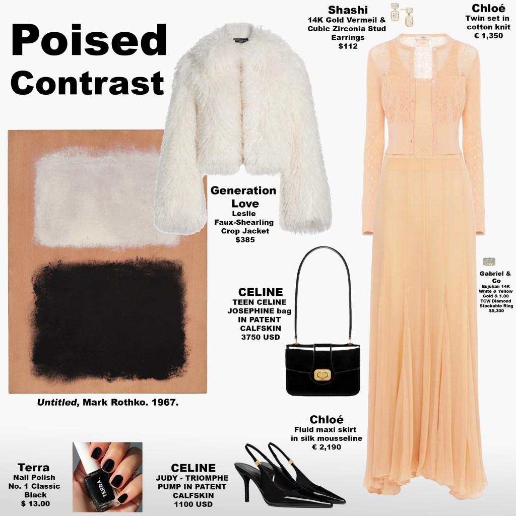
The ensemble Poised Contrast channels this energy. A top and skirt in warm peach echo the painting’s background and border, while a softly structured white cropped jacket mirrors the top block’s luminosity. Black patent leather pumps and a matching handbag anchor the outfit with reflective focus, and black nail polish sharpens the look with refined punctuation. If black nail polish is often associated with edge, here it conveys discipline, elegance, and intentionality. The interplay of warmth, light, and dark produces a psychological rhythm reminiscent of a poised dancer: controlled yet expressive, serene yet magnetic.
Ballet teaches that poise is both physical and mental: posture, spacing, and subtle tension translate into presence and awareness. Similarly, Poised Contrast orchestrates colour and texture to engage perception. Peach encourages openness and gentle vitality, white signals clarity and precision, and black fosters focus and grounding. The combination asks the audience to reflect: how do these tonal relationships shift mood or attention? Can balancing contrast inspire a sense of calm authority or elevate awareness in daily life?
In Poised Contrast, fashion becomes choreography. Each element—the hue, reflective surfaces, and the layering of light and dark—functions as a cue for perception, guiding focus and shaping emotional resonance. The ensemble channels the quiet confidence of a dancer: disciplined, alert, and fully present. When observing the alignment of peach, white, and black, what feelings arise? How does poise translate from the painting to the outfit, and how might it influence your own perception of space, energy, and presence?
The Vibration of Colour
Monday, February 9, 2026
Colour is often treated as surface—an aesthetic choice, a styling decision, a trend cycle. Yet at its core, colour is not static. Like sound, it is vibration. In physics, colour is light oscillating at specific wavelengths, just as sound is air vibrating at particular frequencies. What we perceive as hue or tone is, in fact, movement translated by the senses. This raises a compelling question for fashion and self-presentation: if colour is vibration, what does it mean to wear it?
Sound Waves Made Visible: The Chladni Plate
In the late 18th century, physicist Ernst Chladni demonstrated that sound is not merely something we hear, but something that structures space. Using a violin bow to set a sand-covered metal plate into vibration, he revealed how sound frequencies organize matter into precise geometric patterns. These now-famous Chladni figures show that vibration generates order rather than disorder—that sound, quite literally, gives shape to form. If vibration can visibly reorganize physical matter, it follows that colour—another phenomenon rooted in wavelengths and frequency—may also subtly shape perception, mood, and psychological orientation. When colour moves across the body, it does more than signal taste; it participates in the energetic field of the wearer.
Wearing Frequency
Wearing colour is not a passive act; it is immersive. Colour on the body surrounds the senses, influencing how a person moves, holds themselves, and interacts with the world. Certain colours seem to ground the body, others sharpen attention, others soften emotional edges. This may explain why people instinctively gravitate toward particular shades during periods of change, vulnerability, or ambition. Without consciously naming it, we may be dressing to recalibrate—seeking balance, amplification, or protection through wavelength rather than language. What if getting dressed is less about adornment and more about tuning oneself for the day ahead?
Translating Colour Into Sound
Musicians and sound artists have long explored the overlap between perception and vibration by translating colour into music itself. In 2023, Canadian composer Loscil and Australian experimental musician Lawrence English released Colours of Air, an ambient album that treats colour not as metaphor, but as atmosphere. Both artists are known for working with space, duration, and sensory subtlety rather than conventional melody. The album does not describe colour—it behaves like it. Each track creates a tonal environment that mirrors how colour is experienced psychologically: diffuse, emotional, and deeply personal.
Colours of Air — Track Reflections
Cyan
Cool and suspended, cyan feels expansive rather than cold. Does this colour create mental clarity for you, or emotional distance?
Aqua
Fluid and refractive, aqua suggests movement and emotional permeability. When you encounter this tone, do you feel soothed—or unanchored?
Yellow
Yellow shifts away from exuberance toward the intellectual. Does it clarify the mind, or does it heighten cognitive tension?
Grey
Soft and neutral, grey operates as a pause rather than an absence. When surrounded by grey, do you feel calm—or quietly diminished?
Black
Deep and resonant, black expands instead of receding. Does black make you feel protected, powerful, or inwardly focused?
Pink
Delicate yet emotionally charged, pink oscillates between comfort and vulnerability. Does this colour soften your presence—or expose something tender?
Violet
Abstract and elevated, violet carries associations of intuition and imagination. When you wear or encounter violet, do you feel expanded—or untethered?
Magenta
Dense and magnetic, magenta exists only through perception, not the visible spectrum itself. Does this colour feel intoxicating, or unresolved?
Colour as Composition
If sound can organize matter through vibration, and colour itself is vibration—light expressed as wavelength—then getting dressed becomes a compositional act. Each colour choice sets a tone, not unlike selecting a key or tempo in music, shaping how the body moves through space and how emotion is internally calibrated. Rather than asking whether something simply looks good, a more revealing question emerges: what frequency does this invite into my day? Are you dressing to mirror your current state, or to gently shift it? In this way, colour moves beyond trend and symbolism, becoming something closer to resonance. Once colour is understood as vibration, it becomes clear that what you wear is not only seen—it is felt.
A Study in Warmth, Depth, and Introspection
Monday, February 9, 2026
Mark Rothko’s No. 24 (Brown, Black and Blue) is a study in proportion, warmth, and emotional balance. Carefully held colour fields, separated by thin horizontal bands of a warm red foundation, create a sense of calm and continuity. The upper field glows with warm brown hues, soft and breathable, while a slightly smaller block of black anchors the composition with stabilising focus. The lowest block, a deep, contemplative blue, draws attention inward, creating depth and inviting introspection. Together, the painting exudes steady, composed energy—each colour supporting the next, nothing competing.
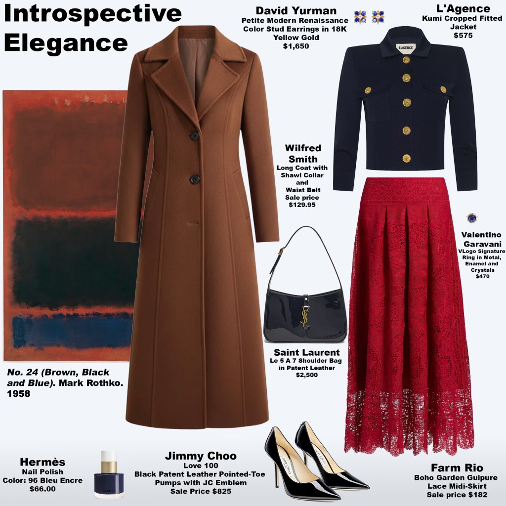
This same sense of introspective harmony carries into the look. The coat mirrors the warmth of the upper field, enveloping and polished, while the skirt reflects the red foundation, anchoring the outfit with structure and presence. Deep navy shades in the top, nail polish, and jewellery echo the contemplative lower field, introducing thoughtful elegance. Black patent leather accessories—handbag and pumps—add definition and subtle joy, their reflective surfaces energising the look and elevating texture without overpowering it.
Psychologically, the combination of warm brown, red, black, and deep navy encourages a reflective, grounded state while simultaneously energising the wearer. Brown and red provide warmth and confidence, black offers stability and clarity, and the deep navy inspires focus and introspection. Together, these hues create an energy that is both self-assured and thoughtful, a kind of quiet power that invites you to pause and consider—how do your own choices and your style influence the way you feel and think?
What makes this look especially compelling is its playful subversion of old rules: brown paired with black, deep navy alongside both. Instead of creating confusion, these combinations add richness, prompting the eye to linger and explore subtle nuance. Navy almost reads as black, encouraging introspection: is this blue or black? Similarly, in our lives, moments of subtle tension or contrast can illuminate depth and perspective. What familiar boundaries in your own wardrobe—or your own thinking—could be gently challenged to create unexpected insight?
Using the same black patent leather accessories from the previous look reinforces continuity while allowing surrounding colours to shift the mood. The result is a look that feels confident, sophisticated, and quietly joyful. It encourages reflection and awareness, inviting you to consider your own personal interplay of warmth, stability, and depth—how the energy of colour, texture, and form can influence your mindset and presence.
Like Rothko’s painting, this ensemble cultivates a sense of balance, intelligence, and introspection. Its energy is warm, composed, and entirely self-possessed—Introspective Elegance is not just a look, but an invitation to reflect, to notice the subtleties of colour, the power of thoughtful style, and to embrace the quiet sophistication that comes from within.
Rediscovering Childhood Colours: A Rothko-Inspired Reflection
Sunday, February 8, 2026
What was your favourite colour as a child?
As a child, many of my friends adored pink and purple. I was a bit different. My favourites had always been pink and yellow—particularly the combination of the two. That pairing felt joyful, expressive, and entirely personal. Seeing Mark Rothko’s White Center (Yellow, Pink and Lavender on Rose) instantly transported me back to that sense of early self—before taste became curated, before preference became influenced. The painting’s layered planes of colour, with warm crimson and muted terra-cotta forming the base and borders, reminded me of my favourite palette and my personality as a little girl. In that sense, the work feels nostalgic—a meditation on how the colours we love as children continue to shape us.
Rothko’s composition is deceptively simple yet emotionally complex. The upper portion holds two blocks separated by a thin black line. A bright, luminous yellow floats above a soft off-white, each subtly informed by the warmth of the crimson base along the borders. The lower half of the painting is a solid expanse of saturated pinks, moving between rosy and violet tones. The base colours along the borders provide visual weight and stability, grounding the composition while emphasizing the vibrancy of the yellow above.
This emotional architecture became the blueprint for the look. A cheerful yellow top mirrors the painting’s upper glow, paired with a satin skirt that appears deep pink with a whisper of violet, shifting with movement like Rothko’s layered colours. A crisp white denim jacket adds clarity and freshness, while black patent leather pumps and a matching handbag anchor the ensemble. The warm crimson and terra-cotta tones from the painting’s borders interrupted the look, so I mirrored them in the nail polish—creating a subtle yet deliberate nod to the foundation of the painting.
Psychologically, this look activates a dynamic interplay of energies. The yellow encourages outward expression, optimism, and joy. The pink-violet of the skirt invites emotional openness, playfulness, and creative exploration. Grounded by black and white, these vibrant colours are stabilized, allowing their energy to be felt fully without overwhelming. The effect is uplifting, reflective, and playful all at once—a gentle invitation to engage with colour on both emotional and visual levels.
I invite you to recall your own real childhood memories—your favourite colours as a child—and look at them anew. Notice how combinations of colours, rather than the shades in isolation, take on a whole different emotion and mood. Just like this painting, just like this look, they can shift perspective, evoke feeling, and inspire play. Perhaps your inner child can begin to explore the colours you loved as a child in a new way, experimenting with them in your style, and bringing back a sense of innocence, joy, and creative freedom into your current wardrobe.
The Intelligence of Colour
Saturday, February 7, 2026
This look draws directly from Mark Rothko’s No. 14, a study in intensity and layering. The painting is framed by a narrow border of deep, earthy brown—the original base of the canvas—which quietly asserts itself beneath the blocks of colour. The top block, expansive and commanding, is a vivid, warm coral with glimpses of the base brown peeking through, while the lower block is a dense, contemplative midnight blue, separated by a thin line of the base brown that maintains cohesion across the composition. The juxtaposition of warmth above and depth below establishes a dynamic tension that is both energizing and grounding.

Translating this into fashion, the look mirrors the painting’s energetic balance. A vibrant coral-orange shirt, paired with matching sling-back heels and nailpolish, carries the expansive, outward-moving energy of the top block—confident, assertive, and stimulating. These pieces are anchored by midnight blue pants, reflecting the grounding quality of the lower block; this deeper tone, combined with a leather jacket in rich, earthy brown and a handbag incorporating the same tonal depth, encourages thoughtful, sophisticated, and grounded communication. The brown stabilizes and frames the midnight blue, allowing it to convey meaning, depth, and composure while supporting the expressive energy of the coral-orange pieces. The effect is a harmonious dialogue between vibrant confidence and measured reflection, where boldness is contained with elegance and intention.
Psychologically, this ensemble evokes a blend of vitality and grounded awareness. The expansive coral energizes and encourages action, while the midnight blue, anchored by the brown, invites reflection, sophistication, and emotional clarity. Together, these energies create a sense of poised authority, where expressive, outward-moving confidence is balanced by depth, intention, and nuanced communication. Like Rothko’s painting, the look engages both perception and feeling: it commands attention, invites reflection, and demonstrates the subtle power of juxtaposition—how warmth and depth, intensity and restraint, can coexist in harmonious tension.
Two Weeks in Colour
Friday, February 6, 2026
As a personal stylist in the fashion industry, I’m drawn to how colour, proportion, and texture shape not only how a look is seen, but how it’s experienced. Over the past two weeks, I’ve been sharing a series of Rothko-inspired looks, using layered colour relationships as a framework for building outfits that are intentional, expressive, and visually compelling. Some of these looks are subtle, others command attention—but all are rooted in how colours interact when placed together.
This is a snapshot of an ongoing exploration, with more looks to come. I’d love to know which of these has resonated with you most, and why—what it made you feel, notice, or see differently in the way colour is used in styling. Fashion, like art, invites both experimentation and awareness, and this series is an open invitation to keep looking, playing, and engaging with colour in new ways.


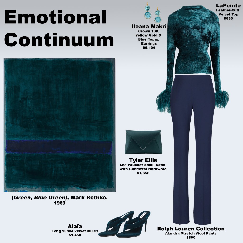


Radiant Foundation: Color, Energy, and Presence
Friday, February 6, 2026
Drawing inspiration from Mark Rothko’s Old Gold Over White (1956), this look translates the painting’s quiet power into fashion. The artwork is built from three horizontal fields: a deep, layered brown dominates the top half, grounding the composition; beneath it, two smaller blocks of white sit atop the original background, allowing the warm glow of coral and pink hues to subtly shine through. Borders in a vibrant coral-red-orange create rhythm and separation, framing the blocks while letting the underlayer emerge, suggesting energy held within restraint.
In this ensemble, the top block’s deep brown inspires a two-toned satin shirt, paired with a brown handbag and pumps. These grounding pieces establish presence and stability, echoing the weight and richness of the painting’s dominant field. The pants mirror the vibrancy of the border, carrying its warmth through the silhouette, with nail polish reinforcing the same tone. A white coat channels the luminescence of the lower blocks, softening the palette and allowing the warm undertones to appear in fleeting glimpses. Yellow gold earrings and a diamond-accented ring punctuate the neutrals, reflecting the painting’s “old gold” title and adding moments of quiet brilliance.
The border’s color leans more toward a warm coral-orange than pure red, stimulating the sacral chakra, associated with creativity, emotional openness, and vitality. Against the browns and whites, it introduces a subtle tension between energy and calm, drawing the eye without overwhelming the composition. Psychologically, the look mirrors Rothko’s layered approach: the browns anchor, the whites illuminate, and the coral-infused accents activate. Each element is intentional, a balance of stability, light, and energy that encourages reflection while maintaining elegance.
“Old Gold Resonance” is more than a color study; it is a meditation on presence, warmth, and layered energy. Like the painting, it asks the viewer—or wearer—to pause, notice, and inhabit the space between weight and light, depth and illumination. The effect is quietly inspiring: a harmonious interplay of colors, textures, and proportions that feels both grounded and luminous.
The Language of Grace at Lambeth Palace
Thursday, February 5, 2026
At Lambeth Palace on February 5, 2026, Princess Catherine appeared alongside Prince William for a conversation with the Archbishop of Canterbury, Dame Sarah Mullally. The setting called for composure rather than display, and her styling reflected a quiet mastery—measured, intelligent, and deeply considered, in harmony with the spiritual and reflective nature of the occasion.

She wore a classically cut brown belted dress, refined in silhouette and assured in tone. The dress grounded the look with warmth and calm authority, offering a sense of stability that felt both elegant and appropriate for a setting shaped by faith and dialogue. Draped over it was a coat whose color resisted immediate definition. At first glance it appeared nearly black; moments later, a deeper complexity emerged. It hovered somewhere between aubergine and charcoal, plum and brown—its undertone subtly shifting with the light and movement.

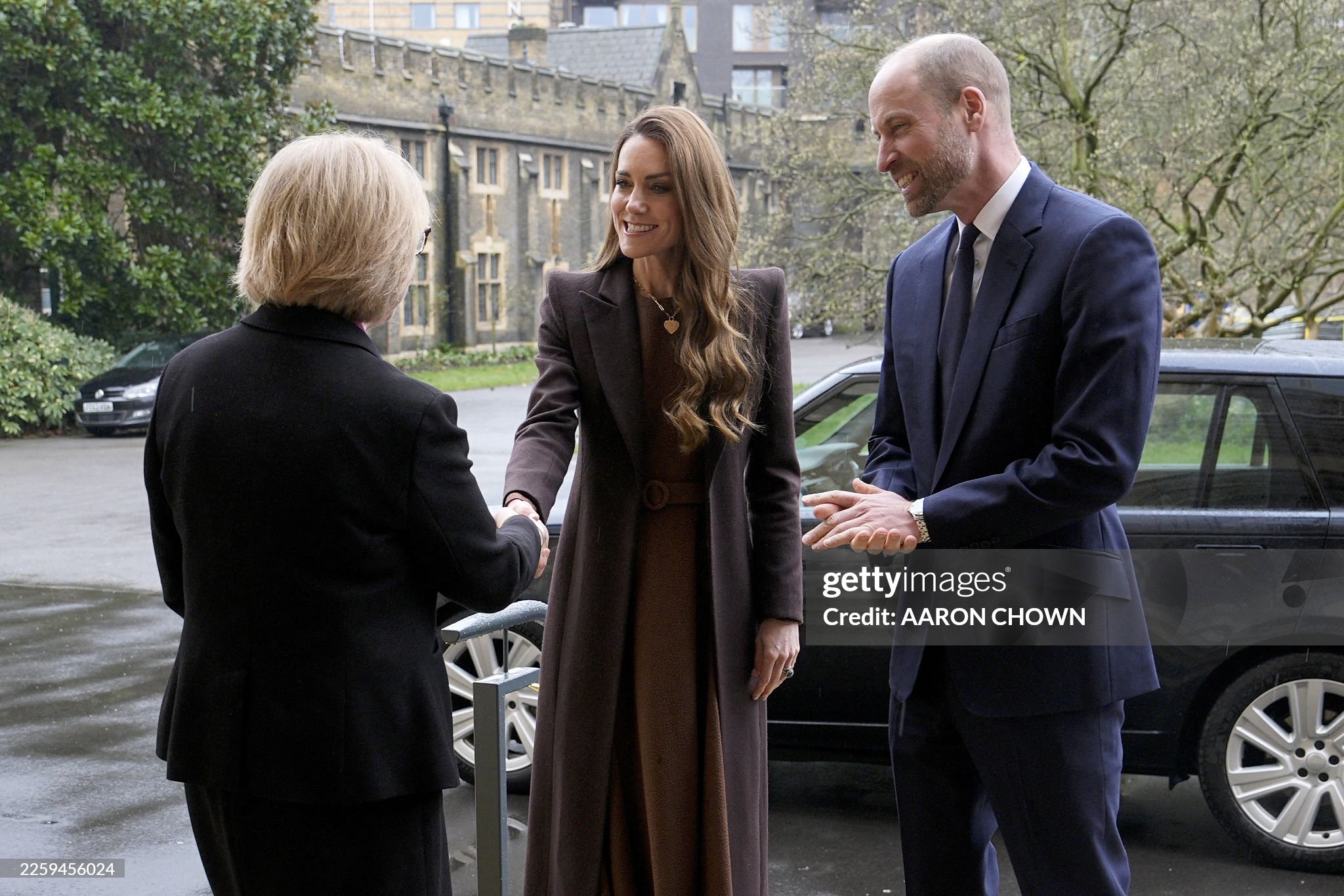
That ambiguity is precisely where the sophistication resides. Much like Mark Rothko’s Purple Brown (1957), the coat operates in a space where color is felt as much as it is seen. Rothko’s work is known for its ability to hold the viewer in a quiet state of attention, and the same visual intelligence was at play here. The tones were grounded, contemplative, and calm, yet what held the eye was not brightness or contrast, but curiosity. The question of what, exactly, am I seeing? invited engagement without demanding it.
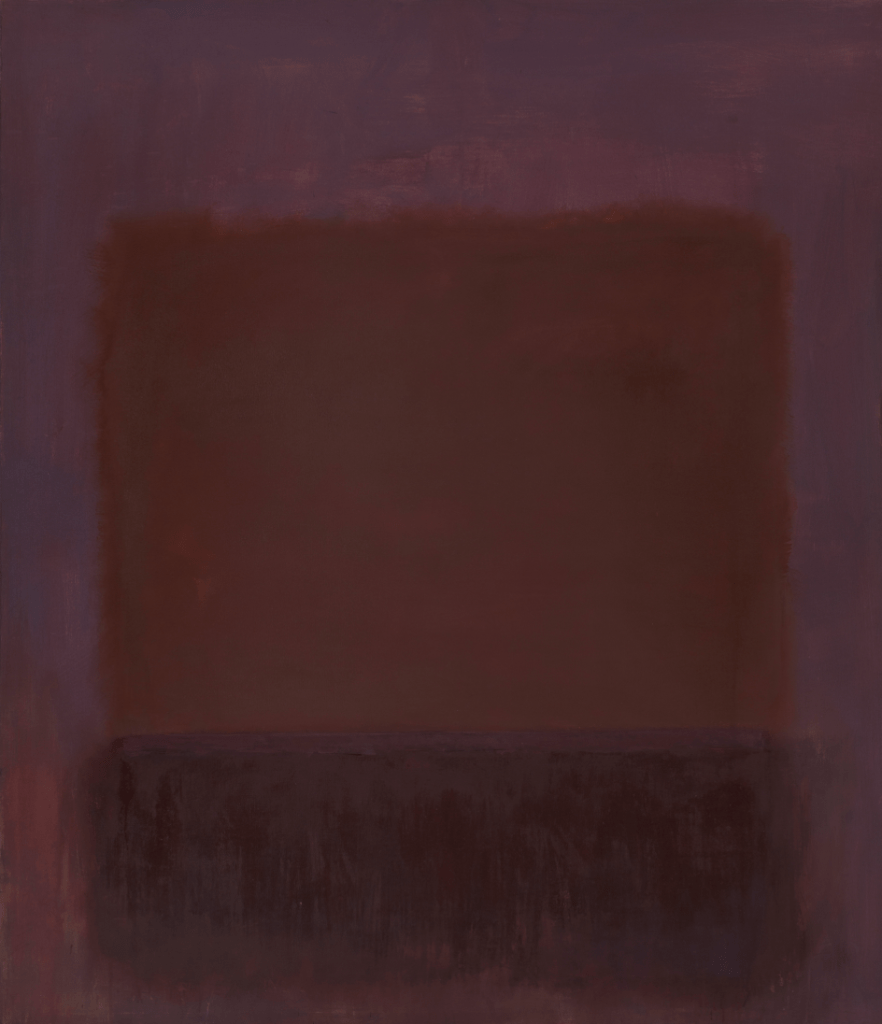

Rather than relying on stark contrast, the palette worked through closeness and restraint. The brown of the dress and the plum-charcoal of the coat sat near one another in depth, creating a subtle tension that felt thoughtful and intentional. The result was a harmony that suggested steadiness, reflection, and grace—qualities closely aligned with the themes of faith and continuity embodied by the setting itself.

What truly illuminated the ensemble was Princess Catherine herself. Her natural radiance—expressed through her smile, her ease, and her quiet confidence—brought light to the darker tones, allowing the look to feel open rather than austere. Her presence animated the palette, softening its depth and giving it warmth. The styling served as a composed frame, allowing her energy to come forward effortlessly.
This is where her approach to dressing consistently resonates. The elegance lies in calibration—in understanding how nuance, restraint, and beauty can communicate meaning without excess. In a space devoted to reflection and moral clarity, her look spoke in the same language: grounded, luminous, and guided by faith in understatement.
Where Instinct Meets Awareness
Thursday, February 5, 2026
This look enters into a psychological conversation with Mark Rothko’s Untitled (1953) through composition rather than quotation. The painting is defined by a quiet gray perimeter that encloses two stacked fields and a sudden, luminous interruption near the base. Color does not function decoratively; it operates relationally. Each zone alters the way the others are perceived, encouraging the viewer to move slowly, to register nuance, and to remain open to uncertainty. The styling adopts this same logic, allowing structure and proximity to guide emotional response.

At the center of the look is the dress, which operates as a single, charged field despite its split composition. One side carries softened violet and rose tones, complex and layered, while the other moves decisively into orange and warm peach. Together, they create a dynamic tension that mirrors the painting’s upper and lower gestures. Violet activates the crown chakra, associated with awareness, perception, and reflective intelligence. Orange activates the sacral chakra, the center of creativity, desire, and embodied vitality. The leopard murena-style print amplifies this dialogue, introducing an almost primal appeal that heightens instinct and movement. Yet because the two chromatic energies are held within one garment, neither dominates. The result is a dress that feels simultaneously visceral and cerebral—desire informed by thought, instinct sharpened by awareness.
This intensity is deliberately moderated by the outer layers. The coat, handbag, and pumps are rendered in deep, earthen browns that echo the painting’s dense lower field. These tones absorb light and weight the composition, cooling the heat of the dress without suppressing it. They introduce discipline, structure, and authority—qualities that prevent the look from tipping into excess. Where the dress activates, the outerwear stabilizes. Where the dress moves, the tailoring holds. This interplay mirrors Rothko’s use of grounding fields to contain emotional charge rather than release it unchecked.
A thin band of orange in the painting—pressed just above the lower edge—finds its conceptual echo in the dress’s warmer side, while the gray nail polish quietly references the painting’s perimeter. Gray here is not warmth but composure: a neutral pause that allows color to resonate without interference. Yellow gold jewelry set with diamonds introduces clarity and continuity, catching light without sparkle-driven distraction. These details reinforce restraint, ensuring that even moments of brightness remain intentional.
Ultimately, this look operates as an exercise in integrated perception. Like Rothko’s painting, it does not ask the viewer to choose between instinct and intellect, heat and control, body and mind. Instead, it stages their coexistence. The sacral and crown chakras do not compete here; they collaborate. The viewer is left not with a conclusion, but with an awareness of how power often emerges—not from singular intensity, but from balance held under tension.
Between What We See and What We Assume
Thursday, February 5, 2026
Rothko’s Purple Brown invites contemplation through ambiguity rather than disruption. Its composition is defined by a three-sided field—present on the sides and top but open at the bottom—within which two stacked blocks quietly reside. A warmer, lighter brown hovers above a darker, near-black brown that rests directly on the bottom edge. The enclosing violet-toned field does not overpower these blocks; instead, it reframes them. What appears stable at first glance begins to soften under prolonged looking. The viewer is not destabilized but gently prompted to reconsider what they thought they knew about the colors before them.

That same logic governs the look. Everything within it is brown—layered, tonal, and grounded—except for two deliberate points of clarity: the shirt and the nail polish. These alone carry a true violet tone, cool and restrained, closely aligned with the atmospheric enclosure of Rothko’s painting. Rather than functioning as accents, they operate as perceptual cues, quietly establishing a reference point that influences how everything else is seen.
Because of this proximity, the browns begin to question themselves. The jacket and the pumps, undeniably brown in isolation, start to hover between identities when worn alongside violet. The eye hesitates. Are these pieces truly brown, or are they registering as violet because of what surrounds and hovers above them? The same uncertainty unfolds in the painting, where the lighter brown block, suspended above the darker one and bordered by violet, invites the viewer to wonder whether it is brown at all—or whether it is drifting toward purple through association.
This perceptual hesitation is where the crown chakra becomes active. The crown chakra governs awareness beyond fixed categories, encouraging observation without immediate conclusion. Traditionally associated with violet, it does not require saturation to function. Here, it operates through relationship. The browns ground the experience in the physical and material, while the violet introduces reflection, subtle elevation, and cognitive openness. Together, they create a state of inquiry rather than declaration.
The effect on the viewer is a quiet mental recalibration. Like Rothko’s painting, the look does not announce its meaning; it asks the viewer to notice how meaning shifts depending on context. Color becomes relational rather than absolute. The question—is it brown, or is it violet?—is never fully answered, and that is precisely the point. The look encourages the viewer to remain with uncertainty, discovering that clarity does not always come from resolution, but from sustained attention.
Harnessing Vitality: A Rothko-Inspired Exploration of Grounding and Creativity
Wednesday, February 4, 2026
This look draws inspiration from Mark Rothko’s Orange, Red, Yellow (1961), a composition defined by warm, layered color blocks that feel both expansive and meditative. The painting opens with a very narrow top horizontal block in camel, tinged with darker undertones. Beneath it, a broad middle block of orange stretches twice the height of the top band, while the bottom block, also orange and much larger, dominates more than half the canvas. Framing the entire composition is a subtle border of light and dark reds. One detail invites reflection: can you find the yellow? Perhaps it emerges where red blends with yellow—creating the camel at the top and the rich orange below—depending on the balance of tones Rothko layered.
Translating this into a wearable palette, the look features a camel-colored shirt paired with a matching handbag and anchored by a brown cropped coat, tying the ensemble together. Brown grounds the outfit in earth and material reality—craft, texture, and longevity—reinforcing a sense of stability while remaining visually compelling. Garnet earrings and a coordinating ring set in yellow gold with diamonds extend root chakra energy, promoting presence, grounding, and a confident connection to the body. Red pumps and matching nail polish continue this root activation, linking the wearer’s stability to a subtle yet potent energy flow.
The orange pants mirror the painting’s expansive middle and bottom blocks, activating sacral chakra energy. This energy supports creativity, vitality, and self-expression, offering a dynamic contrast to the grounding influence of the browns and reds. Together, the tonal dialogue between camel, brown, red, and orange creates a layered energy circuit: grounded, yet expressive; stable, yet vibrant.
Vital Current embodies Rothko’s exploration of color and energy, translating the artist’s meditative, layered palette into a look that balances rooted stability with creative vitality—clothing as both statement and energetic practice.
Princess Catherine Channels 1960s Elegance in Retro Tapestry Coat
Wednesday, February 4, 2026
Princess Catherine embraced the refined spirit of the 1960s in a striking retro coat during her visit to Melin Tregwynt, a historic Welsh wool mill. Crafted from authentic 1960s Welsh tapestry fabric, the coat features a geometric, repeated pattern in warm red, orange, and soft gray tones. Red activates the root chakra, fostering grounding and stability, while orange energizes the sacral chakra, inspiring creativity, vitality, and confidence. Gray introduces a sense of calm and sophistication, providing visual balance and allowing the vibrant warm tones to stand out while reflecting subtlety, restraint, and timeless elegance. Together, these hues form a harmonious palette that balances strength, energy, and measured expressiveness.

The coat reflects the 1960s aesthetic through its structured tailoring, proportion, and compositional restraint. Rather than relying on embellishment, the pattern and fabric itself carry the character of the piece, expressing the era’s focus on thoughtful construction, quality materials, and a self-assured modernity. This approach to design emphasizes intentionality: every element of the coat, from its repeated motifs to its color story, communicates style without needing extra adornment.


Princess Catherine paired the coat with a gray turtleneck and tailored gray trousers, letting the tapestry piece remain the centerpiece of the ensemble. The muted layers underneath provide a quiet backdrop, allowing the colors and pattern of the coat to resonate fully and the chakra energy of the palette to come through.
Her visit to Melin Tregwynt highlighted the connection between heritage craft and contemporary style. The mill’s tradition of weaving high-quality Welsh wool echoes the coat’s meticulous construction, celebrating longevity, skill, and the artistry behind each garment. By choosing a piece with historical and cultural resonance, Princess Catherine demonstrates how vintage clothing can convey elegance, confidence, and a sense of continuity with the past.
With its geometric pattern, a palette of warm red and orange softened by neutral gray, and 1960s-inspired design, Princess Catherine’s coat harmonizes color, form, and heritage, creating a look that is composed, confident, and timelessly elegant.
Speaking in Color: Green, Blue, and the Art of Expressing from the Heart
Wednesday, February 4, 2026
Inspired by Mark Rothko’s Untitled (Green Divided by Blue) (1968), this look treats the painting as a guide rather than a directive. Rothko’s composition is built from horizontal blocks: a green field at the top, a narrow divided band of darker sky blue at the center, and a larger green block anchoring the bottom—within which lighter blue subtly emerges along the edges and peaks through the 3 blocks. When drawing from artwork, precision of hue is not the point. Color functions as emotional instruction, not a formula to replicate exactly. What matters is the relationship between tones, their placement, and the psychological or energetic dialogue they create.

The painting’s central tension—green held apart and connected by blue—translates here into an exploration of communication guided by empathy. Blue, particularly when worn as denim, immediately activates the throat chakra. Denim carries an inherent ease; it is familiar, unguarded, and relaxed, encouraging honesty without performance. In this look, a belted denim jacket serves as the upper anchor. Though elevated with gold details and sharper tailoring, it retains denim’s intrinsic softness, activating the throat chakra’s core themes: truthful communication, self-expression, integrity, and alignment between what is felt internally and what is spoken outwardly. Throat chakra energy isn’t about volume or dominance—it’s about clarity, confidence, and the ability to articulate truth without contraction or apology.
The rest of the look unfolds as a single, cohesive composition. Light mint-green pants and matching pumps echo the painting’s green fields, while a coordinating green handbag reinforces the palette. Green activates the heart chakra, governing compassion, emotional openness, and love expressed without defensiveness. In combination with the throat chakra’s blue, this creates communication that originates from the heart rather than the ego—speech that is both honest and kind. The nail polish introduces a blue closely aligned with the painting’s narrow central stripe, functioning as a subtle dividing note that mirrors Rothko’s “pause” between color fields. Blue gemstone earrings and a matching ring, set in yellow gold and diamonds, amplify this dialogue: blue strengthens clarity and expression, while gold and diamonds act as conduits—stabilizing, refining, and elevating the energetic exchange.
Together, the look mirrors Rothko’s quiet complexity. Green and blue are not in opposition but in conversation—emotion and expression working in tandem. The result is an outfit that encourages speaking from the heart with confidence, where compassion does not dilute truth, and truth does not eclipse care. Like the painting itself, the power lies not in excess, but in balance—subtle divisions that ultimately create alignment.
Horizons of Voice
Tuesday, February 3, 2026
Inspired by Mark Rothko’s Untitled (Yellow and Blue) (1954), this look translates the painting’s three horizontal color blocks into a study of confident communication. Rothko’s composition is direct and deliberate: a broad yellow field at the top, an almost equally sized blue block beneath it, and a smaller yellow block anchoring the bottom. The stacked horizontal structure allows color to convey meaning through placement rather than ornamentation, guiding how energy flows across the canvas.
The yellow top and matching pumps correspond to the painting’s upper and lower yellow blocks, activating solar plexus energy—the center of confidence, will, and self-definition. The blue skirt mirrors the central blue block, occupying the middle of the look just as it does on the canvas and aligning with the throat chakra, the energetic center of communication, truth, and expression. Together, these colors create a dialogue between inner power and outward articulation: yellow signals assurance and self-possession that originates from within, while blue translates that confidence into steady, composed, and emotionally regulated expression. The interplay between solar plexus and throat energies is what gives the look its authority—confidence without expression remains contained, while expression without grounding lacks force. Combined, they create speech and presence that are clear, intentional, and self-possessed.
Above the blue block in Rothko’s painting, a narrow strip of white, so thin it can easily be missed, sharpens the relationship between yellow and blue. This interval functions as a pause, a moment of clarity before expression. The white handbag mirrors this subtle but deliberate detail, representing discernment and the intention that precedes communication.
The jewelry adds depth rather than brightness. Black rhodium–plated 18K white gold set with 5.30 TCW diamonds introduces weight and restraint, grounding the luminosity of the yellow and blue. The matte darkness of the metal offsets brilliance, emphasizing that true authority does not rely on shine alone, but on balance and intention.
Like Rothko’s painting, the look communicates through proportion, alignment, and quiet power. Each horizontal block holds its place, creating a visual and energetic equilibrium where confidence and communication coexist—restrained, intentional, and unmistakably present. The result is a look that activates solar plexus and throat chakras in harmony, teaching that authority is not claimed through volume, but through alignment of energy, intention, and expression.
Between Words: Dressing the Throat Chakra
Tuesday, February 3, 2026
Inspired by Untitled, Blue Divided by Blue (1966), this look explores how subtle variations within a single color can become a language of truth. Rothko’s late work is not about contrast in the traditional sense, but about division, pause, and calibration—how one shade of blue can speak differently from another depending on placement, weight, and edge. The painting’s horizontal division creates a quiet tension: not separation, but articulation. That same principle guides the construction of this look.

The look uses a spectrum of blues to articulate throat chakra energy as a complete system of truthful expression. A clear, resonant blue at the top activates the center of honest communication, while the blue denim skirt mirrors Rothko’s central division, acting as a hinge where inner knowing becomes lived articulation. Light blue outerwear and the handbag echo the painting’s border, functioning as containment rather than decoration—holding the energy steady and reflecting emotional regulation in communication. Teal pumps reference the upper and lower fields of the composition, adding tonal depth and a note of compassion, while blue nail polish bridges the border and center as a subtle transitional cue. Blue topaz earrings and a matching ring amplify clarity and confidence, completing a continuous flow of blue frequencies that emphasizes not just speaking truth, but carrying it with intention, tone, and emotional intelligence.
Like Rothko’s painting, the look does not rely on contrast to make its point. Instead, it trusts variation, restraint, and repetition. The result is an outfit that doesn’t shout, but resonates—activating the throat chakra not through excess, but through alignment. It is a study in speaking clearly, holding space, and allowing truth to move through the body with calm authority.
Articulating Intuition: Dressing the Space Between Seeing and Saying
Monday, February 2, 2026
Inspired by Mark Rothko’s No. 61 (Rust and Blue) (1953), this look continues an ongoing exploration of how a single painting can generate multiple, distinct visual interpretations. Rothko’s work makes clear that color is never singular. His fields are built in layers—veils of pigment where secondary hues quietly emerge beneath the dominant tone. What we see first is rarely the whole story. Styling from this perspective becomes an act of discernment: choosing which hue to bring forward, which frequency to embody.
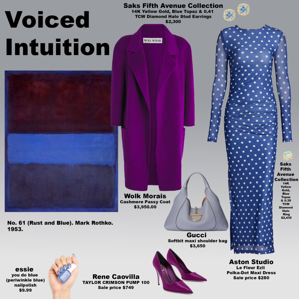
At first glance, the dress reads as blue—but linger a moment longer and the question opens. Is it truly blue, or is it indigo? Perhaps it is both. That ambiguity is precisely where its power lies. Indigo-blue sits at the intersection of the throat chakra and the third eye chakra, activating both honest communication and intuitive perception. Together, these chakras govern not only what we see and sense, but whether we trust ourselves enough to articulate it. This look speaks directly to that relationship: the courage to give voice to inner knowing.
How often do we receive a hunch, a quiet intuitive hit, and dismiss it—afraid of sounding foolish, dramatic, or wrong? This dress encourages the opposite. It supports clear, grounded communication about subtle perception. Throat chakra energy here isn’t performative or loud; it is precise. It asks for alignment between intuition and expression, creating space to say what you sense without apology.
The coat and pumps introduce a strong violet hue, activating crown chakra energy—the center of higher awareness, trust, and expanded understanding. Violet doesn’t override the intuition; it stabilizes it. Crown chakra activation brings confidence in what has been received, reinforcing the idea that intuition is not guesswork, but information. This layer strengthens the wearer’s ability to stand behind their knowing and speak from a place of clarity rather than doubt.
The handbag, rendered in a muted blue-lavender gray, functions as a mediator. Its calming tone bridges the throat and crown chakras, ensuring that communication remains composed, measured, and effective. It tempers intensity, allowing insight to be delivered with ease and grace rather than urgency.
Finally, the blue topaz earrings and ring—set in yellow gold and diamonds—act as energetic conduits. Blue topaz amplifies truthful expression, while gold and diamond elements conduct and refine that energy, helping intuition move cleanly from perception to speech. Together, they support the articulation of inner wisdom in a way that feels confident, luminous, and grounded.
Like Rothko’s No. 61, this look isn’t about certainty at first glance. It’s about layers, nuance, and trust—an invitation to notice what emerges when you stay with color long enough, and to speak what you know once it does.
Rooted Speech
Monday, February 2, 2026
This look takes its structural logic from Mark Rothko’s Blue, Orange, and Red (1961), treating color not as decoration but as an energetic architecture. Rothko’s work offers a framework rather than a formula—an invitation to translate emotional relationships between colors rather than replicate them literally. In styling, this means allowing color to guide sensation, meaning, and embodiment, even when the palette shifts across materials and contexts.
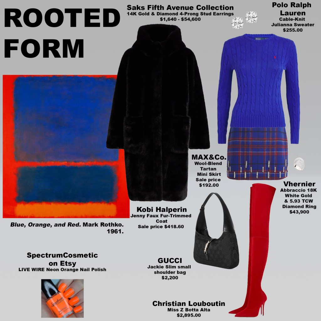
The blue at the top of the composition activates the throat chakra, the center of honest communication and self-expression. Here, blue establishes clarity and integrity—an alignment between what is felt internally and what is articulated outwardly. Throat chakra energy is not simply about speaking; it is about coherence. The blue sets that coherence at the outset and carries it through the body, uninterrupted and intentional.
The skirt’s blue-and-red tartan introduces a dialogue between the throat and root chakras. Red grounds the look in the root chakra—ancestry, belonging, physical presence, and survival—while blue ensures that this grounding remains conscious rather than purely instinctual. Together, they suggest communication that is embodied, historically aware, and emotionally anchored. The red boots intensify this foundation, reinforcing stability and confidence without aggression. The root chakra here is steady and protective, offering assurance rather than force.
Black appears in the coat and handbag as a necessary neutral—absent from Rothko’s canvas but essential to the translation. Rather than diluting the palette, black sharpens it, providing containment so the color relationships can register with greater clarity. It allows the energetic elements to remain legible, composed, and deliberate.

Orange, the final element, resisted overt placement within the garments themselves. Instead, it appears with precision through an orange manicure, activating sacral chakra energy—creativity, sensuality, and vitality—in a restrained but intentional way. This mirrors Rothko’s restraint: energy does not need to dominate the frame to be felt. When the look came together, it carried an unexpected emotional resonance. With the coat layered over the tartan and paired with the boots, the silhouette recalled the MacGregor Rob Roy tartan of my own ancestry. The interplay of blues and reds echoed the MacGregor Glengyle (Deeside) tartan, creating a visual lineage that felt both personal and embodied. The grounding was not only energetic, but ancestral—color functioning as memory, identity, and inherited visual language.

Like Rothko’s painting, the look resolves not through exactitude, but through balance: voice and body, expression and foundation, past and present—held together in quiet equilibrium.
Vermilion at Your Fingertips
Monday, February 2, 2026
Art can serve as a guide without demanding literal translation. The power of a Rothko painting isn’t in matching exact hues, but in responding to its emotional architecture. Inspired by Blue over Red (1953), I chose interpretation over imitation. Rather than replicating Rothko’s saturated blue, I grounded the look in classic blue jeans—an accessible, lived-in blue that still carries the same psychological weight. Blue here becomes communicative rather than atmospheric, activating throat chakra energy and signaling honesty, expression, and the willingness to speak about desire, confidence, and creativity rather than merely feel them.

The warmth of the painting is translated through the body: an orange bodysuit anchors the look in sacral chakra energy—sexuality, creativity, pleasure—while mule sandals that sit between yellow and orange bridge directly into the solar plexus. Yellow diamond earrings and a matching ring amplify this register, reinforcing themes of confidence, self-worth, and personal radiance. Gold accessories—the belt and handbag—extend this energy further, acting as conductive elements that allow sacral and solar plexus energies to circulate fluidly through the look rather than remain isolated.
To temper the heat, a neutral faux-fur bolero rests over the bodysuit. Though absent from the painting itself, this layer plays a crucial stabilizing role. It softens the intensity of the palette, providing containment so the energy reads as magnetic rather than overwhelming. This is a reminder that balance often requires elements not explicitly present in the source material—restraint can be just as intentional as saturation.
The final challenge was vermilion. I experimented with shoes and handbags, but the color disrupted the flow every time. The solution arrived quietly: vermilion nail polish. A manicure and pedicure became the ideal placement—deliberate, contained, and expressive without overpowering the system. It’s a styling lesson worth remembering: if you want to introduce contrast or emphasis without breaking harmony, nail color is often the most elegant solution.
Together, the look allows sacral and solar plexus energies to move in tandem—desire supporting confidence, creativity reinforcing self-belief—while blue grounds the entire composition in truthful expression. This is not about spectacle, but circulation: energy moving cleanly through the body, articulated through color, texture, and thoughtful restraint.
The Psychology of Orange Desire
Sunday, February 1, 2026
Mark Rothko’s Orange and Yellow is often described in terms of optimism and warmth, but to stop there is to miss its deeper charge. The painting operates at a visceral level, where color bypasses language and speaks directly to the body. In this work, orange dominates not as decoration, but as activation—a frequency tied to desire, creativity, and emotional movement.

Orange is the color of the sacral chakra, the energetic center associated with sexuality, pleasure, intimacy, and creative flow. It governs how we experience attraction, how freely we express desire, and how safe we feel inhabiting our sensual selves. In Rothko’s canvas, the orange field doesn’t sit politely beneath the yellow—it radiates upward, as if stirring something awake. It feels alive, almost restless, charged with feeling rather than meaning.
The yellow above it introduces a different register of energy: the solar plexus chakra, which rules confidence, self-worth, and personal power. Yellow is where desire gains direction. Where orange says I feel, yellow says I choose. Together, these colors mirror the emotional arc of early love—the flutter of attraction grounded by a growing sense of self.
This dialogue between sacral and solar plexus energy informed the look. An orange turtleneck paired with orange sandals creates a continuous current of heat and confidence, while citrine earrings and a matching ring amplify the solar quality of joy, clarity, and abundance. Citrine, long associated with personal power and optimism, reinforces the upward movement of energy—desire becoming self-assured expression. The effect is intentionally bold. As you can see, orange carries a tremendous amount of energy; it is not a passive color, and it does not whisper.
That intensity is precisely why restraint matters. Although beige appears nowhere in Rothko’s painting, a beige jacket and handbag were essential here. More orange would have tipped the look into sensory overload. Beige acts as a visual exhale—a neutral pause that allows the sacral energy to remain potent rather than overwhelming. It grounds the heat without extinguishing it.
The yellow skirt completes the composition. As a solar plexus color, yellow introduces lightness, confidence, and movement. When paired with orange, it creates a buoyant, almost weightless feeling—what can only be described as butterfly energy. That sensation of being slightly unsteady, slightly radiant, when you’re on the edge of something emotional. When you’re in love, or about to be.
With Valentine’s Day just around the corner, most people instinctively reach for red or pink—colors of romance, yes, but also expectation and performance. Orange offers an alternative. It activates the sacral chakra rather than signaling love outwardly. It’s less about being seen as desirable and more about feeling alive, creative, and open to connection. This year, instead of dressing for the gaze, consider dressing for your energy. Orange doesn’t ask for approval—it invites experience.
Full Moon in Leo: Dressing Your Emotional Self
Sunday, February 1, 2026
February 1, 2026, marks a full moon in Leo, a luminous moment for reflection, creativity, and self-expression. Most people focus primarily on their Sun sign—the zodiac that represents your core identity, ego, and outward personality—the traits you project into the world. But astrology is layered: your rising sign functions like the “front door” of your chart, the persona you present to others and the lens through which the world first sees you. Your Moon sign, on the other hand, is like your living room: the space where you feel safe, express yourself freely, and process emotions. It governs your instincts, emotional habits, and how you respond to others on a deep, subconscious level.
For romance and intimate connection, the Moon is key. Your Moon sign reveals what makes you feel secure, how you nurture and are nurtured, and your instinctual “emotional language” in relationships. Partners whose Moon signs are compatible often understand each other without words—they intuitively “get” each other’s moods, rhythms, and needs. Even when Sun signs clash, harmonious Moon pairings can create a nurturing and emotionally satisfying bond. The practical takeaway: Moon compatibility is about feeling at home emotionally, and this alignment often matters more than outward personality for long-term relational fulfillment.
In honor of Valentine’s Day and the Leo full moon’s radiant energy, I created a look inspired by Mark Rothko’s Untitled (1955). The painting features a dark orange border framing a top block of transparent sage over olive green and a bottom block of bright orange—a composition that mirrors both grounding and expansive energy. In the outfit, head-to-toe green activates the heart chakra, fostering love, compassion, and emotional openness. The net embroidery cardigan in sage green channels subtle transparency and layered depth, while the olive green pants, mules, and bag root the look in stability and presence. Beneath the cardigan, a deep orange bralette and bright orange jewels in earrings and ring awaken the sacral chakra, stimulating sexuality, creative vitality, and emotional fluidity.
Just as Rothko’s painting balances the intensity of warm and cool colors, the outfit balances the heart and sacral energies. Green correspond to love and openness, creating a nurturing, receptive space, while the orange elements anchor pleasure, desire, and emotional courage. The layered textures—netting over solid fabric—mirror the painting’s interplay of transparency and depth, reflecting how emotions move between conscious and subconscious expression. Together, the colors and textures activate a full spectrum of Moon-centered energy, enhancing self-awareness, romantic receptivity, and emotional alignment.
This Leo full moon invites you to inhabit your living room fully: to express your feelings, honor your emotional needs, and shine with both passion and presence. Through both astrology and fashion, we can celebrate our Moon sign energy, creating spaces and styles that nourish the inner self while radiating outward confidence. Whether in love or self-reflection, this is a moment to dress the emotional self, aligning chakras, Moon energy, and personal style in one harmonious, luminous expression.
Moon compatibility isn’t about perfection — it’s about emotional fluency.
The best Moon pairings feel inhabitable: emotionally safe, intuitive, and regulating.
This is why Moon sign alignment often predicts romantic longevity better than Sun signs.
Complete Moon Sign Compatibility (Emotional Dynamics)
Aries Moon + Moon in…
- Aries: Passionate, reactive, exciting; emotions flare quickly, cool quickly.
- Taurus: Aries pushes, Taurus resists; desire vs. security tension.
- Gemini: Fast emotional pacing; stimulating but inconsistent.
- Cancer: Aries feels smothered, Cancer feels unsafe.
- Leo: Warm, expressive, mutually energizing.
- Virgo: Aries feels critiqued; Virgo feels overwhelmed.
- Libra: Chemistry with emotional negotiation; balance required.
- Scorpio: Power struggles; intense attraction, volatile emotions.
- Sagittarius: Playful, adventurous, emotionally liberating.
- Capricorn: Aries feels restricted; Capricorn feels destabilized.
- Aquarius: Exciting, independent, emotionally non-clinging.
- Pisces: Aries feels confused; Pisces feels emotionally overrun.
Taurus Moon + Moon in…
- Aries: Too rushed vs. too rooted.
- Taurus: Deep comfort, shared rhythms, emotionally steady.
- Gemini: Taurus wants consistency; Gemini needs variety.
- Cancer: Very nurturing, emotionally safe pairing.
- Leo: Competing needs for control and attention.
- Virgo: Grounded, supportive, quietly devoted.
- Libra: Romantic but slow to emotionally synchronize.
- Scorpio: Intense, loyal, deeply bonded—but possessive.
- Sagittarius: Taurus wants permanence; Sag wants freedom.
- Capricorn: Stable, dependable, long-term oriented.
- Aquarius: Taurus craves closeness; Aquarius needs space.
- Pisces: Gentle, romantic, emotionally soothing.
Gemini Moon + Moon in…
- Aries: Energetic, stimulating, emotionally light.
- Taurus: Gemini feels constrained; Taurus feels unsettled.
- Gemini: Talkative, mentally bonded, emotionally evasive.
- Cancer: Gemini intellectualizes; Cancer feels deeply.
- Leo: Playful, expressive, socially vibrant.
- Virgo: Overthinking meets restlessness.
- Libra: Harmonious, communicative, emotionally balanced.
- Scorpio: Gemini feels probed; Scorpio feels dismissed.
- Sagittarius: Curious, adventurous, emotionally non-attached.
- Capricorn: Gemini feels restricted; Capricorn feels immature.
- Aquarius: Strong mental and emotional rapport.
- Pisces: Gemini feels foggy; Pisces feels unseen.
Cancer Moon + Moon in…
- Aries: Too abrupt vs. too sensitive.
- Taurus: Safe, nurturing, emotionally consistent.
- Gemini: Cancer feels emotionally unmet.
- Cancer: Deeply bonded, home-centered, emotionally fused.
- Leo: Warm but emotionally mismatched needs.
- Virgo: Practical care meets emotional depth.
- Libra: Cancer needs depth; Libra prefers balance.
- Scorpio: Powerful emotional intimacy, high trust.
- Sagittarius: Cancer feels abandoned; Sag feels confined.
- Capricorn: Complementary opposites; security through structure.
- Aquarius: Cancer feels emotionally ignored.
- Pisces: Deep empathy, emotional understanding.
Leo Moon + Moon in…
- Aries: Passionate, expressive, emotionally bold.
- Taurus: Power struggles around needs and attention.
- Gemini: Playful, social, emotionally affirming.
- Cancer: Leo wants admiration; Cancer wants security.
- Leo: Warm, generous, emotionally dramatic.
- Virgo: Leo feels judged; Virgo feels overwhelmed.
- Libra: Socially and emotionally harmonious.
- Scorpio: Intense emotional standoffs.
- Sagittarius: Joyful, expressive, emotionally freeing.
- Capricorn: Leo feels unsupported emotionally.
- Aquarius: Magnetism with emotional detachment.
- Pisces: Leo leads, Pisces absorbs.
Virgo Moon + Moon in…
- Aries: Too impulsive vs. too cautious.
- Taurus: Stable, emotionally supportive.
- Gemini: Mental mismatch emotionally.
- Cancer: Nurturing with structure.
- Leo: Virgo feels overlooked; Leo feels critiqued.
- Virgo: Quiet, service-oriented, emotionally reserved.
- Libra: Polite but emotionally distant.
- Scorpio: Depth meets discernment—powerful bond.
- Sagittarius: Virgo needs order; Sag resists it.
- Capricorn: Highly compatible, secure.
- Aquarius: Emotional logic clash.
- Pisces: Virgo grounds Pisces; Pisces softens Virgo.
Libra Moon + Moon in…
- Aries: Push-pull emotional dynamics.
- Taurus: Romantic but emotionally slow.
- Gemini: Easy, communicative bond.
- Cancer: Libra avoids emotional intensity.
- Leo: Expressive, socially aligned.
- Virgo: Emotionally restrained.
- Libra: Harmonious, balanced, relationship-focused.
- Scorpio: Emotional tension beneath charm.
- Sagittarius: Light, social, emotionally fluid.
- Capricorn: Different emotional priorities.
- Aquarius: Strong intellectual-emotional rapport.
- Pisces: Libra feels overwhelmed emotionally.
Scorpio Moon + Moon in…
- Aries: Combative emotional energy.
- Taurus: Magnetic, deeply bonded.
- Gemini: Scorpio wants depth; Gemini skims.
- Cancer: Profound emotional intimacy.
- Leo: Power struggles.
- Virgo: Grounded emotional depth.
- Libra: Polite surface, deep undercurrents.
- Scorpio: Intense, loyal, consuming.
- Sagittarius: Scorpio feels unsafe.
- Capricorn: Strong emotional containment.
- Aquarius: Emotional disconnect.
- Pisces: Soul-level emotional bond.
Sagittarius Moon + Moon in…
- Aries: Energetic, emotionally freeing.
- Taurus: Sag feels stuck.
- Gemini: Curious, restless bond.
- Cancer: Emotional needs mismatch.
- Leo: Joyful, expressive.
- Virgo: Too structured for Sag.
- Libra: Social, optimistic.
- Scorpio: Emotional mistrust.
- Sagittarius: Independent, adventurous.
- Capricorn: Restrictive emotionally.
- Aquarius: Free-spirited alignment.
- Pisces: Emotionally confusing.
Capricorn Moon + Moon in…
- Aries: Emotional impatience vs. restraint.
- Taurus: Secure, stable.
- Gemini: Emotional immaturity perceived.
- Cancer: Opposites that complete each other.
- Leo: Capricorn withholds validation.
- Virgo: Highly compatible.
- Libra: Emotional distance.
- Scorpio: Powerful emotional control.
- Sagittarius: Conflicting priorities.
- Capricorn: Emotionally reserved but loyal.
- Aquarius: Emotionally detached pairing.
- Pisces: Pisces softens Capricorn.
Aquarius Moon + Moon in…
- Aries: Exciting emotional freedom.
- Taurus: Taurus feels disconnected.
- Gemini: Mentally and emotionally aligned.
- Cancer: Cancer feels emotionally abandoned.
- Leo: Attraction with emotional distance.
- Virgo: Logical mismatch.
- Libra: Balanced and intellectual.
- Scorpio: Emotional power struggle.
- Sagittarius: Free and expansive.
- Capricorn: Cool, emotionally contained.
- Aquarius: Independent, emotionally non-traditional.
- Pisces: Aquarius feels overwhelmed.
Pisces Moon + Moon in…
- Aries: Pisces feels overpowered.
- Taurus: Safe, romantic.
- Gemini: Emotional misunderstanding.
- Cancer: Deep empathy.
- Leo: Pisces admires, Leo leads.
- Virgo: Healing but critical tension.
- Libra: Pisces wants depth.
- Scorpio: Soul-bond level intimacy.
- Sagittarius: Pisces feels abandoned.
- Capricorn: Grounding but distant.
- Aquarius: Emotional disconnect.
- Pisces: Dreamy, emotionally merged.
Reading Between Indigo and Violet: Dressing the Threshold of Perception
Saturday, January 31, 2026
Mark Rothko’s Untitled (Purple, White, and Red) (1953) operates as a study in perceptual discernment rather than pure abstraction. Its stacked fields of color—softly edged and internally luminous—invite the viewer into a quiet interrogation: can you feel the difference between indigo and violet? In chakra terms, this is the difference between the third eye, which interprets and perceives, and the crown, which receives and knows. Rothko’s upper field, where the two hues subtly merge, mirrors how often intuition and higher knowing are conflated, even though they originate from distinct energetic registers.

The painting’s structure clarifies this dialogue. Violet and indigo hover at the top, expansive and open, while layered reds below anchor the composition in root chakra energy—presence, body, gravity. Between them lies a field of warm, luminous neutrals, encircled by a narrow band of white, with all three blocks bordered by taupe. Though restrained in scale, this white interval holds the composition together, functioning as a regulating channel where perception integrates rather than overwhelms. White here is not empty; it is stabilizing consciousness made visible.
When translated into dress, this energetic architecture becomes legible on the body: a light violet top with amethyst jewelry activates crown awareness—openness, receptivity, a softened relationship to control—while indigo platform sandals introduce third-eye clarity, grounding intuition through structure and discernment. Red pants anchor the look in root chakra energy, affirming presence and physical authority, as a lilac-violet waistband and border subtly stitch higher awareness back into the body, preventing grounding from becoming heavy or inert. The white handbag mirrors Rothko’s central band, standing out against saturated color to pull the entire composition into coherence and signal integration rather than ornamentation. A cropped beige jacket, taupe in spirit, completes the system—neutral not as absence, but as containment—stabilizing the flow of energy so heightened perception remains embodied, wearable, and socially legible.
As a whole, this look activates integrated awareness. It speaks to someone rooted yet receptive, perceptive without being overstimulated, spiritually attuned without losing physical authority. Like Rothko’s painting, it does not announce its power loudly. It radiates it—quietly, steadily—asking not for attention, but for attunement.
In both canvas and clothing, the message is the same: the most sophisticated expression of energy is not contrast alone, but discernment. Knowing where perception ends, where knowing begins, and how to inhabit both—fully, and at once.
The Language of Yellow
Saturday, January 31, 2026
Mark Rothko’s No. 10, Yellow White (1957) is constructed around containment rather than contrast. An amber field forms the outer atmosphere of the painting, holding two distinct yellow blocks—one slightly brighter at the top, one more grounded below. Between them sits a horizontal field of ivory, creating a quiet interruption that brings focus and clarity. The composition feels intentional and centered, with each tone defining its role through proximity rather than opposition.

This structure mirrors the energy of the solar plexus chakra, the body’s center of personal authority, will, and self-definition. Solar plexus energy is not about projection; it’s about alignment. The layered yellows suggest confidence expressed through steadiness, while the ivory center functions like a pause—a moment of internal calibration. It’s the difference between radiance that spills outward and radiance that knows exactly where it belongs.
The outfit draws directly from this architecture. Bright yellow trousers anchor the look, echoing the painting’s saturated yellow blocks and placing confidence at the body’s core. An ivory silk top and ivory jacket reference the central ivory field, creating visual clarity and breathing room. Rather than breaking the yellow, the ivory refines it, allowing the color to read as intentional and composed.
Accessories deepen the story without adding noise. Citrine and diamond drop earrings introduce light near the face—citrine reinforcing vitality and inner strength, diamonds offering precision and permanence. An amber handbag and amber lace pumps return the eye to warmth, extending the yellow narrative into texture and depth. These tones feel sun-warmed rather than sharp, grounding the look in richness.
Together, the painting and the outfit communicate a form of confidence that is held, not asserted. This is solar plexus energy as containment—clarity without force, authority without armor. Yellow becomes a language of self-trust, structured, luminous, and fully inhabited.
What Your Zodiac Sign Reveals About How You Dress
Friday, January 30, 2026
Fashion is often framed as taste, trend, or access—but at its core, it’s instinct. How you choose clothing, how you repeat pieces, how you experiment or refuse to, often mirrors how you move through the world. Astrology doesn’t dictate style, but it offers a useful vocabulary for understanding why certain approaches feel natural and others don’t.
Below, each zodiac sign reflects a different relationship to clothing: as armor, expression, ritual, signal, or pleasure.
Aries
Aries dresses with momentum. Choices are fast, intuitive, and rarely overthought. There’s often a preference for clean lines, bold silhouettes, or something that feels slightly athletic or assertive. Aries doesn’t dress to impress—clothes are tools for movement, confidence, and action. If it slows them down, it’s out.
Taurus
Taurus dresses for the body. Texture, fabric quality, weight, and comfort matter more than novelty. This sign gravitates toward pieces that feel good on the skin and age well over time. Taurus style often looks effortless, but it’s deliberate—investment pieces worn repeatedly because they feel grounding and sensual.
Gemini
Gemini treats fashion as conversation. Style shifts with mood, curiosity, or environment. Mixing, layering, and playful contrasts come naturally. This sign enjoys experimentation and irony—today minimal, tomorrow maximal. Clothes are a way to stay mentally stimulated and socially agile.
Cancer
Cancer dresses emotionally. Clothing is often tied to memory, safety, or personal meaning. This can translate into soft silhouettes, familiar colors, or pieces that feel comforting and protective. Cancer style isn’t about display—it’s about feeling held, even when stepping into public space.
Leo
Leo dresses with intention. Even understated looks carry presence. There’s an instinct for drama—through color, shine, proportion, or confidence itself. Leo doesn’t dress for attention, but they understand how visibility works. Clothes become an extension of self-respect and creative power.
Virgo
Virgo dresses with precision. Fit, tailoring, cleanliness, and functionality are paramount. This sign favors clothes that make sense—nothing excessive, nothing careless. Virgo style often looks minimal, but it’s thoughtful, refined, and quietly exacting. Every piece earns its place.
Libra
Libra dresses relationally. Harmony, balance, and visual flow guide their choices. There’s an eye for proportion, color relationships, and elegance. Libra style often feels polished without being rigid—clothing as a way to create ease, beauty, and connection with others.
Scorpio
Scorpio dresses with depth. Style is intentional, controlled, and often private. This sign gravitates toward darker palettes, strong silhouettes, or pieces that feel psychologically charged. Scorpio doesn’t reveal everything at once—fashion becomes a boundary as much as an expression.
Sagittarius
Sagittarius dresses for freedom. Comfort, movement, and adaptability matter more than perfection. There’s often a global or eclectic influence—pieces collected rather than curated. Sagittarius style reflects a life lived outward, with clothes that can keep up.
Capricorn
Capricorn dresses strategically. Clothing is a form of credibility. Structure, quality, and timelessness dominate. This sign often favors classic silhouettes and neutral palettes—not out of conservatism, but because they understand longevity and authority. Fashion is part of their long game.
Aquarius
Aquarius dresses conceptually. Style is often ahead of its time, unconventional, or detached from trends altogether. This sign uses clothing to question norms rather than follow them. Aquarian fashion feels intentional, intellectual, and often slightly unexpected.
Pisces
Pisces dresses intuitively. Mood, color, and softness guide their choices. There’s often a dreamlike or fluid quality—sheer layers, washed tones, or romantic details. Pisces style feels porous, expressive, and emotionally responsive, as if clothing is an extension of inner atmosphere.
Final Thought
Your zodiac sign doesn’t prescribe what you should wear—but it can illuminate how you approach dressing: whether you seek control, comfort, play, authority, or expression. Fashion, like astrology, is less about rules and more about awareness. When you understand your instincts, getting dressed becomes less about trends—and more about alignment.
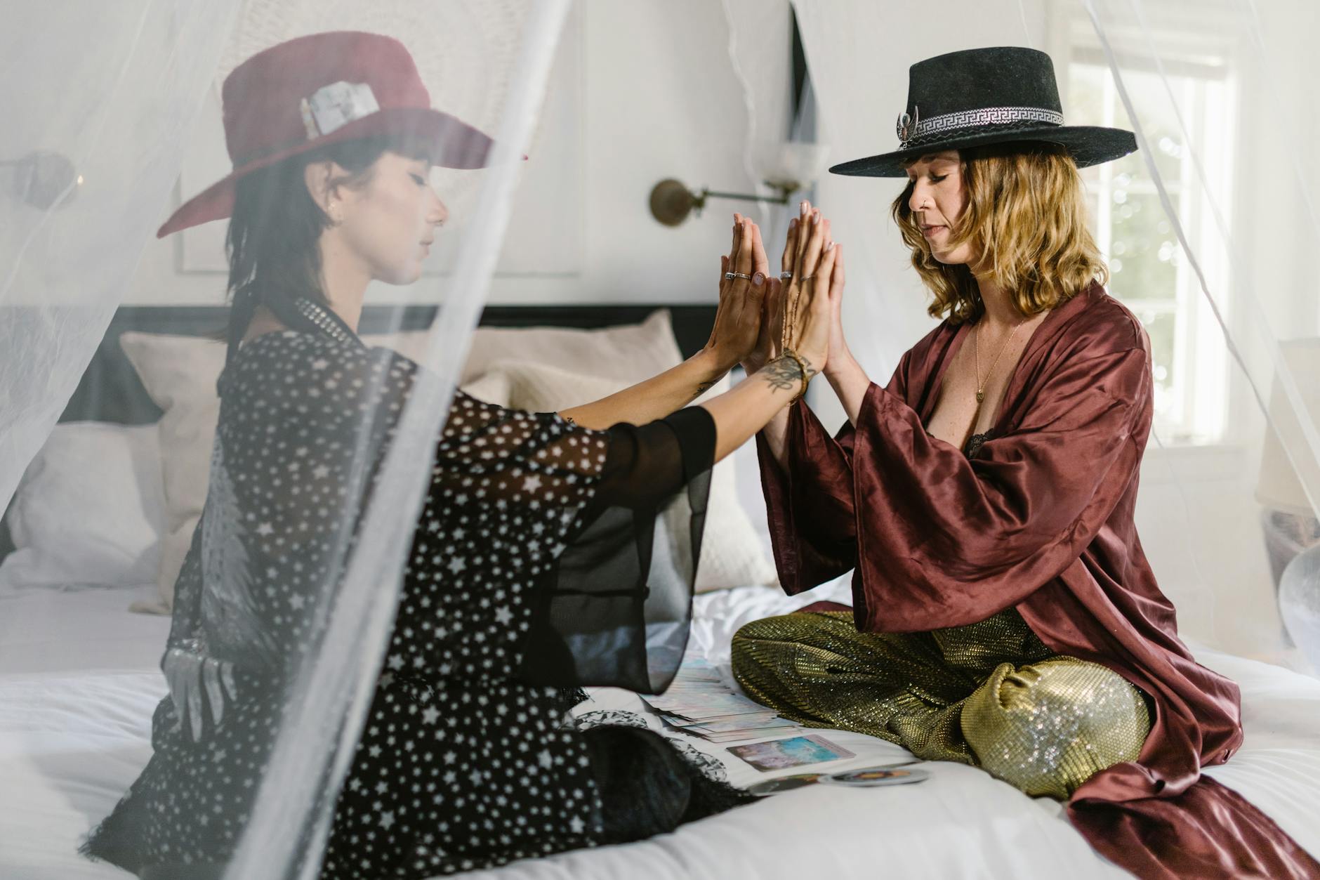
A Study in Green Proximity
Friday, January 30, 2026
There are moments when a single piece stops you—not because it’s practical, but because it feels alive. That was my reaction to the green sequined pants from Alice + Olivia. They don’t behave like a neutral foundation; they insist on participation. While it would be easy to ground them with black, white, grey, or beige, the more interesting question was how far the color conversation could go without breaking harmony.

This look was built by treating Mark Rothko’s Untitled (1968) not as mood, but as structure. A grounded field of green supports a more saturated, distinct green above it, while a restrained band of cream anchors the composition below. The painting isn’t about contrast or spectacle; it’s about hierarchy and relationship. Color carries weight, direction, and pause. Translating that into dressing meant working within a narrow spectrum, allowing dominance, softness, and relief to coexist without competing.
Emerald green becomes the anchor, threading the look from head to toe through earrings, necklace, ring, and pumps. Rather than acting as accents, these pieces establish continuity, allowing the eye to travel without interruption. The sage green shirt introduces variation without disruption, sitting adjacent to the sequins rather than competing with them. Each green maintains its identity while participating in a larger system.
Cream appears through the jacket and handbag, echoing the painting’s quiet stabilizer. It functions as visual breathing room—space that prevents saturation from becoming noise. Instead of softening the look, it organizes it, allowing the greens to feel intentional rather than overwhelming. The result is a composition that feels resolved, not styled.
In this context, the heart chakra is less about expression and more about circulation. Associated with green, it governs connection—how energy moves between elements, how parts relate to the whole. This look activates that energy through coherence rather than display. The invitation is to approach your own closet the same way: choose a palette, stay close to it, and see what emerges when color is treated not as decoration, but as dialogue.
Pixie Core: Dressing the Heart in Light
Friday, January 30, 2026
Mark Rothko’s Untitled (1968), composed of two tonal greens softened by a field of cream, operates quietly but deliberately. Like much of his work, it doesn’t ask to be decoded; it asks to be felt. Green, layered upon green, creates an atmosphere of emotional openness, while the cream functions as a pause—space to breathe, to soften, to receive. It’s a painting rooted in balance rather than drama, and it offers an unexpected point of departure for a look built around joy, play, and sincerity.

The look inspired by this painting is called Pixie Core, anchored by a green sequin mini dress that catches light with every movement. Sequins carry a specific psychological charge: sparkle activates attention, delight, and a sense of possibility. There’s a reason shimmer has endured across cultures and eras—light-reflective surfaces trigger pleasure responses in the brain, signaling celebration, attraction, and emotional warmth. Sparkles, in this sense, really are a girl’s best friend—not as excess, but as expression.
This is where the heart chakra comes into focus. Associated with the color green, it governs love, compassion, joy, and emotional honesty. The energy reads as light and flirtatious because it springs from emotional security, not a need to be seen. It is the center where playfulness and sincerity coexist. Dressing in green—especially when that green moves, reflects, and catches the light—signals emotional availability paired with self-assurance.
Pixie Core isn’t about flirtation for approval; it’s about flirtation as a natural byproduct of feeling good in one’s own emotional skin. The sparkle here isn’t performative—it’s responsive. The mini dress doesn’t demand attention; it invites connection. This kind of playfulness reads as light because it’s rooted in authenticity, not defense or spectacle.
Like Rothko’s painting, the look leaves room for interpretation. Some will feel joy first, others warmth, others a quiet confidence that sits beneath the shimmer. That’s the power of heart-centered dressing: it doesn’t impose meaning, it reflects it back. Pixie Core is ultimately about allowing pleasure, lightness, and flirtation to exist as honest expressions of emotional alignment—proof that when the heart is open, even sparkle can be grounded in truth.
Are Overalls Making a Comeback?
Friday, January 30, 2026
Growing up in the Midwest in the 1990s and early 2000s—long before Facebook or Instagram—overalls were part of everyday streetwear. They weren’t ironic, nostalgic, or styled as costume; they were simply cool. Brands like Tommy Hilfiger and Calvin Klein helped cement the look as modern and urban, often worn with fitted tops or sleek sneakers. Without social media, style remained regional. Where you were from largely defined what you wore, and local culture shaped fashion in a way that felt organic and unselfconscious.
That isolation is easy to forget now. Before constant visual exposure to other lifestyles, trend forecasters physically traveled to cities, suburbs, and college towns, documenting how real people dressed. Those observations informed collections that were meant to feel familiar across markets, not aspirational in a digital sense. Overalls, at least where I was from, were never rural or bohemian—they were streetwear, rooted in youth culture and confidence.
In 2002, when I moved to the East Coast for school, that regional divide became immediately apparent. On my first day, I wore Calvin Klein overalls with a pink tube top—an entirely normal outfit back home. But in that new environment, particularly among students from places like the Upper East Side of New York, the look felt foreign. A guy actually stopped me and asked if I was “serious”—about the overalls. At the time, I was genuinely confused. Looking back, it’s funny, but it also highlights how fragmented fashion once was before the internet flattened everything.

Overalls eventually went mainstream again in the 2010s, largely reintroduced through a different lens. Brands like Free People reframed them as bohemian, relaxed, and pastoral—far removed from the sharp, street-driven way they were worn in the Midwest years earlier. That shift softened the garment’s identity, turning it into a lifestyle piece rather than a statement of urban ease.

Now, the pendulum may be swinging again. Seeing designers like Prada revisit overalls suggests a renewed interest in elevating the silhouette—bringing structure, intention, and polish back into the conversation. When I’ve worn overalls in recent years, I’ve styled them with pumps, treating them less as casualwear and more as a deliberate fashion proposition. Even an overall mini-dress can shift in tone with the right details—add a pair of Emilio Cavallini tights and it immediately reads as styled, not nostalgic. So are overalls making a comeback? Possibly—but not as a throwback. More as a reminder that garments carry multiple histories, shaped by where and how you first encountered them.
The Heart, Stabilized
Friday, January 30, 2026
Green is not a color that asserts itself. It circulates. It regulates. In the language of energy, green is the frequency of the heart chakra—associated with balance, compassion, connection, and emotional restoration. It is the point where instinct and intellect meet, where giving and receiving are held in equilibrium. Dressing in green does not seek attention; it establishes continuity.

Mark Rothko’s Green, Blue Green (1969) operates in this same register. The painting does not dramatize emotion—it sustains it. Fields of green are layered, softened, and held in quiet tension with blue, creating a sense of breath rather than narrative. The eye does not land; it moves. What emerges is not mood, but attunement—a steady, almost physiological sense of openness.
Translated into dress, this logic becomes spatial. An emerald green top anchors the look at the heart, while the same green reappears below in the form of mules and a small satin pouch, allowing the color to travel uninterrupted from head to toe. The repetition is subtle but deliberate: green is not confined to one focal point but permitted to flow through the body. Navy trousers provide structure without interruption, while blue topaz earrings echo Rothko’s blue-green dialogue—cooling, clarifying, and gently expansive.
The effect is one of emotional alignment. Green, when allowed to circulate rather than dominate, activates feelings of trust, steadiness, and relational ease. It supports empathy without exposure, softness without vulnerability. This is not about romance or display; it is about resonance. The look does not ask to be noticed—it asks to be felt. And in that quiet continuity, the heart chakra is not merely referenced, but activated: open, balanced, and at rest.
Two Frequencies, One Source
Thursday, January 29, 2026
Mark Rothko believed that a painting was not complete until someone stood in front of it. Across his work, the colors remain still while the viewer moves—emotionally, psychologically, energetically. The canvas does not decide how you feel. It waits for you to arrive.
Purple Brown (1957) becomes the entry point here, not the subject. Like many of Rothko’s paintings, it holds multiple emotional registers at once. Calm and tension. Depth and lift. Stillness and charge. What emerges depends entirely on the person looking—and the state they’re in when they do.
From this same source, two looks were styled. Similar palette. Shared inspiration. Identical energetic center: the crown chakra, associated with higher awareness, intuition, and expanded perception. And yet, the experience of each is distinctly different.

Now the question is not which look is better. The question is which one you respond to—and why.
Does one ground you while the other expands you? Does one awaken energy as the other offers calm? Which look feels instantly legible—and which one invites you to stay with it? What might that tell you about what your nervous system, your intuition, or your inner world is reaching toward right now?
Rothko never offered answers. He offered space. These two looks do the same. The meaning doesn’t live in the styling—it lives in the pause, in the noticing, in the moment you realize that your response is the signal.
Beyond the Strip: Discovering Las Vegas’ Vintage Scene
Thursday, January 29, 2026

Las Vegas is often associated with neon lights, casinos, and whirlwind weddings, but step off the main tourist avenues and a quieter, more textured side of the city emerges. In the heart of the Arts District, a community thrives around creativity, art, and self-expression — and at its center, a collection of vintage boutiques offers a glimpse into fashion as storytelling.
The Arts District, locally called 18b, is an 18-block neighborhood that feels deliberately removed from the city’s high-energy commercial zones. Its streets are lined with galleries, cafés, murals, and a mix of small shops, where carefully curated vintage clothing stands out as both cultural artifact and wearable style. Here, every piece tells a story, and shopping is as much about discovery as it is about purchase.
Stores in the district take curation seriously. Boutiques source clothing and accessories from estate sales, local consignments, and forgotten closets, giving each shop its own personality. Some, like a few hidden gems along Main Street, focus on mid-century classics; others incorporate streetwear or contemporary pieces alongside vintage finds, blending eras to create a dynamic shopping experience. The result is a network of shops where fashion becomes a dialogue between past and present.
What sets this scene apart is the atmosphere. The Arts District hosts monthly cultural events, bringing the streets alive with music, art, and community energy. Shoppers can explore a vintage jacket, linger in a sunlit café, or admire a mural around the corner — it’s a blend of lifestyle and style, where each visit feels like a curated journey rather than a transaction.
In a city known for spectacle, Las Vegas’ vintage scene offers contrast: a space where patience, curiosity, and taste take precedence. Beyond the Strip’s flashing lights, these boutiques preserve fashion’s history while giving it new life — and for those willing to look, they reveal a side of Vegas that feels authentic, thoughtful, and deeply creative.
Crown Frequency: Dressing the Space Above Thought
Thursday, January 29, 2026
Some colors don’t belong to the body as much as they hover above it. Purple is one of them. Historically associated with transcendence, spirituality, and higher awareness, it has long been linked to the crown chakra—the energetic center located at the top of the head, governing consciousness, intuition, and connection beyond the material world.

The inspiration for this look comes from Mark Rothko’s Purple Brown (1957), a painting that feels less like an image and more like an atmosphere. The canvas is subdued, meditative, and inward-facing. The purple does not glow; it recedes. The brown beneath it grounds the composition, giving weight to what might otherwise drift into abstraction. Together, they create a suspended stillness—an awareness that exists above emotion but remains tethered to the human experience.
Rothko’s genius here lies in restraint. There is no urgency in the painting, no demand for interpretation. Instead, it creates space. The colors seem to breathe slowly, inviting contemplation rather than reaction. This is crown chakra energy in its purest form: not stimulation, but clarity; not performance, but perception.
When translated into dress, this sensibility becomes immediately legible. An outfit inspired by Purple Brown carries a quiet authority. Purple, carried through the outer layer, creates an energetic field around the body rather than a focal point—drawing awareness upward while signaling intuition, vision, and inner alignment. It suggests a mind that is open rather than cluttered, receptive rather than defensive. Brown or earth-toned elements anchor the look, ensuring the energy remains integrated rather than dissociated—spiritual, but embodied.
The crown chakra governs our relationship to meaning itself. When activated, it supports clarity of thought, trust in intuition, and a sense of connection larger than the self. Visually, this manifests as composure. There is nothing to prove. The outfit doesn’t seek validation; it creates coherence. It communicates presence without ego.
In a culture saturated with noise, urgency, and over-signaling, dressing in this register becomes an act of quiet differentiation. Purple, especially when tempered and intentional, does not compete for attention. It operates above the fray. Paired with grounding tones, it reflects a person who can hold both insight and reality at once—someone attuned to what’s unfolding, but not overtaken by it.
To dress for the crown chakra is to dress for perspective. It is an acknowledgment that style, at its highest level, is not about trend or dominance, but about alignment. Like Rothko’s painting, the look does not explain itself. It simply creates the conditions for awareness—and lets everything else fall into place.
Fields of Blue and Awareness
Wednesday, January 28, 2026
Some colors function as events. Others exist as states. Blue belongs to the latter. It does not announce itself; it settles. In art, architecture, and dress, blue has long been associated with alignment—the moment when intention, structure, and expression coincide. It is the color of systems that work quietly.
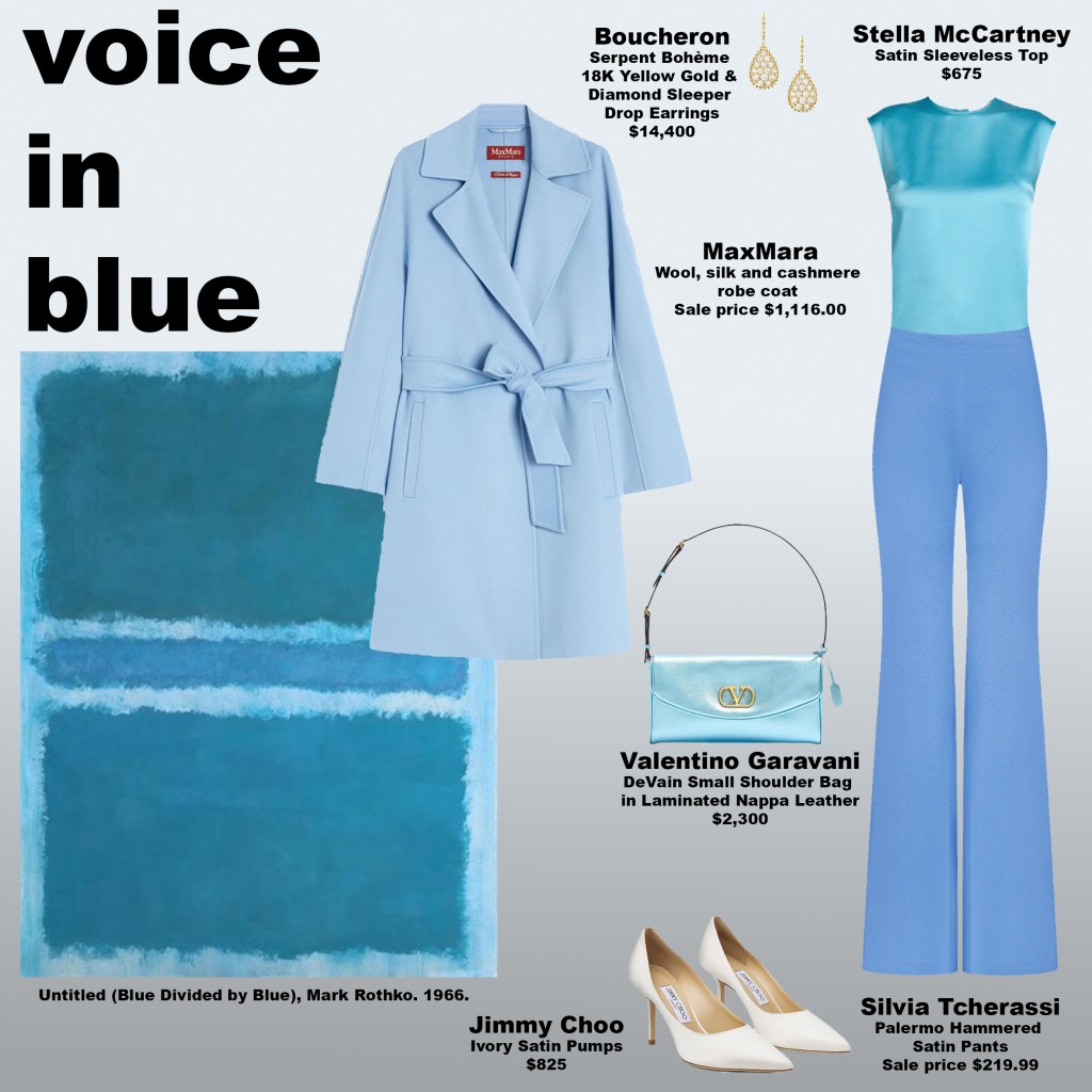
Mark Rothko’s Untitled (Blue Divided by Blue) (1966) is not about emotion in the expressive sense. It is about calibration. The canvas is held in equilibrium: two fields, nearly identical, separated just enough to register awareness. Each plane exists in tension yet harmony. It does not demand interpretation. It does not shout or dramatize. It invites steadiness. In a world increasingly defined by noise, urgency, and fragmented attention, this quiet equilibrium feels radical—a reminder that balance is not achieved through spectacle, but through subtle precision. The painting mirrors the way the mind and body crave coherence in times of constant stimulation.
When translated into dress, this quality becomes immediately legible. An all-blue look communicates internal coherence. There is no hierarchy within the outfit—no piece competing for dominance, no gesture seeking emphasis. The eye moves continuously; the body appears resolved. Blue governs the throat chakra, the energetic center of communication, expression, and alignment between thought and speech. Wearing it signals clarity and composure, a visual articulation of confidence and coherence without needing words.
In practice, blue rewards restraint and intention. It frames the body as capable and intentional rather than ornamental. Each layer, each tone, exists in relation to the whole, creating a unified statement that is both subtle and complete. The color does not perform; it inhabits. The wearer is aligned, not exaggerated; present, not performative.
In this sense, an all-blue ensemble is less about style as spectacle and more about style as statement—a meditation on steadiness, balance, and clarity. It translates a state of internal alignment into visual language, offering the eye, the body, and the mind a moment of coherence in an otherwise fragmented world.
Wearing Red: Rooting the Body in an Unstable World
Wednesday, January 28, 2026
Red operates at the edge of consciousness. It is the first color the eye registers and the color most closely tied to physical presence. In color psychology and chakra theory alike, red corresponds to the root chakra—the energetic center associated with grounding, safety, and survival. When activated, the body feels anchored rather than scattered, decisive rather than reactive.
In a cultural moment defined by constant acceleration and abstraction, many people feel unmoored. The nervous system rarely rests. Wearing red becomes less about spectacle and more about reclamation: of gravity, boundaries, and occupying space with intention.

The inspiration for this look comes from Mark Rothko’s White Over Red (1957), a painting that hums with intensity rather than shouting. Rothko’s red is immersive and bodily, while the white hovering above it clarifies rather than softens its impact. That balance between grounding and restraint informs the styling here.
A continuous field of red—through the top, handbag with gold hardware, and pumps—creates an unbroken energetic line through the body, signaling grounded confidence and self-containment rather than aggression. A blackened burgundy faux-fur jacket deepens the palette, adding warmth, authority, and sensory weight without disrupting the chromatic flow. White enters with intention in the form-fitting stretch cotton sailor pants, echoing Rothko’s compositional restraint and introducing structure through crisp tailoring and gold-button detailing. An 18k yellow gold chain necklace completes the look, amplifying themes of permanence, value, and self-worth with quiet restraint.
Together, this look activates root chakra energy in a way that feels composed and contemporary. It communicates grounded confidence, sensuality without fragility, and presence without performance. In a culture that rewards speed and disembodiment, wearing red becomes a quiet act of resistance—a return to the body, to gravity, and to standing firmly where you are.
Chromatic Ascension: Dressing the Upper Chakras
Tuesday, January 27, 2026
Mark Rothko’s No. 61 (Rust and Blue) (1953) is not a painting that asks to be analyzed so much as it asks to be felt. Rothko understood that color does not simply accompany emotion—it creates it. When hues are layered with intention and allowed to exist in relationship with one another, they form a psychological environment, a state of mind.
That same principle applies to how we dress. During my time as a stylist at a luxury department store, the most rewarding part of my work wasn’t selling individual pieces, but helping clients put together complete looks. When everything aligned, people carried themselves differently. Their posture shifted, their voices softened or sharpened, and their presence became more assured. Clothing, at its best, was never about trend alone, but about coherence.
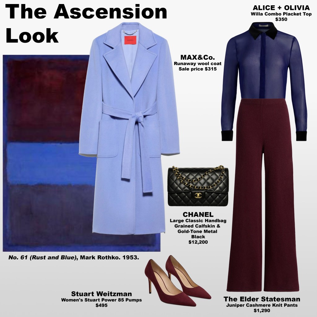
This particular look draws inspiration from Rothko’s chromatic intelligence and centers on the upper three chakras—the Third Eye, the Crown, and the Throat. Through indigo, bordeaux-violet, and periwinkle blue, the palette creates a refined yet powerful visual frequency that feels intentional rather than decorative.
The indigo shirt anchors the look at the level of perception, aligning with the Third Eye chakra. Indigo carries a sense of quiet intelligence—observant, discerning, and internally confident—signaling clarity without force. Grounding this is the bordeaux pant and pumps, a deeper expression of the Crown chakra. These shades translate transcendence into something embodied, suggesting wisdom that has weight and authority without rigidity. Completing the composition is the periwinkle coat, a softened blue associated with the Throat chakra. As an outer layer, it opens the look, encouraging expression that feels fluid, articulate, and trustworthy rather than confrontational.
Together, these colors create a visual progression: perception, meaning, and expression moving in harmony. The result is a look that conveys vision without noise and authority without heaviness—one that feels both thoughtful and composed.
Rothko’s work was never about color in isolation, but about the way one hue alters the emotional temperature of another. Dressing this way follows the same logic. When clothing is chosen for resonance as much as beauty, it becomes a form of alignment. And alignment, when worn well, speaks for itself.
The Psychology of the S-Curve: Why Contrapposto Remains a Timeless Language
Tuesday, January 27, 2026
In modeling, photography, and art, the fluid, S-shaped posture is more than just visually pleasing—it is a silent language of elegance, confidence, and motion. Historically known as contrapposto, and in modern fashion circles as the Classic S-Curve, this stance communicates on multiple levels, guiding perception and emotion in ways words cannot. It is one of the most enduring and psychologically resonant ways to present the human body.
Contrapposto: The Origins of Communicative Posture
The term contrapposto comes from Italian, meaning “counterpoise.” In classical sculpture, it described a figure standing with most of their weight on one leg—the “engaged leg”—while the opposite leg relaxed. This shift in weight causes the hips and shoulders to tilt in opposite directions, naturally creating a gentle S-line along the spine.
The communication here is subtle but profound: the body signals relaxation, confidence, and dynamism. Unlike rigid or symmetrical poses, contrapposto conveys that the subject is alive, aware, and psychologically present. Ancient Greek sculptors understood that asymmetry itself is a communicative tool, evoking grace, poise, and emotional depth, and creating an unspoken connection between viewer and subject.
The Modern S-Curve in Fashion and Photography
In fashion today, the S-curve has evolved into a strategic tool for visual storytelling. Models use it to flatter the body, create movement, and communicate personality without a single word. By shifting weight, elongating the torso, and angling the shoulders and hips, the S-curve directs the viewer’s gaze, establishing a dialogue between the model and the observer.
The Communicative Power of the S-Curve
- Hip-Shoulder Opposition: Suggests balance, elegance, and subtle confidence.
- Leg Placement: Signals relaxed poise or playful energy, depending on stance.
- Spinal Arc: Highlights natural curves, conveying vitality, grace, and fluid motion.
- Neck and Head Alignment: Offers cues of engagement, introspection, or allure.
- Fluidity: Curves and gentle arcs subconsciously signal health, life, and elegance.
- Movement in Stillness: Guides the eye along the figure, creating the illusion of motion and forming an unspoken dialogue with the viewer.
- Organic Asymmetry: Slight imperfection communicates authenticity, making the pose feel natural and relatable.
- Emotional Storytelling: Small shifts in tilt, arch, or limb placement allow the body to convey playfulness, curiosity, or sensuality—demonstrating the model as a nonverbal communicator.
Why the S-Curve Endures as a Communicative Tool
From Greek sculpture to haute couture photography, the S-curve endures because it speaks without words. It balances elegance with realism, sensuality with restraint, and stillness with energy. In fashion and art, the pose does more than flatter the figure—it transmits confidence, grace, and emotion, creating a visual dialogue that resonates subconsciously. It is a timeless gesture of storytelling, persuasion, and aesthetic communication.
Rothko as a Guide for Chakra Color Dressing
Monday, January 26, 2026
When working with chakra colors to activate specific energy centers in the body, fine art can be a powerful source of inspiration. Mark Rothko’s paintings are devoted to conveying emotion and energy through color, revealing how hues interact to create resonance, depth, and intensity. His work offers a refined visual guide for building intentional, color-driven outfits.
You don’t need to use every color in a painting. The most effective approach is to select two to three hues that align with your chakra focus and allow them to work in harmony.
Inspired by Rothko’s Blue Over Red, this look centers on communication, creativity, and confidence. Blue, associated with the throat chakra, anchors the outfit through a structured Akris jacket, supporting clarity and presence. The sacral chakra is activated through orange Ungaro flared pants, bringing warmth and creative energy, while lemon yellow Jacquemus leather mules engage the solar plexus chakra, linked to confidence and power.
To create cohesion from top to bottom, the yellow is echoed in a Cape Diablo lemon yellow beaded necklace. A simple white silk top by MANGO and a white Dolce & Gabbana handbag balance the palette and keep the look polished.
The result is an outfit that feels energized, intentional, and composed. When it comes to chakra-focused color blocking, Rothko’s paintings remain one of the most compelling references—showing how color can activate energy before a word is spoken.
Hollywood in Color: How Television and Film Transformed Fashion
Monday, January 26, 2026
Before color television, Hollywood glamour existed largely in black-and-white abstraction. Audiences could admire shapes, silhouettes, and contrasts—but they could not fully experience the richness of color, the shimmer of satin, or the subtleties of coordinated ensembles. Costume and style were appreciated, yet much of their impact was muted by monochrome screens.
Color film began making its mark in the late 1930s and 1940s, with milestones like The Wizard of Oz (1939) and Gone with the Wind (1939) dazzling audiences with Technicolor spectacle. Color television arrived later, in the early 1950s, becoming increasingly widespread by the mid-1960s. Suddenly, cinematic and televised fashion was no longer abstract; it could be vividly experienced in living rooms across America and beyond. Designers and viewers alike were inspired to translate what they saw on screen into tangible wardrobes—ready-to-wear, coordinated outfits and tailored ensembles that captured the allure of Hollywood without leaving home.
I experienced Hollywood’s global reach firsthand while living in Milan. I became friends with a German girl who spoke English perfectly. Curious, I asked how she had learned it so well. She told me, “American movies. I watched them over and over.” But it wasn’t just the language that people around the world absorb—it was also style: color, texture, silhouette, and the way clothing communicates identity, aspiration, and mood. This illustrates a larger truth: Hollywood did more than export glamour; it exported a visual language of fashion that shapes wardrobes, taste, and aspiration far beyond American borders.
The transition from black-and-white to color fundamentally shifted how fashion was perceived. Costumes and ensembles, once valued primarily for cut and silhouette, could now be celebrated for tone, harmony, and visual storytelling. Palettes became part of the narrative, conveying mood, character, and desire. Audiences began to emulate these colors in their own clothing—matching, layering, and coordinating in ways that reflected what they saw onscreen.
Hollywood in color created a new dimension of aspiration: it allowed viewers to dream in shades, to notice nuance, and to translate cinematic elegance into everyday life. From the Technicolor films of the 1940s to the early color broadcasts of the 1960s, designers and consumers alike were learning to think in terms of color as a language, a signal, and an inspiration—a lesson that continues to resonate in fashion today.
Which Color Are You Today? How Fashion Helps You Channel Energy Through Style
Monday, January 26, 2026
Have you ever noticed that certain colors make you feel a specific way? Bright yellow can make you feel confident and energized, calming blue can center you and help you to communicate clearly, and soft pink can lift your mood. Fashion isn’t just about aesthetics—colors carry energy, influence perception, and even affect how we show up in the world. Once you start paying attention, your wardrobe and accessories become tools for channeling the energy you want to embrace.
Luxury designers know this, which is why many pieces come in multiple shades. And that’s where the fun—and the subtle challenge—begins. Take Dolce & Gabbana’s Small Devotion top-handle bag. Feminine, versatile, and exquisitely crafted in calfskin with a bejeweled heart clasp, it comes in nine different colors. Suddenly, you’re deciding: do you pick a color that activates a specific energy, like orange for creativity and intimacy or green for love and connection? Do you go neutral for flexibility, or choose a pink that simply lifts your mood? Each option subtly influences how the piece interacts with your day and your presence.
The beauty of having multiple color options is that it allows you to explore how different energies resonate with you. It’s why some people end up buying merchandise in several different colors—not because they need multiples, but because each color speaks to a different mood, intention, or version of themselves. Paying attention to color isn’t just playful—it’s a form of self-awareness. The next time you’re shopping or getting dressed, ask yourself: which energy do I want to wear today?
Why Consistency Feels Luxurious
Sunday, January 25, 2026
Do you know why some people, brands, or outfits instantly feel trustworthy—or why others make you uneasy, even when they look appealing? It’s not magic. It’s consistency. Our brains respond to stability, repetition, and resolution. Symmetry and pattern aren’t just pleasing—they signal reliability. The same is true in identity. People who know who they are, and who project it steadily over time, communicate confidence without effort. That clarity feels luxurious.
In fashion, this shows up in subtle ways. A designer who refines their aesthetic season after season builds trust with the wearer. You can spot a Missoni piece immediately—the signature knit patterns and color sequences are unmistakable. Free People consistently delivers a bohemian, relaxed vibe; you know exactly what energy a garment will carry. A wardrobe curated around signature shapes, familiar silhouettes, and balanced proportions delivers calm and clarity. Conversely, constant reinvention—rapidly changing colors, proportions, or personal style—can feel exciting at first, but it signals instability. It triggers a quiet vigilance in the mind: is this reliable? Can I invest attention, energy, or money here? That uncertainty is exhausting.

This extends beyond clothing. Individuals who consistently carry themselves in recognizable ways—the same posture, energy, and visual language—exude authority and magnetism. Public figures who pivot too rapidly lose resonance. Even influencers, whose entire business depends on novelty, often find their audience disengages when identity becomes unanchored. Stability is magnetic. Volatility is draining.
There’s a reason legacy brands maintain iconic codes for decades. Consumers trust them. They know what to expect, and in that expectation lies comfort and desire. The same applies to personal style: consistent choices feel deliberate, intentional, and ultimately, valuable. They say, without words, I know myself. I am worth your attention.
Paying attention to what feels stable, resonates over time, and aligns with your own rhythms is not boring—it is mastery. Consistency is more than an aesthetic preference; it is a strategy for presence, influence, and impact. Every choice—from the clothes you wear to the identity you project—becomes a deliberate, potent signal.
What Your Eye Chooses Before You Decide
Sunday, January 25, 2026
Do you know what your eye is drawn to when you shop for clothes—or why? Have you ever wondered why certain pieces feel immediately right, while others repel you before you can explain it? Long before logic or taste steps in, your brain is already making a decision.

On the left: a pair of pants with asymmetry—vertical stripes that don’t match from one side to the other, lines that refuse to resolve. On the right: a symmetrical pair—mirrored stripes, visual balance, order. Most people, instinctively, will feel more comfortable with the symmetrical version. That reaction isn’t about trend or sophistication. It’s neurological. Symmetry signals stability and coherence to the brain. It feels resolved. Choosing it often reflects a person who values clarity, balance, and continuity—not only in clothing, but in how they move through the world. As a consumer, this preference usually aligns with investing in pieces that feel wearable, grounding, and mentally calm. I fall squarely into this category myself. I won’t even try something on unless it’s symmetrical—my mind can’t relax into it otherwise.
But if your eye went first to the asymmetrical version, that says something equally meaningful. Asymmetry appeals to people who are comfortable with visual tension and ambiguity. These are often individuals who enjoy disruption, experimentation, and expressive design. They don’t need immediate resolution; they enjoy the idea, the challenge, the friction. As consumers, they tend to engage with fashion as a form of dialogue rather than function—less about ease, more about statement.
There is no wrong answer. What matters is awareness. While the human eye is generally drawn to symmetry because it’s easier to process and feels instinctively satisfying, fashion repeatedly introduces designs that push against that order. Noticing whether you prefer balance or disruption is a useful exercise—not just in shopping, but in understanding yourself.
Pay attention to what your eye settles on first. The shapes you choose reflect how you think, what soothes you, and what energizes you. When you understand that, shopping becomes less about chasing trends and more about choosing alignment.
Energy You Can Wear
Saturday, January 24, 2026
I used to think fabrics were just fabrics—soft, rough, heavy, light. But natural materials carry something more: a subtle vibration, a quiet energy that hums through the body. Wearing silk, cotton, or linen feels like stepping into a calm current, a gentle charge that moves across your skin. It isn’t just comfort—it’s resonance.
Synthetic fabrics can mimic the look, stretch, or shine, but they rarely carry the same vibration. There’s a subtle heaviness, a flatness, even a draining quality. Our bodies notice, even if our eyes do not.
Natural fibers carry a history: sunlight on cotton fields, minerals in silk cocoons, the steady rhythm of linen growing in soil. That history becomes part of the energy wrapped around your body. It’s grounding, soothing, and surprisingly powerful. Subconsciously, we respond to it, which is why certain fabrics just “feel right.”
Synthetic fibers, by contrast, are engineered. Flawless, durable, bright—but often missing this life force. They hold shape and resist wrinkles, yes, but they rarely offer the quiet lift and balance that natural materials provide.
I notice it in small, vivid moments: slipping into a silk blouse in the morning and feeling a lift in mood, wrapping a linen scarf around my shoulders and sensing calm, choosing cotton pajamas for sleep and resting more deeply. These experiences are supported by science: studies in touch, thermal regulation, and biofeedback show that what we wear affects subtle physiological responses. Natural fibers breathe, release, and balance energy in ways synthetics cannot fully replicate.
In a world obsessed with novelty, digital perfection, and fast fashion, these sensations are easy to overlook—but they are profound. Fabrics are not just decorative; they are energetic companions. They lift, center, and restore. When you notice, they change how you feel, move, and carry yourself.
The lesson is simple: choose materials that carry life. Choose energy that resonates with yours. In a world of synthetic noise, natural vibration is a rare luxury—and worth every conscious touch.
The Joy of Finding What You Really Love—On Sale
Saturday, January 24, 2026
Nothing feels better than finding a piece you love at an incredible price. One of my favorite items that I wore over and over again was an amber-colored stretch crochet maxi skirt from Zara. I got it on sale for just $10 and wore it until the crochet loops stretched and became too loose from repeated wear. There’s something uniquely satisfying about owning an outfit that brings you joy—and compliments—without breaking the bank.
I’ve also learned that the worst feeling when shopping comes from buying something full price, only to see it deeply discounted a few weeks later. That experience has trained me to always check the sale racks first. And too many times I’ve bought something full price thinking I loved it, only for it to end up sitting in my closet as a collector’s item instead of being worn.
When I spot something I truly like, I don’t rush to buy it. If I’m still thinking about it a week later, I know it’s a piece I genuinely want—not a spur-of-the-moment purchase.
High-end stores also reward patience with considerable markdowns. I recently came across a leather biker jacket by BOSS, a brand known for its quality craftsmanship, and it was over 50% off. There’s no need to prove anything to anyone about how much you spent. What matters is feeling confident and at home in your clothes, in your own environment.

When you buy what you genuinely love, at a price that makes sense for you, your wardrobe becomes something you live in and enjoy—not a display of status. Instead of becoming a collector’s item, each piece becomes part of your everyday style, worn with intention and joy.
The Power of Wearing It Again
Saturday, January 24, 2026


Kate Middleton attends day 1 of the Cheltenham Horse Racing Festival on March 13, 2007 in Cheltenham, England.
Britain’s Catherine, Princess of Wales and Britain’s Prince William, Prince of Wales react during a visit to Meadow Street Community Garden and Woodland in Pontypridd, south Wales on February 26, 2025.
In a culture conditioned to equate relevance with constant novelty, wearing the same outfit more than once has become an unexpected signal of authority. Few public figures illustrate this better than Catherine, Princess of Wales. As one of the most photographed women in the world, she is regularly seen re-wearing coats, dresses, and tailored pieces across multiple engagements, sometimes years apart—fully aware the images will be compared, archived, and recirculated.


Catherine, Princess of Wales curtseys to King Charles III as she attends The Order of The Garter service at St George’s Chapel, Windsor Castle on June 19, 2023 in Windsor, England.
8 May 2025, THE ROYAL FAMILY JOIN THE NATION TO MARK THE 80TH ANNIVERSARY OF VE DAY
This choice is not accidental, nor is it practical in the way it is often framed. It is strategic. Re-wearing communicates confidence: the confidence to let the work speak louder than the wardrobe, and the confidence to treat clothing as a tool rather than a performance. In an industry where many celebrities openly state they will never be photographed in the same outfit twice, repetition is positioned as a failure. Catherine reframes it as composure.


Catherine, Duchess of Cambridge visits the mentoring programme of the XLP project at London Wall on March 11, 2016 in London, England. XLP supports young people who are facing emotional, behavioural and relational challenges.
Catherine, Duchess of Cambridge attends the launch of maternal mental health films ahead of mother’s day at Royal College of Obstetricians and Gynaecologists on March 23, 2017 in London, England.
Her wardrobe operates on consistency rather than spectacle. Familiar silhouettes return, color palettes remain coherent, and styling shifts subtly rather than theatrically. The effect is cumulative. Over time, the clothes stop competing for attention and begin to support a recognizable visual identity. Style becomes stable, legible, and unforced.


Catherine, Duchess of Cambridge attends a ‘Mental Health In Education’ conference at Mercers’ Hall on February 13, 2019 in London, England.
Catherine, Duchess of Cambridge joins a workshop run by the National Portrait Gallery’s Hospital Programme at Evelina Children’s Hospital on January 28, 2020 in London, England.
In this context, repetition reads as control. It suggests that the wearer is not at the mercy of trends, sponsorships, or image churn. It also resists the idea that visibility requires constant consumption. Each re-wear quietly challenges the logic of disposability that dominates both celebrity culture and fashion media.


Catherine, Duchess of Cambridge arrives by Tuk Tuk with Prince William, Duke of Cambridge, as they attend a special reception hosted by the British High Commissioner Thomas Drew, at the Pakistan National Monument, during day two of their royal tour of Pakistan on October 15, 2019 in Islamabad, Pakistan.
Catherine, Duchess of Cambridge attends the Royal Variety Performance at the Royal Albert Hall on November 18, 2021 in London, England.
In a hyper-visual world, choosing to wear something again is a refusal to participate in unnecessary noise. It says: this piece still works, it still belongs here, and it does not need to prove itself again. Over time, that restraint becomes its own form of elegance—and a reminder that style, when it is real, does not expire after one photograph.
The Power of a Signature
Friday, January 23, 2026

Just like Anna has a signature style, the real question is simpler—and harder—than it sounds: do you have consistency in your style across the last three-plus years?
Anna Wintour’s look has barely wavered for years. Sunglasses. Almost never a handbag. Long floral dresses. Shoes that occasionally clash on purpose. A chunky, overstated necklace. It isn’t about novelty or signaling spending power; it’s about repetition. The same visual language, returned to again and again, regardless of season or trend cycle.
That’s the tell. When someone wears the same elements across years and weather, it’s proof they’re styling themselves—not following instructions handed down by the trend cycle.
For me, that consistency shows up in Betsey Johnson sparkle sneakers. I’ve worn them for three years straight. I’m on my third pair—black sparkles, rhinestones, now gold—and the first two weren’t retired for aesthetic reasons. They were worn beyond donation.

Sparkles work because they trigger a genuine psychological response. Light-reflective surfaces stimulate visual pleasure and dopamine release; they register as playful, uplifting, and energizing. It’s immediate, and it’s emotional—not performative. And it doesn’t require a luxury price tag to be effective.
That repetition becomes the style. The compliments follow not because anything is being flaunted, but because consistency reads as intention. My gold pair is nearing retirement, which means a fourth pair is inevitable—helped by the fact that Betsey Johnson keeps releasing limited editions tied to holidays and seasons, without disrupting the core idea.
If you don’t yet have that one piece you return to—season after season, year after year—ask yourself why. Not what you’re supposed to like. Not what signals taste or access. What you actually enjoy wearing. Something that reflects your personality, not your purchasing power. Something you could live in for the next three years without ever growing bored.

That’s not trend-following. That’s personal style.
Why Anna Wintour Almost Never Carries a Handbag
Thursday, January 22, 2026
Have you ever noticed that Anna Wintour is almost never photographed carrying a handbag? In a fashion culture where handbags have become the loudest form of self-definition, Anna Wintour’s absence of one is quietly radical.
Today, the handbag is rarely just functional. It signals access, price point, and alignment. It anchors selfies, drives algorithms, and often speaks before the person carrying it does. Logos do the talking; ownership becomes identity. Against this backdrop, choosing not to carry a handbag reads less like omission and more like intention.
By opting out, Wintour removes herself from a visual economy built on constant signaling. There is no logo to decode, no trend to update, no object performing relevance on her behalf. The absence eliminates distraction and resists the pressure to be visually legible through consumption.

This restraint also creates distance from a culture increasingly defined by accessories rather than ideas. Where handbags now operate as shorthand for belonging, not carrying one refuses that language entirely. It sidesteps the performance of taste and the expectation that style must be proven through purchase.
In a moment when fashion is saturated with symbols competing for attention, the choice to carry nothing at all becomes its own statement. Not a rejection of fashion, but a refusal to let objects speak louder than substance.

Anna Wintour: The Power of a Signature Style
Thursday, January 22, 2026
Have you ever really noticed how Anna Wintour dresses? Beyond the iconic sunglasses, beyond the headlines, there’s a consistency to her style that rarely gets acknowledged. She’s spent a lifetime covering trends, documenting the fleeting whims of fashion, yet her own wardrobe is remarkably steady—distinct, recognizable, and entirely hers.

Anna herself has mentioned in interviews that she wishes people were more interested in conversing with her than snapping selfies. Because let’s be honest: when someone posts a photo with a super-famous figure like Wintour, it’s never about her. It’s about access, about signaling status to your followers, about being “in” rather than observing the person in front of you.

Her outfits tell a different story. A long floral dress paired with an over-the-top chunky necklace becomes a statement not because it’s trend-forward, but because it’s reliably Anna. She wears it again, and again, across seasons and events. There’s no chasing fleeting fads, no performing someone else’s persona. Her style isn’t temporary—it’s solid, owned, and unmistakable.
In a world obsessed with constant reinvention, Anna Wintour reminds us of the rare power of holding onto your own trend. She is, in essence, her own fashion authority. And that, perhaps, is why she remains untouchable.
Purses, Pocketbooks, and the Secret Sociology of Luxury Words
Thursday, January 22, 2026

I was merchandising in a luxury department store. Calm, deliberate, fully in control—until I said purses.
The room froze. My associate’s eyes went wide. “Purses?” he hissed. I nodded. “You mean… HANDBAGS,” he corrected, like I’d just tried to board a private jet with a carry-on from the wrong century.
I wasn’t wrong. I was channeling my past life in the 1940s. Back then, a purse was the proper word for a woman’s daily bag—originally meant for coins—while handbags were travel luggage. Pocketbooks flourished regionally in the U.S., then faded. By the 1940s, purses had grown to wartime proportions—big enough for rations and letters home—and postwar, big enough for lipstick and powder, yet through it all, we still called them purses. So while the influencer era marched in with its “handbag” chic, I was quietly honoring 1940s America, one purse at a time.
Not long after, I wandered by the fragrance counter and inhaled a new scent. “I love this perfume,” I said. A subtle correction slid in. “Oh… you like that fragrance.” Perfume became gendered; fragrance became cool, modern, unisex, lifestyle-adjacent. And here I was, accidentally historic again.
Words in fashion aren’t just labels—they’re social coordinates. Say purse, say perfume, and suddenly you’re a time traveler, a sociologist, and “that girl” all in one.
Behind the Velvet Rope: The Allure of Luxury You Can’t Buy
Thursday, January 22, 2026

Picture this: you’re strolling through the cobblestone streets of Milan, the sun glinting off the Duomo, and you catch a glimpse of a girl with a handbag so striking it stops you in your tracks. The leather gleams, the silhouette is sculptural, and the detailing is unlike anything you’ve ever seen. You try to get a closer look, your pulse quickens—you need to know the brand.
It’s a name you recognize, a storied luxury house, but then comes the catch: no matter how much cash you have, how willing you are to spend, you can’t ever get your hands on it. Not today, not tomorrow. You’re not on their list. Not because you’re not worthy, but because your past social media behavior didn’t pass the algorithmic test. Too many ice cream posts? (If you know, you know.)
These ultra-limited releases—sometimes only 100, 200, or a few hundred pieces worldwide—exist in a space between fashion and fantasy. They are carefully curated for the select few who have earned their place not through obvious loyalty programs or previous spending, but through subtle alignment with the house’s image and an aura that fits the brand’s ideal muse. It’s exclusivity dialed up to its highest level: desire without access.
For luxury brands, scarcity isn’t a bug—it’s a feature. It’s what turns handbags into icons, sneakers into collector’s items, and fleeting pieces into legend. For consumers, it’s both thrilling and frustrating: the allure isn’t just the product, but the story of not being able to own it, of knowing it exists somewhere out there in the hands of someone else.
In a world where social media has made the unattainable almost visible—flooding feeds with influencer hauls and mass-produced luxury—the quiet, private drop feels revolutionary. It reminds us that real desire can’t always be algorithmically delivered. Sometimes, it still lives behind a velvet rope, in the hands of a girl you passed on Via Montenapoleone, in a Milanese moment that feels almost cinematic.
Dressed for the Algorithm: Satire or Reality?
Wednesday, January 21, 2026

While studying fashion through the University of the Arts London—across courses at London College of Fashion and Central Saint Martins—I worked on a range of projects, one of which I chose to pursue independently: designing a brand of the future. After all, isn’t that what fashion designers are always working toward?
That project became Subject Streetwear.

The brand sits at the intersection of ’90s street credibility and contemporary digital life—but visually, it pushes far beyond nostalgia. Subject Streetwear is defined by metallics, neons, vegan leather, and graphic line work that cuts across the body like transmission paths. The directional lines are intentional: they reference signals, data flow, and the constant exchange between physical presence and digital identity. The garments feel engineered rather than styled—constructed to reflect how information moves, not how trends circulate.

There is an inherent tension in the work. The silhouettes nod to comfort and repetition, but the surfaces are sharp, reflective, and unapologetically synthetic. Vegan leather replaces traditional luxury materials. Neon accents interrupt otherwise muted forms. Metallic finishes catch light the way screens do. The result is clothing that feels both protective and exposed—streetwear calibrated for a surveillance-driven, hyper-connected era.
The tone is self-aware but not ironic. Much like elevated pajamas becoming acceptable daily wear, Subject Streetwear treats contradiction as reality rather than commentary. It is serious in its construction, even when the concept feels provocative.

What made the project resonate in an academic setting was its grounding in behavior. This was not trend-chasing. It was a response to how people already exist in public space—moving between online and offline worlds, signaling identity through surfaces, texture, and visibility.
If the idea feels ahead of its time, that may be temporary. Fashion has always absorbed concepts quickly once they reflect lived reality. Consider this both a preview and a marker: Subject Streetwear is more than an aesthetic—it’s a system of ideas.

If investors or collaborators are interested in developing the brand, the door is open, please feel free to contact me and we can expand this idea together. And if the idea gets borrowed before that happens, it only reinforces the thesis.
This is a glimpse into my project.
Is it realistic?
Is it excessive?
Or is it simply the direction fashion is already moving?
When Street Cred Was the Currency
Wednesday, January 21, 2026

In the 1990s, fashion operated on a different value system. Labels like Tommy Hilfiger, Ralph Lauren, Nautica, FUBU, and K-Swiss didn’t just sell clothing—they signaled belonging. These brands moved fluidly between prep, sport, and street, becoming shorthand for credibility rather than conspicuous wealth. What mattered wasn’t where you traveled or what you could afford, but whether you were real.
Street credibility in the ’90s came from proximity and presence. It was local and social, built through relationships, environments, and being seen in the right places, the parties, or the mall. Fashion functioned as a quiet language of taste and awareness. You didn’t have to perform status; you simply had it.
Brands understood this cultural logic. Tommy Hilfiger’s oversized silhouettes, Nautica’s color-blocking, FUBU’s cultural authority, and Ralph Lauren’s puffers crossing into streetwear reflected aspiration without alienation. Even K-Swiss, designed for tennis, became a street staple because it fit seamlessly into everyday life. None of it required irony or explanation.
This mattered because the ’90s valued authenticity over display. Where you were from carried weight. Who you spent time with mattered more than where you vacationed. Coolness came from being grounded, not elevated. Street cred meant moving easily through your environment without trying to outshine anyone.
That framework shifted in the 2000s. Celebrity culture, reality television, and eventually social media redirected fashion away from locality and toward spectacle. Cool became increasingly tied to visible spending power—luxury goods, travel, and lifestyles often subsidized rather than sustained. What could be monetized replaced what felt real.
Street credibility lost cultural relevance because it didn’t translate cleanly online. Down-to-earth couldn’t compete with curated fantasy. As aspiration moved upward and outward, local department stores declined, and fashion detached further from everyday life.
Most people can’t keep pace with influencer lifestyles, but they can engage with their own environments. That’s where the ’90s still resonate. Being present, socially connected, and culturally aware carried more weight than appearing untouchable.

For me, that clarity arrived in middle school. My most important purchase wasn’t tied to horseback riding or polo matches—it was a red Ralph Lauren puffer jacket. In my world, that coat signaled awareness, confidence, and humility. It communicated street credibility, not wealth.
That era understood something essential: cool didn’t require escape. It lived in neighborhoods, friendships, and shared spaces. As fashion cycles forward, the renewed interest in street credibility reflects a desire to return to authenticity over performance. In a culture saturated with spectacle, being real still carries power.
Paper Dress Vintage: When Shopping Becomes a Secret Nightlife Experience
Tuesday, January 20, 2026
In Hackney, East London, there’s a spot where fashion and music intersect in the most unexpected way: Paper Dress Vintage. By day, it’s a carefully curated vintage clothing store, divided into sections by decade—from roaring ’20s glamour to 1970s retro cool. But come evening, the store transforms. With minimal fanfare, the boutique becomes a lively music venue and bar, hosting intimate concerts for a creative, engaged crowd.
The magic lies in the dual-purpose concept. Upstairs, an intimate music room holds performances that range from breakout artists like to experimental indie acts. Downstairs and in the backyard, visitors can enjoy drinks, cocktails, and local beers, all while the boutique’s unique décor provides an unmistakable sense of place. The total capacity of 180 makes every event feel exclusive, private, and energetic without feeling overwhelming.
For luxury stores, Paper Dress Vintage offers a compelling lesson: exclusivity and surprise can create desire. By hosting private, invite-only events that are not publicized on social media, brands can build intimacy with a select audience, fostering loyalty and turning shopping into an experience. It’s not about mass exposure; it’s about creating memorable moments that align the brand with creativity, culture, and a sense of discovery.
This approach reminds us that the most coveted experiences often happen off the grid—where fashion, music, and social connection collide to form something entirely original.
Comfort Meets Style: Walking Scotland and Beyond
Tuesday, January 20, 2026
I’ve always gravitated toward ballerina flats or heels when wearing pants. There’s something about the sleek, “sockless” look that feels effortless and chic. Stockings and tights work beautifully with dresses, but with trousers, the aesthetic just feels off.
That all changed when I traveled to Scotland one cold November. Walking up cobblestone streets and steep hills, my go-to flats and heels were completely impractical. Blisters and sore feet loomed after just a few blocks. I quickly realized that to enjoy my days exploring Edinburgh, I needed boots that could handle the terrain without compromising style.
Enter Rieker, a brand with a history spanning more than 140 years. Founded in Germany, Rieker has long been celebrated for crafting shoes that balance comfort, durability, and fashion. Known for flexible soles, shock-absorbing technology, and thoughtful design, the brand makes shoes that support long days on your feet while remaining stylish. What’s more, Rieker is incredibly affordable—proof that comfort and quality don’t have to break the bank.
For those looking to combine function with fashion, the beige checked Rieker biker boots are a perfect example. These boots have it all: comfort, durability, and a style that stands out. The stitchdown construction makes them flexible and long-lasting, while the combination of laces and a zipper ensures a secure, perfect fit. The checked pattern is a subtle statement, and the lightweight, shock-absorbing sole makes long walks feel effortless. An extra-soft cover sole completes the experience.
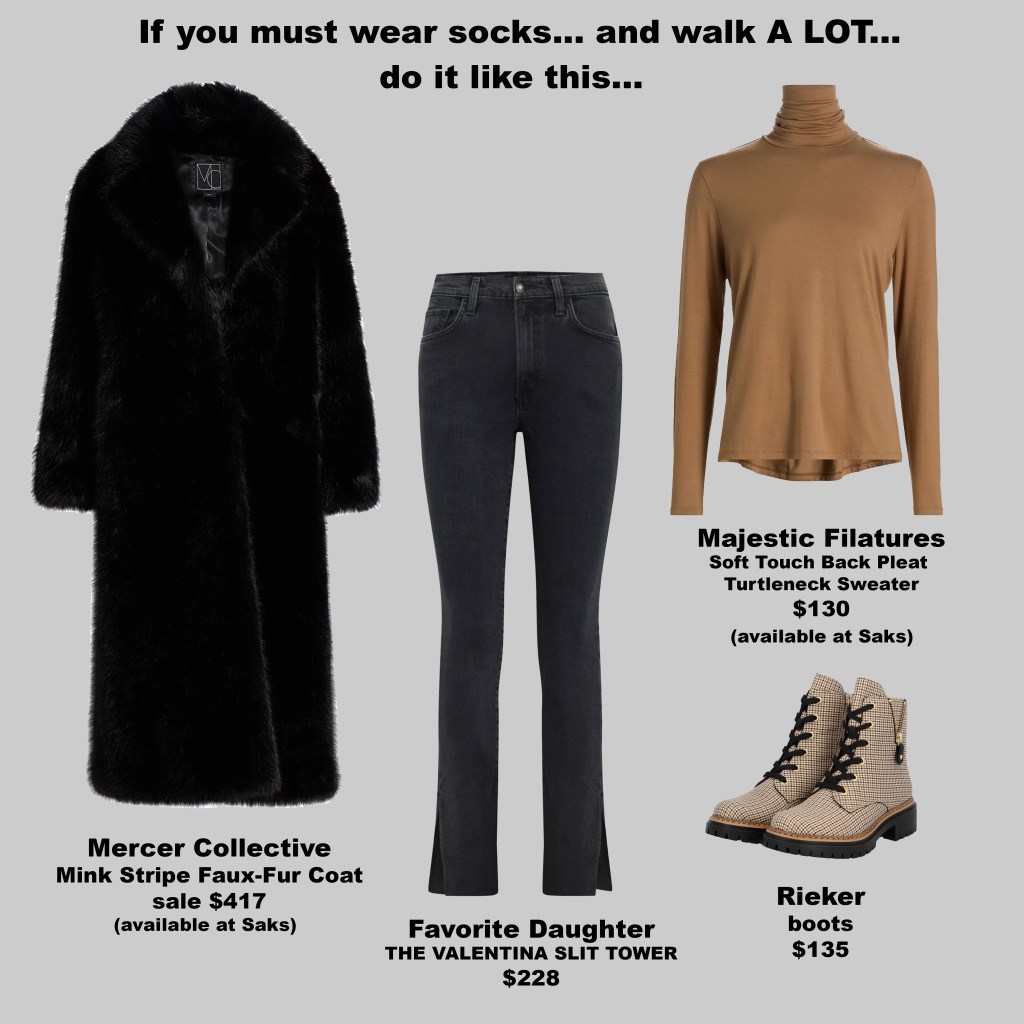
Styling these boots is easy and versatile. Pair them with Favorite Daughter’s Valentina Slit Tower denim in Boulder—a washed black, comfort-stretch jean with with a side slit at the hem. Add the Majestic Filatures Soft Touch Back Pleat Turtleneck in camel cut with an inverted back pleat for fluid drape, and finish with the Mercer Collective Mink Stripe Faux-Fur Coat. The result is a look that feels relaxed but considered—easy enough for long days on your feet, yet refined enough to feel styled rather than practical.
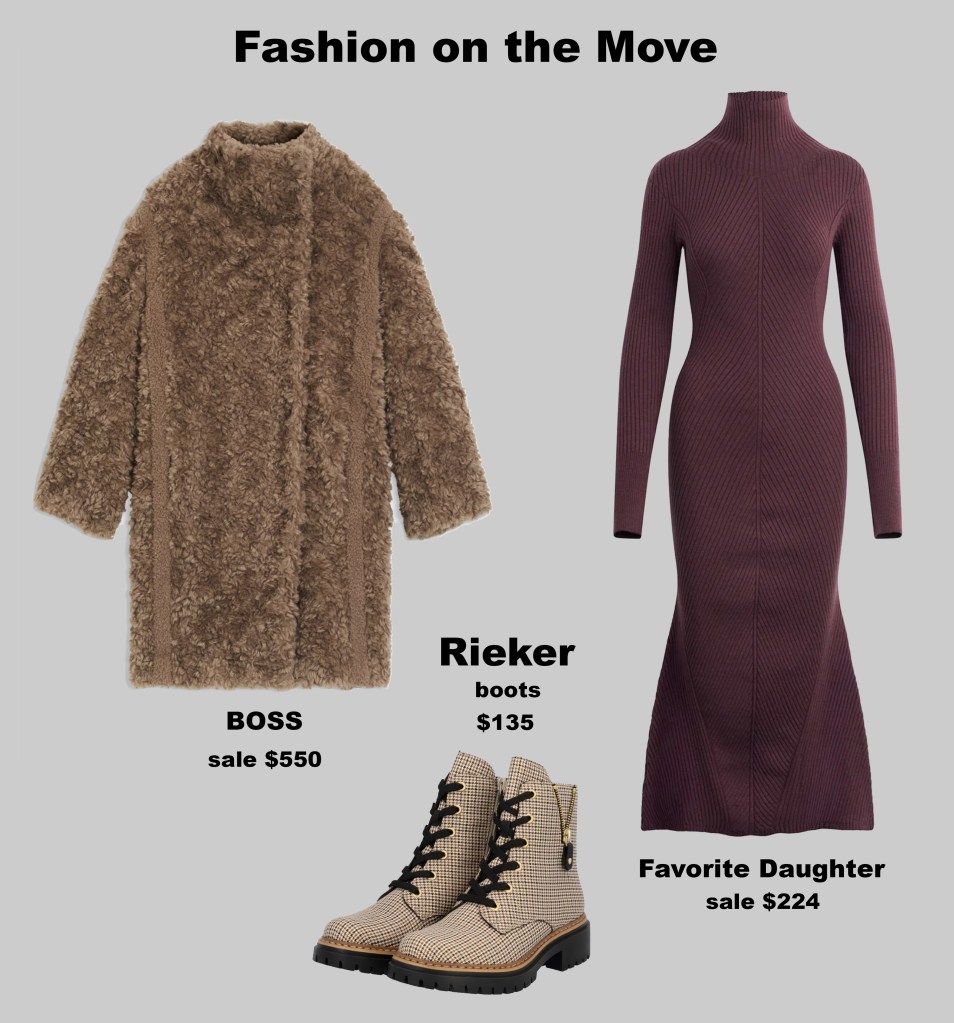
Styled another way, pair them with the Favorite Daughter dress in bergundy dahlia, a ribbed merino blend with a turtleneck and ankle-grazing length that moves beautifully with your body. Top it with a BOSS womenswear coat, crafted from plush faux fur blended with wool. Together, the outfit balances rugged practicality with refined elegance—perfect for long walks, urban exploration, or weekend adventures.
Whether worn with a dress or with denim, these boots prove the same point: practicality doesn’t have to look practical. With Rieker, comfort becomes the foundation—not the compromise—allowing you to walk farther, feel better, and still look completely pulled together.
From the Streets I Know: How Local Culture Shapes Style
Tuesday, January 20, 2026
Growing up in life before social media, where you were from defined your universe, and local culture shaped the way you dressed. There is nothing to be ashamed of in this—it’s the very essence of fashion inspiration. Major designers rarely draw solely from luxury; instead, they look to unique local cultures and reinterpret them for the mainstream.
Today, with travel posts from influencers flooding feeds, I realized I didn’t need to look elsewhere for inspiration. I began to see my own environment—the culture I live in now—as fertile ground for style. I live in a town known for its biker community. While I myself am not a biker, the aesthetic is all around me: leather jackets, rugged boots, bandanas, and a rebellious energy woven into everyday life. This local vibe has subtly infiltrated my wardrobe, influencing how I approach textures, silhouettes, and accessories.
The emerging trend of biker chic—a nod to freedom, edge, and understated rebellion—mirrors this environment. It’s not about copying anyone; it’s about observing, absorbing, and letting what’s around you inform your own personal style. In embracing my surroundings, I’ve learned that fashion doesn’t have to be borrowed from distant lands—it can be discovered in the streets you already walk every day.
Craft in Focus: Why Portuguese Manufacturing Feels Different
Monday, January 19, 2025

Last year, I walked the aisles of a fashion trade show, surrounded by racks of garments, swatches, and flashes of seasonal color. Amid the noise, one thing immediately caught my attention: the remarkable quality of clothing coming out of Portugal. There was a tactile precision in every piece—the weight of the fabric, the smoothness of the seams, the way materials moved in the hand—that set it apart.
It’s one thing for a garment to look good on a hanger; it’s another for it to feel purposeful, built to last. As I examined multiple brands, a clear pattern emerged: the “Made in Portugal” label consistently promised durability, attention to detail, and a subtle luxury that didn’t need to announce itself. This was not accidental. Portugal has long been home to skilled textile artisans and factories that value precision, quality fabrics, and longevity over speed or cost-cutting.
What struck me most was how these garments communicated care through touch. The fabric had weight without stiffness, the stitching was deliberate, and even smaller details—buttons, linings, closures—were executed with subtle expertise. It reminded me that manufacturing is not just a process—it is a craft. And when the craft is respected, the wearer notices, even subconsciously.
I found myself reading labels with new awareness. Where something is made is no longer trivia; it’s a signal of how it will hold up over time, how it will drape, and whether it will reward care and attention. In a fashion world dominated by fleeting trends and fast-turnover collections, Portugal’s consistency felt like a quiet rebellion against disposability.
For those who spend years curating a wardrobe, who value fabrics that breathe and seams that endure, this matters. It matters because touch shapes experience, because quality carries a story, and because garments made with care reflect the human effort behind them. Portuguese manufacturing reminded me that the story of a garment is in its feel as much as its fit—proof that craft, patience, and thoughtful production are not just luxuries, but essential.
Learning Timelessness on Cobblestones
Monday, January 19, 2026
When I went to Italy in the early 2000s, I didn’t realize I was about to relearn how fashion could function in everyday life.
What struck me immediately was how elegant people looked without appearing dressed for anything. Italian women, in particular, moved through their days with a quiet assurance—walking uphill on cobblestone streets in stilettos and navigating uneven ground without hesitation. There was no sense of spectacle, no urgency to stand out. Style felt internal rather than performative.
The palette was restrained: black, white, beige, soft neutrals. What drew the eye wasn’t color or novelty, but form. Long skirts that moved with the body. Well-cut trousers. Linen and other breathable fabrics that aged gracefully. Accessories were chosen, not accumulated—a pair of sunglasses, a handbag that clearly had a history. Everything looked intentional, worn, and lived in.
What fascinated me most was the philosophy underneath it all. At the time, many Italians viewed American consumer culture as excessive. The idea of constantly buying new things, wearing something once, and moving on felt unnecessary—even strange. Instead, wardrobes were built around a limited number of quality pieces that could move seamlessly from day to night, from work to dinner. Clothes were worn repeatedly, sometimes several days in a row, without apology. Loving something meant using it fully.
Purchases weren’t about keeping up or showing off. They were about attachment. When someone bought a garment, it was because they genuinely liked it—because it fit into their life. That emotional relationship changed how clothing aged. Pieces accumulated meaning rather than losing value with repetition.
Being immersed in that environment shifted my understanding of fashion entirely. It moved me away from the idea of dressing for a single moment—looking “cute” for a night out or owning a bag for what it signaled—and toward an appreciation for timelessness. Fashion became less about visibility and more about continuity.
Looking back now, that mindset feels quietly radical. If people expect to wear their clothes often and for years, quality becomes non-negotiable. Fabric, construction, and durability matter again. Designers are forced to prioritize longevity over speed, substance over novelty. Production can no longer rely solely on cheaper labor and disposable materials if garments are meant to endure real life.
Perhaps most importantly, this approach makes luxury accessible in a different way. Not as constant acquisition, but as thoughtful investment. Even those who are not excessively wealthy might choose to invest in luxury pieces—if those pieces are meant to last, to be worn, to become familiar.
Italy taught me that fashion doesn’t need to shout to be powerful. It can be quiet, repetitive, and deeply personal. When clothing is treated as something to live in rather than move past, it stops chasing relevance—and starts building meaning instead.
Forever in Style: The Enduring Appeal of Tartans
Monday, January 19, 2026
Tartans—or plaids, as they’re often called in the United States—have a timeless quality. They appear on runways, in street style, and in wardrobes around the world, season after season. Their appeal isn’t just aesthetic; each pattern carries history, symbolism, and identity woven into every thread.
In terms of widespread cultural recognition, the origins of tartans trace back to Scotland, where distinct patterns were historically associated with clans. Wearing a clan’s tartan was a declaration of loyalty, heritage, and belonging. Each combination of colors and lines told a story—sometimes of battles fought, lands owned, or alliances formed. Over centuries, tartans became a visual language of identity, rooted in tradition yet endlessly adaptable.
For me, this connection is personal. The MacGregor clan has several tartans, each carrying its own history and significance. Wearing any MacGregor tartan is more than a fashion choice—it’s a way to honor the clan’s legacy and maintain a tangible link to our Scottish heritage. Through these patterns, the stories and traditions of generations past remain alive and present.
Tartans also have a playful side in popular culture. One of the most iconic examples is the yellow plaid outfit worn by Cher Horowitz in the movie Clueless. While not an official Scottish clan tartan, the look closely resembles the MacLeod of Lewis tartan. Its yellow-and-black check, with thin white and gray lines, was actually created by French designer Jean Paul Gaultier for his Fall 1994 collection—but it demonstrates how tartans have inspired style beyond Scotland, merging heritage with contemporary fashion.
What makes tartans endlessly fascinating is their versatility. They can be classic or modern, structured or oversized, muted or vibrant. They are at once personal and universal, capable of signaling identity while remaining effortlessly stylish. In every check, stripe, and color combination, tartans connect past and present, tradition and trend, making them one of fashion’s most enduring patterns.
The Return of Tactile Fashion: Why Texture Is Winning
Monday, January 19, 2026

For the last fifteen years, fashion has been built for a single moment: the photograph. Instagram-ready outfits, carefully curated for lighting, pose, and angle, dominated the way we dressed. A blouse, a blazer, a pair of jeans—none of it was meant to last beyond a swipe, a double tap, or a story that disappears in 24 hours. Clothes became ephemeral; quality suffered because outfits were designed to be seen once, and then replaced.
It wasn’t always this way. Twenty-five years ago, brands like Express made pieces that lasted. I still own some of the same skirts and jackets I bought in the early 2000s. You wore them repeatedly because there was no platform that demanded instant, permanent validation. Longevity and wearability mattered. Clothing was meant to be lived in, not frozen for a photo.
Now, a subtle but significant shift is underway. Consumers and designers are seeking fabrics that feel alive and move with the body—velvet, boucle, fine knits, silk blends—combining texture with durability. These pieces invite repeated wear and layering, rewarding the wearer beyond a photo. Fashion is reclaiming the sensory experience lost to digital perfection.
This turn isn’t nostalgia—it’s a response to fatigue. After years of dressing for the camera, people want clothing that reconnects them to the act of dressing itself. Touchable fabrics offer comfort and joy, while emphasizing craftsmanship and longevity. Quality is central again.
Clothing is being made to be worn, layered, and interacted with—not just documented. Consumers are noticing fabric, construction, and resilience, rejecting the disposability of the Instagram era. The tactile turn reflects a larger shift: style is about inhabiting clothing, savoring its feel, and valuing pieces that endure
The Masks We’ve Worn: Fifteen Years of Perfection and What It Cost Us
Monday, January 19, 2026
For the past decade and a half, social media has been a stage for perfection. Every feed, every story, every post carried the weight of meticulously curated images—smiling faces, flawless skin, perfectly placed hair, and outfits arranged with almost ritual precision. It was the era of the “clean girl” aesthetic, minimalistic and polished, where even rebellion had to be perfect, every strand of hair in place.
But living in this world feels different when you’re watching it from the inside. When every interaction, every profile, every potential connection is filtered and measured, the real becomes almost invisible. It’s exhausting—trying to see who someone truly is behind the screens, knowing that almost everything they present is carefully edited. Relationships, both romantic and platonic, carry a constant tension: you don’t know if you’re connecting with a person or the persona they’ve constructed for the world to see.
For those of us who’ve spent years participating, or even just observing, there’s a strange fatigue. The curated perfection feels hollow, a barrier to real connection, a pressure to perform constantly. You start to question your own sense of self, wondering if you can ever be fully known when everyone around you is performing, and if simply being yourself has become a radical act.
Now, as the culture begins to shift, the cracks are showing. Messiness, spontaneity, and imperfection are starting to reclaim space—not as a fleeting trend but as a rebellion. It’s more than undone hair or smudged eyeliner; it’s the courage to let the masks drop. It’s about showing up as you are, with all the contradictions, failures, and quirks that make you human. After fifteen years of curated perfection, it’s as though we’re collectively breathing again, reminded that to be human is to be seen fully, to stumble, to laugh, to feel—and to be enough exactly as we are.


